
tru vessel Health
by tvfatlContest received 50 entries and the contest holder has awarded a winner.
- BACK TO CONTEST ENTRIES
- CREATIVE BRIEF
- ALL ENTRIES
Company or website name
tru vessel Health
Slogan or Tagline
feel seen to feel better
Describe your company and organization and target audience
This is a community based health education company. Its targeted audience is the community and families.
The design should have the following
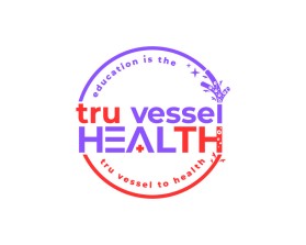
I envisioned the logo the following way: lower case tru vessel and Health capitalized. I want the colors red and purple and black throughout the design. I would recommended prior to creating something that the artist look up the picture of a blood vessel. The blood vessel is made up of a few layers. Blood flows through blood vessels and supplies our body/organs. I want the logo designed so well that the words do not have to be written on it and the actual logo can stand alone if need be.
I want the logo to look realistic. Once you see the picture of a vessel, I think it should help with the realistic feel I am going for.
****See attached image I created. Would like what I already have to be enhanced****
This logo will be used for
- Online (Website, facebook etc.)
- Print (business cards, letterheads, brochures etc.)
- Merchandise (mugs, t-shirts etc.)
- Signs (including shops, billboards etc.)
- Television/screen
This design should not have this in the entries
No cursive
Colors to use in the design
purple, red and black (See attached image I created)
Types of files I need for this design
- .EPS
- .PNG
- .GIF
- .PSD
- .JPG
Briefly describe your contest
Community Health Education Brand Looking to Stand Out!