
thepoppyproject.org
by darbsakulContest received 104 entries and the contest holder has awarded a winner.
- BACK TO CONTEST ENTRIES
- CREATIVE BRIEF
- ALL ENTRIES
Company or website name
thepoppyproject.org
Describe your company and organization and target audience
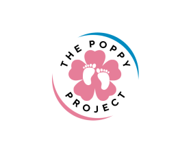
The Poppy Project is a non-profit that was created after my daughter passed away during the birthing process. The organizatin is designed to support those who suffer pregnancy or the loss of a child
The design should have the following
I would like to make our logo more elegant and less cartoonish.
What I like about the existing logo- The Halo over the word Poppy
I would like to include The Poppy Project in the logo
I like including a flower of a Poppy (but less cartoonish)
The Ribbon is the ribbon for infant loss but doesn't need to be that big.
The baby feet are symbolic of babies.
What we don't like about the existing logo
It's cartoonish.
The Font is not elegant.
The Poppy could be much more classy/elegant.
The colors/ lines could be crisper.
This logo will be used for
- Online (Website, facebook etc.)
- Print (business cards, letterheads, brochures etc.)
- Merchandise (mugs, t-shirts etc.)
- Signs (including shops, billboards etc.)
What style of logo would you like?
Colors to use in the design
Black/ Blue/Pink, but more subtle than our existing logo.
I do like the gold halo over Poppy.
Briefly describe your contest
The Poppy Project Contest