
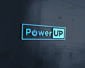
PowerUP
by PowerUPMikeContest received 445 entries and the contest holder has awarded a winner.
- BACK TO CONTEST ENTRIES
- CREATIVE BRIEF
- ALL ENTRIES
Company or website name
PowerUP
Describe your company and organization and target audience
Our Mission Statement is: To equip youth with the essential skills to be career-ready. Our target audience consists of high school-age youth (mostly Jrs & Srs) who are members of youth serving nonprofit organizations (Boys & Girls Clubs, Scouts, 4-H, Future Farmers of America, etc)
The design should have the following
PowerUP is used as one word. The P in Power is upper case and UP is upper case. The "O" in Power should be the start symbol you see used for push button ignitions and on/off buttons for many modern electronic devices. Currently, the letters P wer are Canva light blue color #3cbdfe and the UP is Canva dark blue color #0860a7. The "O" or start button transitions from light blue to dark blue. Our draft design used the Quicksand font, but we are not wedded to it.
This logo will be used for
- Online (Website, facebook etc.)
- Print (business cards, letterheads, brochures etc.)
- Merchandise (mugs, t-shirts etc.)
- Signs (including shops, billboards etc.)
- Television/screen
What style of logo would you like?
Colors to use in the design
Currently, the letters P wer are Canva light blue color #3cbdfe and the UP is Canva dark blue color #0860a7.
Briefly describe your contest
Logo for a youth-oriented workforce development training company.