
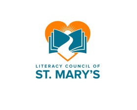
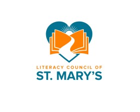
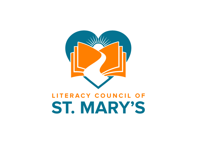
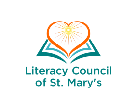
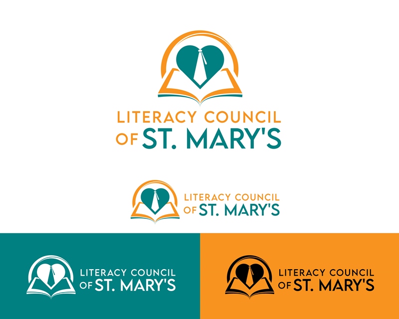
Logo Design Contest
Literacy Council of St. Mary's
by kmuchContest received 391 entries and the contest holder has awarded a winner.
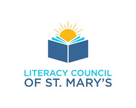
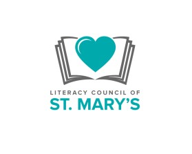
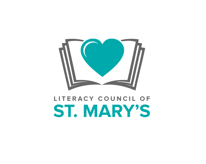
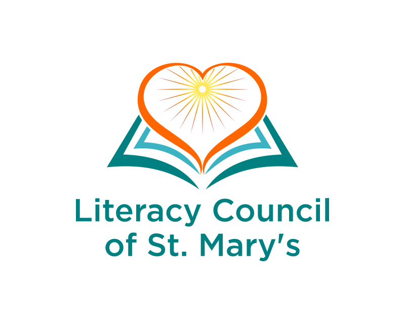
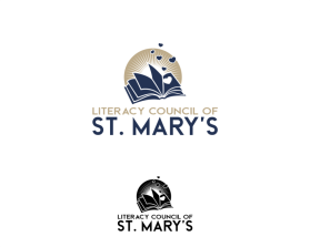
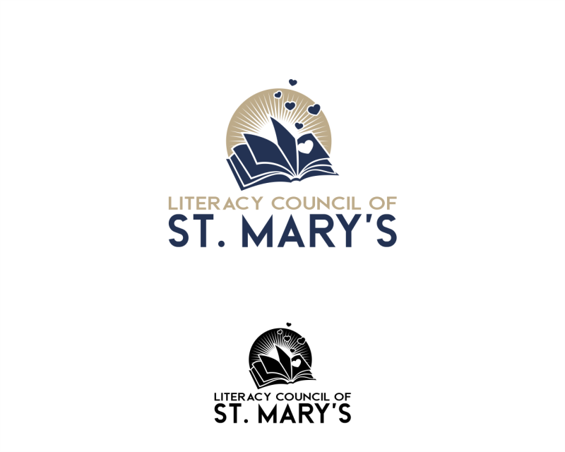
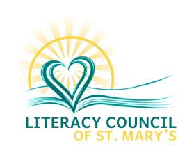
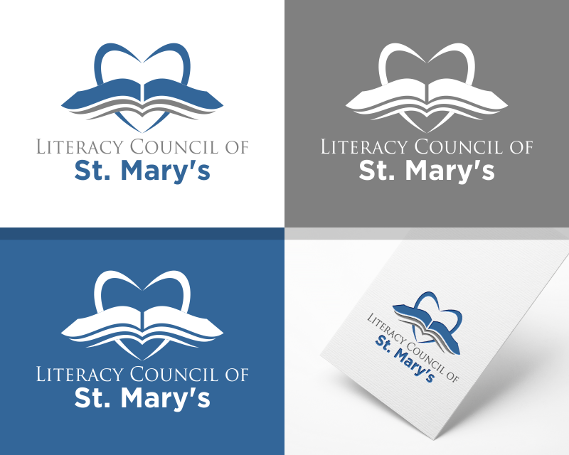
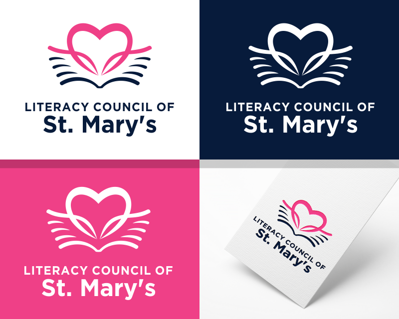
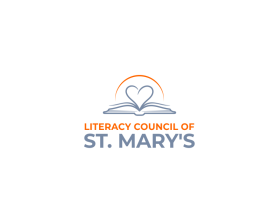
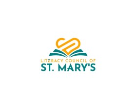
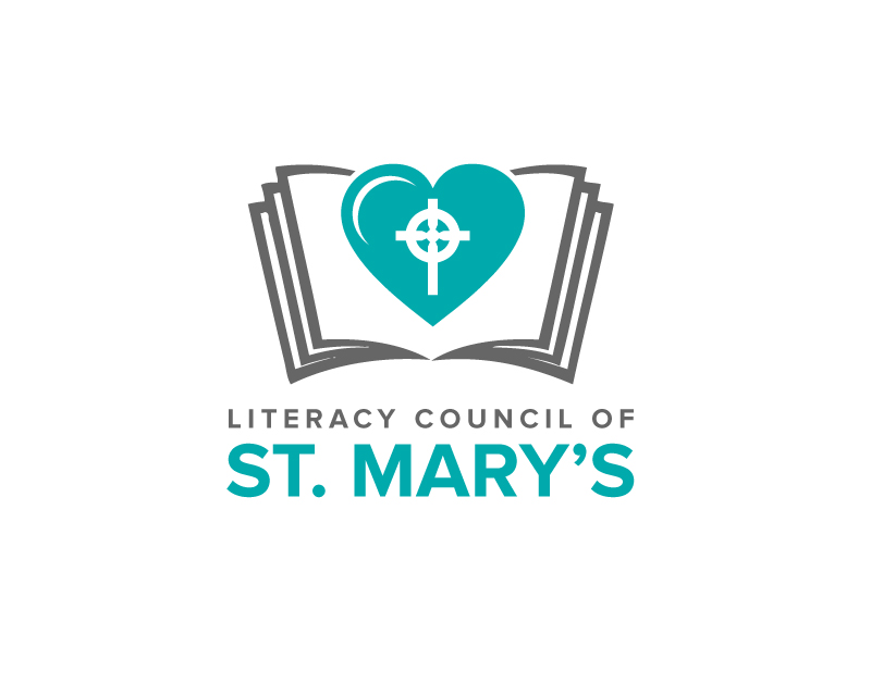
Winning entry by gEt_wOrk
- CONTEST OVERVIEW
- CREATIVE BRIEF
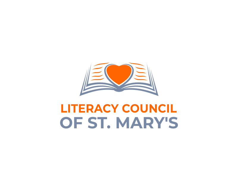
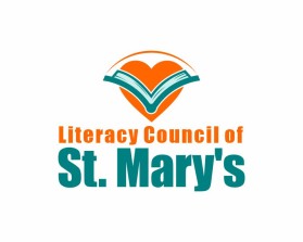
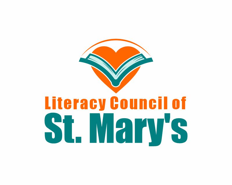
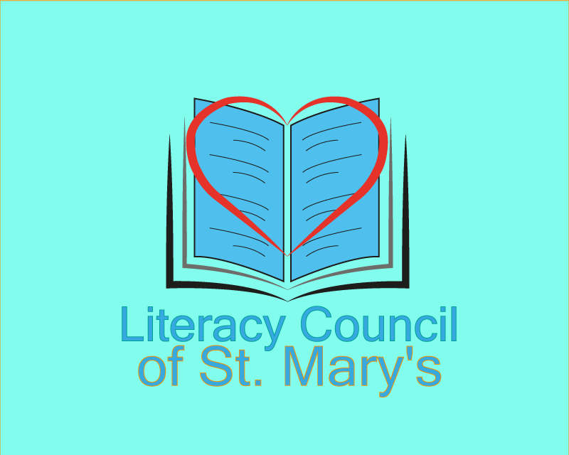
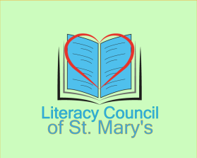
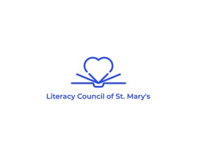
- ALL ENTRIES
Congratulations to winner gEt_wOrk ! They were awarded the contest prize of $189.00


Discussion:
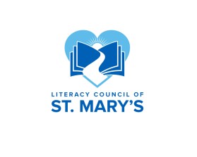
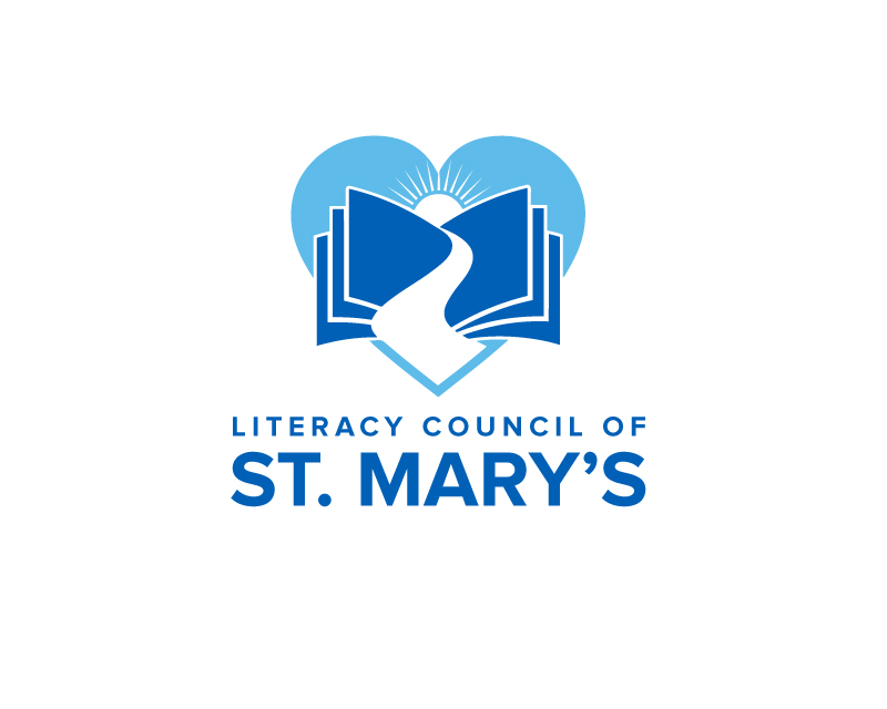
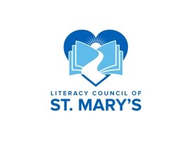
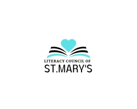
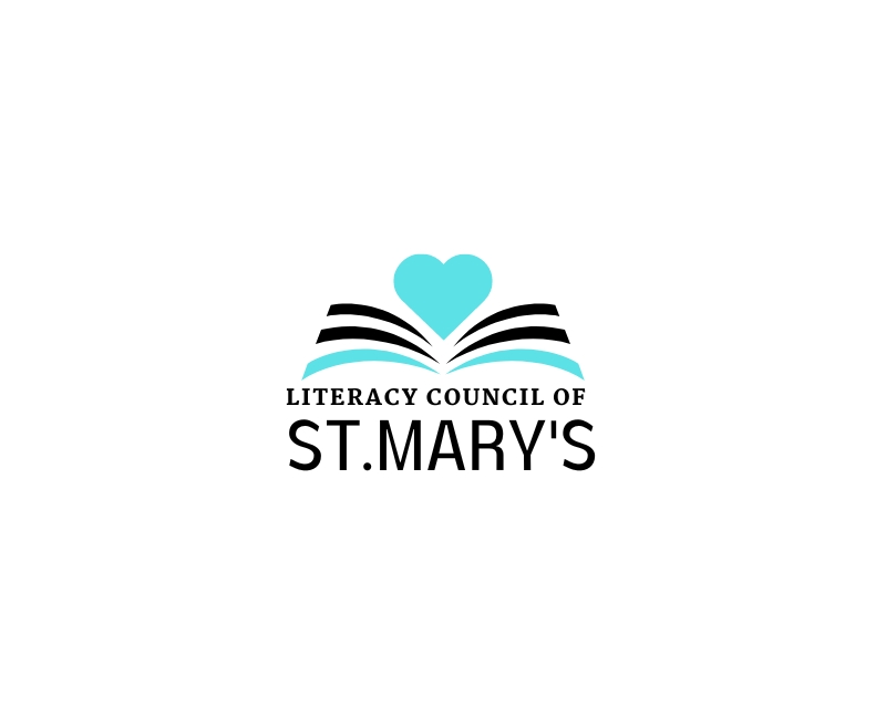
1. We like a “stacked” logo or a side-by-side layout.
2. NO People. No Hands. We like open books where it feels like something rising up to a sun or with heart or a building or combo.
3. Font: Sans Serif font. We like Literacy council on one line and “of St. Mary’s” on the second line.
4. Colors = they liked the orange and teal so OKAY to play with more color
Updated notes: https://docs.google.com/document/d/1OItYVSZ8YIbpRM6sJOdk3yYABLExkqLzAAH5wJMbwlI/edit?usp=sharing We have decided that we want to have the sun emerging from a book. No heart. Just book and sun. We like these shapes:
We want the sun to actually emerge from the book not be behind it. Similar to this if it were a sun;
These are suns we really like - note they have thin lines and an interior white ring between the lines and the circle:
For colors:
blue and teal for the book and wording. Could use orange and/or yellow for sun OR blue is fine too.