
iGrow Industries
by igrowContest received 918 entries and the contest holder has awarded a winner.
- BACK TO CONTEST ENTRIES
- CREATIVE BRIEF
- ALL ENTRIES
Company or website name
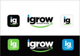
iGrow Industries
Slogan or Tagline
Spend Less. Grow More.
Describe your company and organization and target audience
The #1 Online Store for Nutrients, Grow Lights, Grow Kits, Growing Tools, and Gardening Supplies.
Professional online superstore selling hydroponic, planting and gardening products at discounted prices.
We are a professional, trusted, and reliable company with more than 97% customer satisfaction rate. We are experienced in providing quality growing services to both commercial and individual growers.
The design should have the following
FINAL UPDATE- CAN ANYONE CREATE A MORE CORPORATE-LOOKING DESIGN? google it for ideas. Just remember the business has to do with supplies for growing anything. Any font, any original-looking design will be reviewed. Pick your fonts, pick your colors.
Our managers are giving it one last run because they think a lot of the designs weren't thought out enough. So, anyone with a corporate-looking logo idea, let us have it. Last Chance.
DO NOT COVER THE LETTERS, LET THE LETTERS BE CLEAR FOR ALL TO SEE, YOU CAN USE AN ICON OR ART IN OR AS AN ACCENT TO THE LETTER WHERE IT DOES NOT BLOCK THE LETTER, LIKE INSIDE THE EMPTY SPACE OF A LETTER OR LIKE THE DOT OF THE i, OR LIKE REPLACING A PART OF A SPECIFIC PART OF A LETTER THAT STICKS OUT BASED ON THE TYPE OF FONT.
you designers are fire! each idea is better than the next. there are some really good ones on here that still need some tweaking to look like a big business.
we were thinking to minimize the design. Having a leaf, a vine, a drop, etc. makes it way too busy.
Good luck to everyone. Please keep trying, you can simply recycle these ideas on other contests.
Where's the designer that creates million dollar logos?
The design should also work well on a dark background. so white bordering can be an option but not necessary. alll the ideas below are to help guide with your creativity. if you have other ideas please submit them. we are looking for a Clean, Simple Deisgn that tells you what we do just by looking at the logo. Hints of vibrant color will make the design come to life. less is more when you combine the right fonts, icons, details, etc.
"iGrow" above "Industries" properly sized (reduced) to match iGrow width which should be Bigger Font. iGrow should stand out from rest.
Lowercase "i" for iGrow - dot of "i" should be nice fresh looking Drop of Water
Idea: "G" from iGrow (igrow) may be lowercase in order to possibly use or connect the i and g (like a vine going from leg of the "g" maybe in a loop connecting to the "i" like a looped or unlooped vine with a water drop for the dot of the "i".
Idea: Below iGrow- Use Amazon Smile Logo and add a Leaf Design to one side of the smile. Make sure to put the leaf design on the RIGHT side of the smile.
Idea: "Industries" can be a sort of Metalic or Machinery looking to incorporate both Nature & Technology together. (This may not work well with the Smile logo that goes directly underneath iGrow; So option to put Industries directly after iGrow)
Use Greens, Blues, Black, White, possibly some Yellow. Colors should be Bold. No pastels or dull coloring.
Leaf, Water Drop, Sunlight(hint of) should be used. Hint of Sunlight only an option.
***Don't forget a design for the top of the webpage tab: smaller maybe just"ig" or "igi".
This logo will be used for
- Online (Website, facebook etc.)
- Print (business cards, letterheads, brochures etc.)
- Merchandise (mugs, t-shirts etc.)
- Signs (including shops, billboards etc.)
- Television/screen
This design should not have this in the entries
No dull or pastel colors. No overdesign. Should be Clean and Simple. Customers should be able to determine what we sell/do just by looking at the logo.
Colors to use in the design
Black White Blue Green. Maybe Metallic for Industries word.
Briefly describe your contest
May the force be with You!