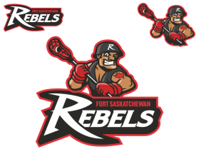
Fort Saskatchewan Rebels Lacrosse
by ddeis13Contest received 100 entries and the contest holder has awarded a winner.
- BACK TO CONTEST ENTRIES
- CREATIVE BRIEF
- ALL ENTRIES
Company or website name
Fort Saskatchewan Rebels Lacrosse
Describe your company and organization and target audience
We are a lacrosse team in central/northern Alberta, Canada. The club appeals to all age groups from young children to older adults.
The design should have the following
There are elements to a sports team logo that are essential to promote the brand while using it for merchandise by sublimation, embroidery, silkscreen, etc. We are looking to upgrade this brand while maintaining the same elements, colours, stance, etc., but modernizing the logo and making it timeless. It needs thick lines that can withstand any medium. The original logo was created in the 90's and is just tired. We also need a secondary logo to go along with the primary logo that can be put on a hat or something. I have examples, if needed.
EDIT #1 - As the initial designs come in, there are some great ideas that are coming through. A few elements that need to be considered though... the character must be the primary element of the logo and not the words or background. I have attached a couple of logos that show upgrades, but also having the character as a primary feature of the logo. We have also discussed this internally and agree that EVERYTHING can change, but him being a mean, contemptuous, take no crap, sleeveless biker (Harley Davidson motorcycle gang) type of man needs to stay. His musculature and the shadowing need to be upgraded. Right now, the lacrosse stick is over his right shoulder, but we found another logo like ours that is almost exactly the same, so that can also change so that he is holding the stick in front of him (like the attached red bird logo). His facial expression needs to change and make the other team scared! Think mean and nasty! His hat can also change and we like the idea of a motorcycle helmet similar to the attached, but the strap under the chin is not needed. For those who are in countries where lacrosse may not be played, look at "lacrosse teams logos" in Google. GREAT WORK FOLKS!
EDIT #2 - The colours in the graphic need to remain the ones that are in the original graphic. We could introduce grey and even use more red, but shading and highlights need to be like shown in the red bird logo. Also, it would be better if the character was offset a little one way or the other and not facing the front directly. It would allow some addition perspective of the character to be shown. We have increased the prize to hopefully garner some more interest from artists who may have specific experience with sports teams logos.
This logo will be used for
- Online (Website, facebook etc.)
- Print (business cards, letterheads, brochures etc.)
- Merchandise (mugs, t-shirts etc.)
- Signs (including shops, billboards etc.)
This design should not have this in the entries
Everything is up for grabs to be modernized! DESIGNERS CHOICE!
Colors to use in the design
The same colours shown in the attached.
Types of files I need for this design
- .AI
- .EPS
- .PNG
- .JPG


