
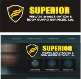
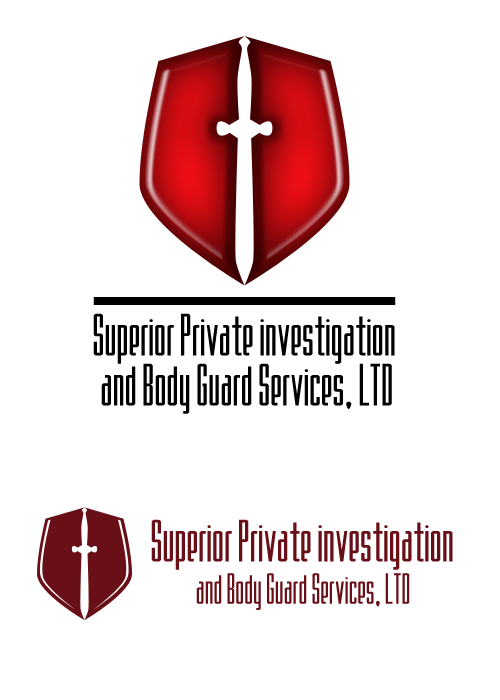
Logo Design Contest
Superior Private Investigation and Body Guard Services, LTD
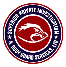
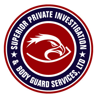
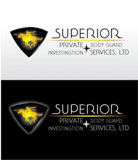
by beyondlabelsContest received 74 entries and the contest holder has awarded a winner.
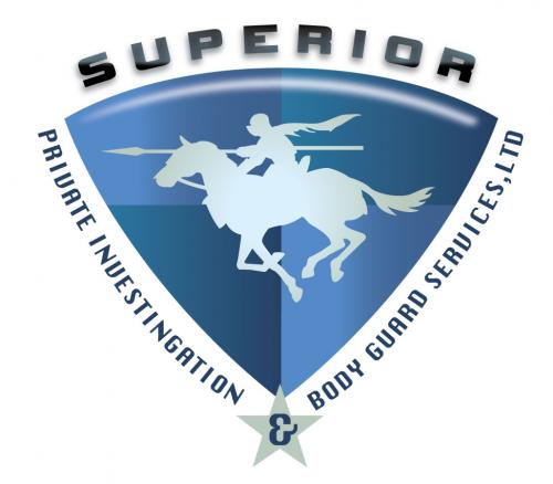
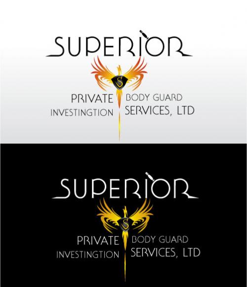
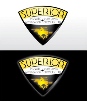
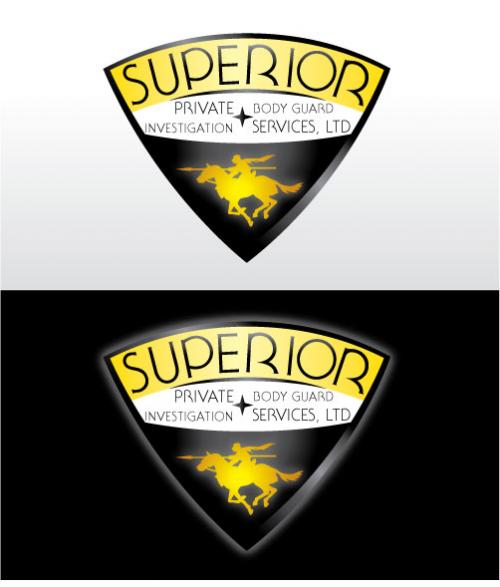
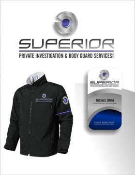
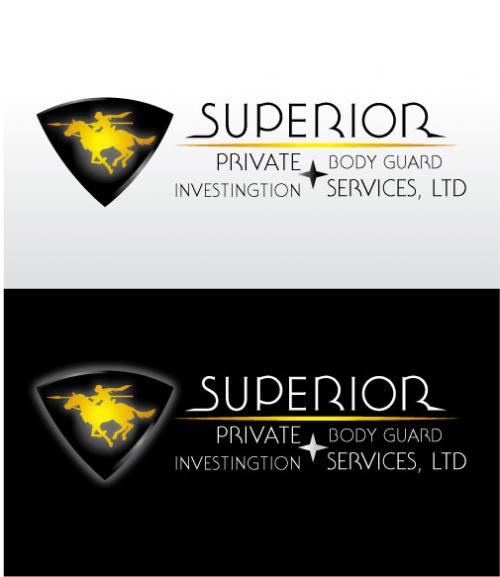
Winning entry by mahmur
- CONTEST OVERVIEW
- CREATIVE BRIEF
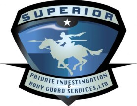
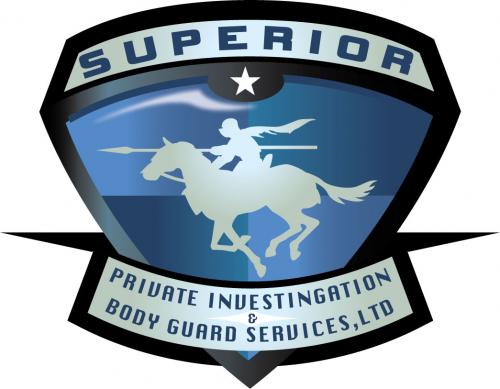
- ALL ENTRIES
Congratulations to winner mahmur ! They were awarded the contest prize of $125.00


Discussion: