

- BACK TO CONTEST
- CREATIVE BRIEF
- ENTRY # 31206
Other entries by awokiyama (15)
Comments for entry # 31206
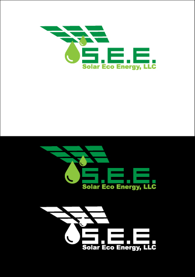
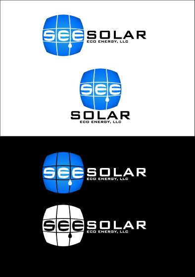
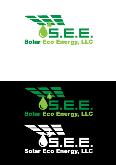
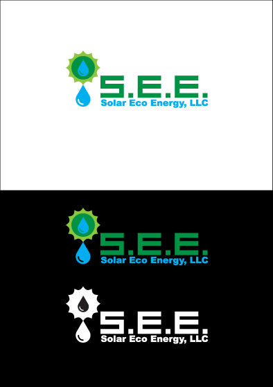
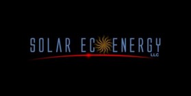
solareco09
Apr 27, 2009 05:04 PM
This is my favorite from this series of submissions. I like the integration of the solar array. I also like the use of the acronym "see". Also, it looks fantastic on the black background. My only concern is how unobvious the word solar is (probably due to its size). Any ideas on how to make that stand out. The word just really grabs peoples attention when they see it. Which is exactly what I'm after.
Browse other entries from this Logo Design Contest


Fast. Awesome. Affordable
About the Creative
2
2
16
Other entries by awokiyama:
Similar Entries