

- BACK TO CONTEST
- CREATIVE BRIEF
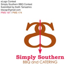
- ENTRY # 38915


Comments for entry # 38915

Hi again, Yes I can do just that for you, I will take away both swoops at the top and bottom and re-submit. Thank you for your feedback,:)
Can we take away the swoop under the "th" and maybe just on top? or maybe not at all on top either. I am thinking once it is in print that the word can be read within one second of reading it. Thanx
Hi there, Thank you for your feedback, and I am happy you like the design. I have made the S's a bit bigger. Please let me know if you like them re-sized, also I added a little bolder to the S's as well.:)
Browse other entries from this Logo Design Contest


Fast. Awesome. Affordable
About the Creative
4
4
13
Other entries by sboze16:
Similar Entries