

- BACK TO CONTEST
- CREATIVE BRIEF
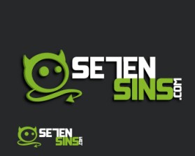
- ENTRY # 354581
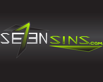
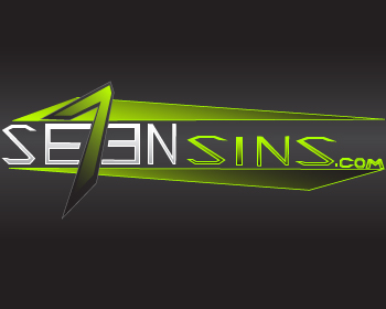
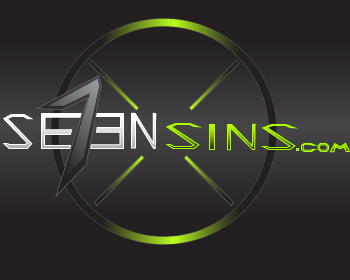
Comments for entry # 354581
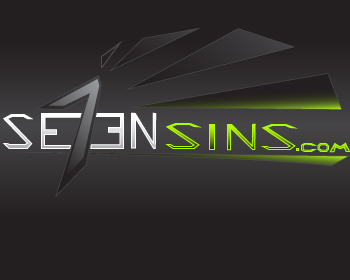
Very unique idea. Not sure if I like the fonts chosen, especially "sins".
Also the dual "E" represents Call of Duty's scope. You can imagine seeing the target in the middle when looking.
Anything can be adjusted to you liking. The stlye represents some of the biggest games to date; like Halo for example with the blades. The "E" letters are pitchforks.
Browse other entries from this Logo Design Contest


Fast. Awesome. Affordable
About the Creative
Similar Entries