

- BACK TO CONTEST
- CREATIVE BRIEF
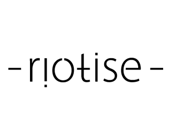
- ENTRY # 484352
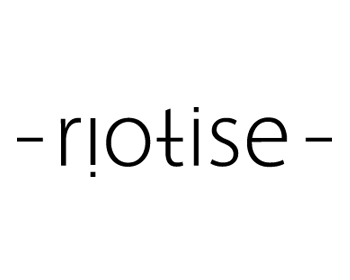
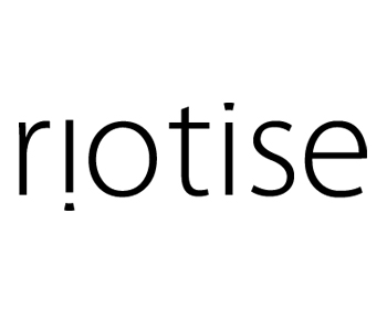
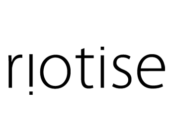
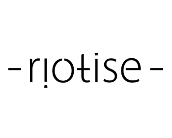


Comments for entry # 484352
there is something that i like about the "t" when you move the bar down. gives it more character. font still isn't quite right. the "e" is better but it leans a smidge on the feminine. perhaps the bubbly "i"
Browse other entries from this Logo Design Contest
Browse other Logo Design Contest


Logo Design Contest: The Online Site
In need of an outside creative mind
$300.00 Prize
194 ENTRIES

Logo Design Contest: www.bulutoglu.com
Food ingredients and Flavor Company Logo
$170.00 Prize
131 ENTRIES


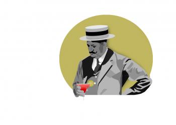
Logo Design Contest: Rosemont Social Club
Classic Speakeasy bar and upscale lounge
$900.00 Prize
220 ENTRIES
Logo Design Contest: The Sorus Group
Bar and Restaurant Concept development
$900.00 Prize
872 ENTRIES

Fast. Awesome. Affordable
About the Creative
1
1
1
Other entries by Wobbles:
Similar Entries