

- BACK TO CONTEST
- CREATIVE BRIEF
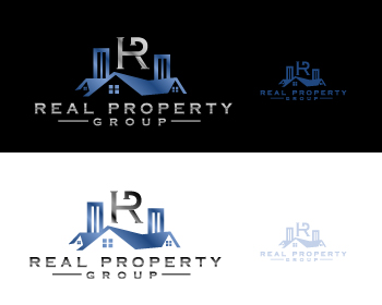
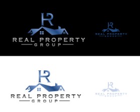
- ENTRY # 915486
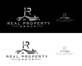
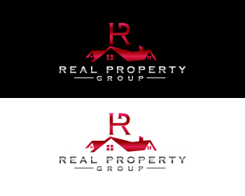
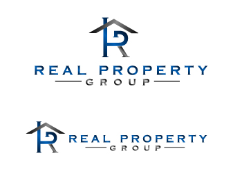
Comments for entry # 915486
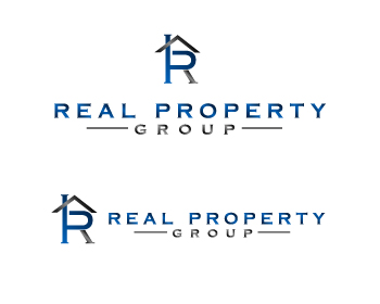
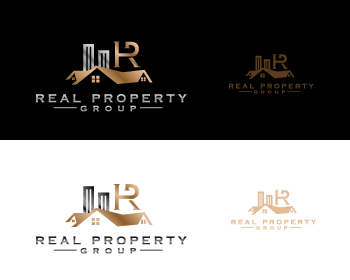
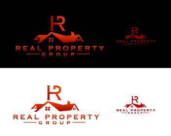
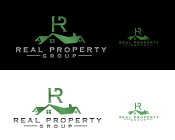
When you put the house on top it makes it look like a G at the top of R&P. can you Mage the G a little more visible somehow?
Like the concept a lot of incorporating the house somehow. The house forms a G for group as well which is cool. Can you somehow maybe make that stand out a little more?
Browse other entries from this Logo Design Contest

Browse other Logo Design Contest
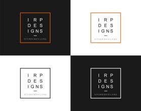
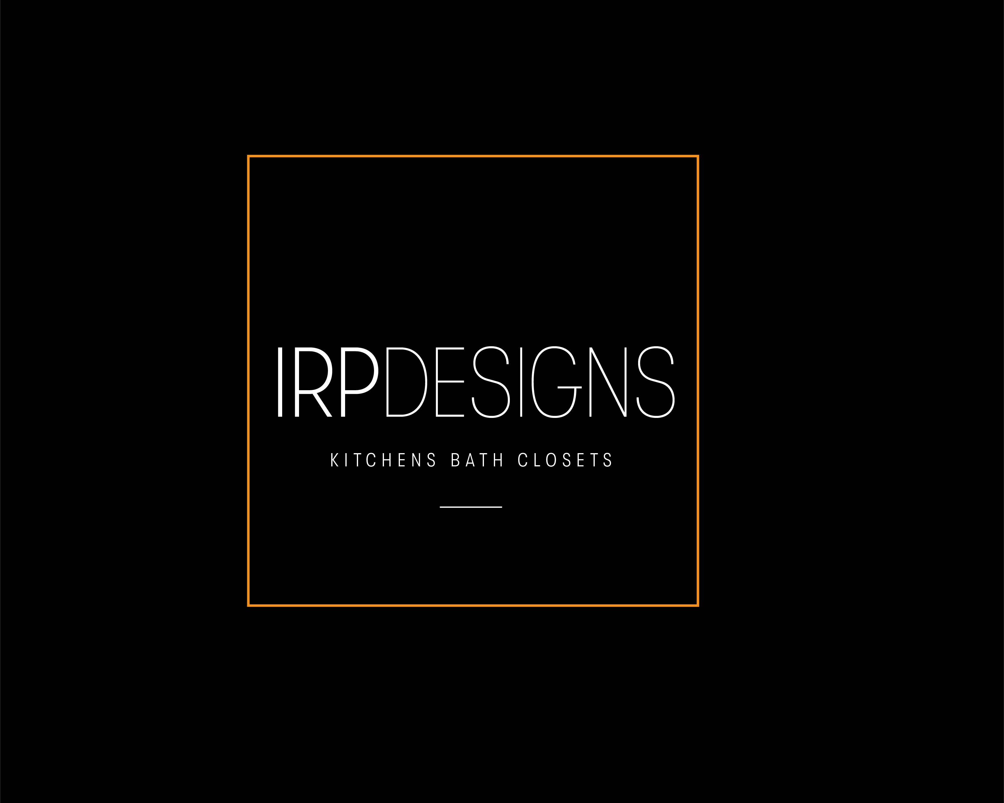


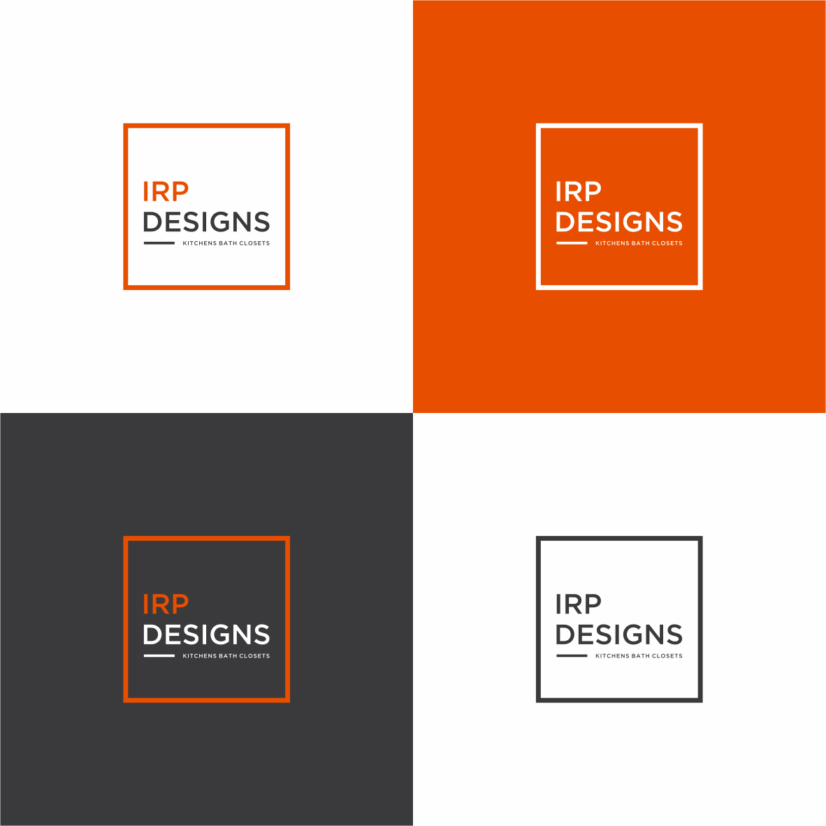
Logo Design Contest: IRP DESIGNS
re doing and modernize the current logo we have.
$150.00 Prize
439 ENTRIES
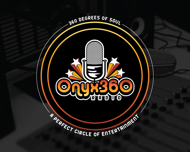
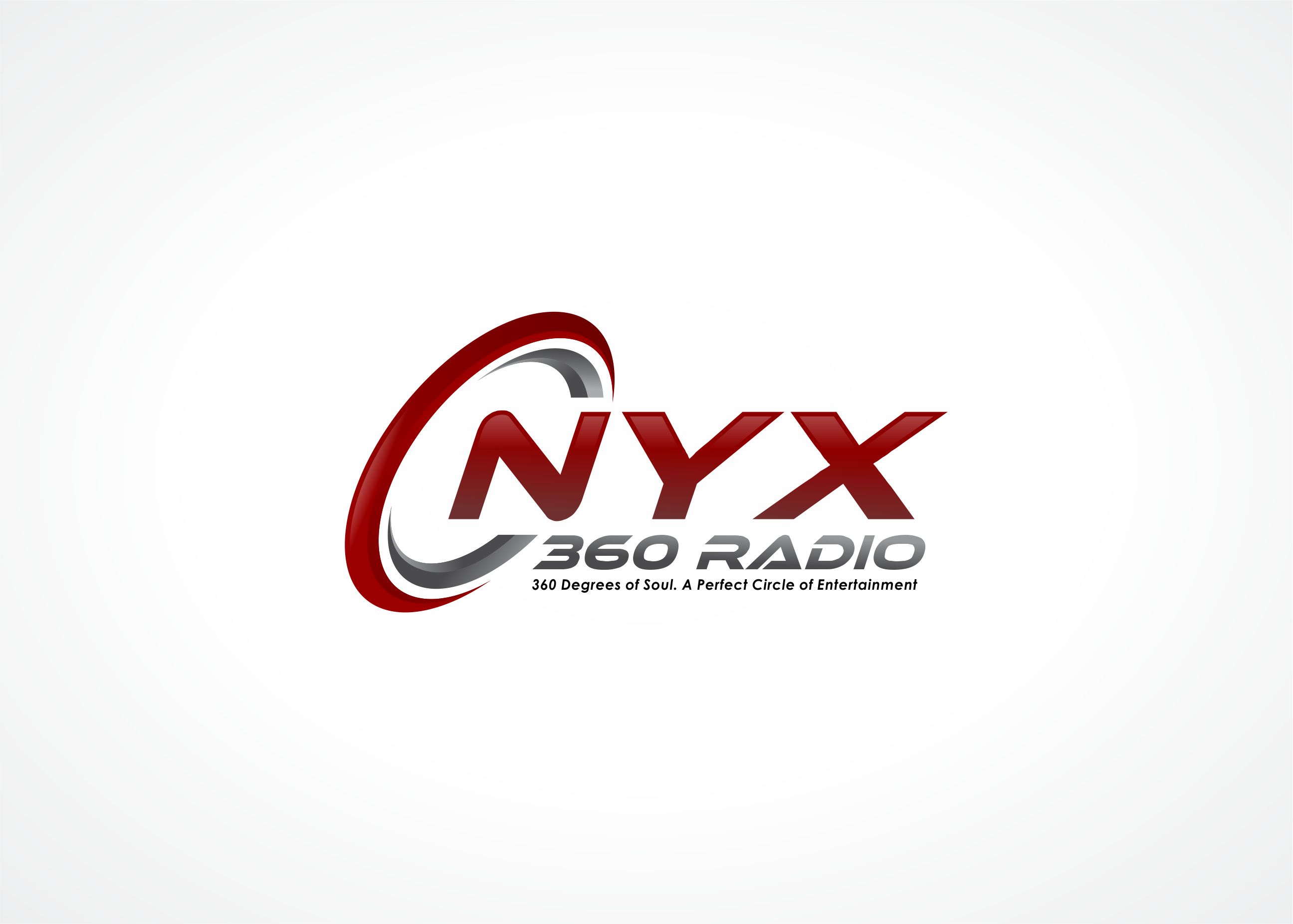
Logo Design Contest: ONYX 360 Radio
Need a logo for new business launch.
$150.00 Prize
67 ENTRIES
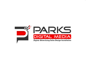
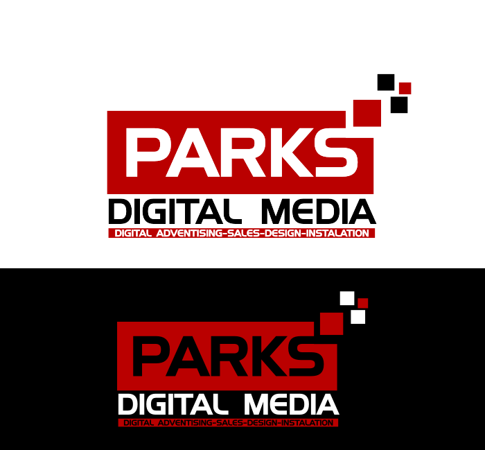
Logo Design Contest: Parks Digital Media
Fresh New Ideas for Digital Advertising
$210.00 Prize
318 ENTRIES
Logo Design Contest: Child Communication and Behavior Specialists
Business logo contest
$200.00 Prize
56 ENTRIES


Logo Design Contest: Immigration Housing Australia
No information provided.
$150.00 Prize
56 ENTRIES


Fast. Awesome. Affordable
About the Creative
30
31
189
Other entries by rSo:
Similar Entries