

Logo Design Entry # 502197
by INHABITED- BACK TO CONTEST
- CREATIVE BRIEF
- ENTRY # 502197


Comments for entry # 502197
Thank you very much!

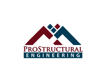
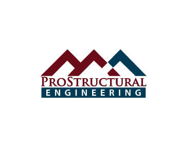
I used more darker burgandy in Prostructural in #502184. Just trying to experiment on the color. But for me #502184 is much better with this one. Im going to revise my logo as per your instruction. Thank you =) Thank you very much.
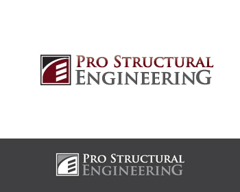
This is good, not wild about the gray color at all though. Should probably try to go with black in lieu of the gray for 'ENGINEERING'. Is there a reason 'PRO' and 'STRUCTURAL' are separated? I know my wife likes how the word 'ENGINEERING' is emphasized but is there a reason 'PROSTRUCTURAL' isn't larger in text than 'ENGINEERING'? What is the difference between this and #502184?
Browse other entries from this Logo Design Contest
Browse other Logo Design Contest


Logo Design Contest: Recruit Up, LLC
a new logo for a growing recruiting firm
$150.00 Prize
285 ENTRIES


Fast. Awesome. Affordable
About the Creative
Similar Entries