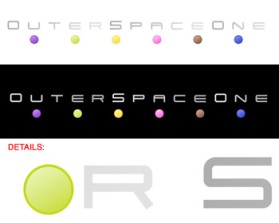
Outer Space One
by MasmaietContest received 209 entries and the contest holder has awarded a winner.
- BACK TO CONTEST ENTRIES
- CREATIVE BRIEF
- ALL ENTRIES
Company or website name
Outer Space One
Slogan or Tagline
none
Describe your company and organization and target audience
- The most important thing is to see example linked. This is a rough visualisation of what we have in mind. - Long horizontal logo with graphic element (it could represent various planets) - The graphic element should have a contemporary style, not
The design should have the following
The name Outer Space One is intended to denote a fictional space station (the company) that travels in deep space looking for planets (that is, fictional worlds that the user can inhabit). The space metaphor is designed to create a detached, abstract feeling towards the company’s mission. Another advantage of this indetermination is that corporate image might be translated and customised for different products/audiences. CLEAN, STREAMLINED, MINIMALISTIC NASA-LIKE DESIGN Minimalistic, plain palette design of the classic NASA era, technical, streamlined and essential. It could also be laid out as a blueprint.
This design should not have this in the entries
Outer Space One products will be directed mainly to “casual” users, both male and female, from 6 to 50 years old.
Colors to use in the design
http://www.outerspaceone.com/images/OSO_Logo_001.jpg
Briefly describe your contest
Minimalistic, abstract logo for game dev

