

- BACK TO CONTEST
- CREATIVE BRIEF
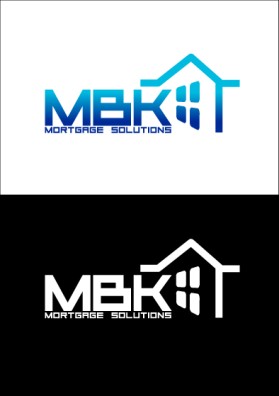
- ENTRY # 30727


Comments for entry # 30727
noted wif thanks, will revised the comment accordingly
another font to use would be from entry 30571.
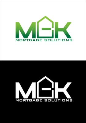
We, have an idea. Can you put the tree that is over the house in your other logo entry, outside of the acronym on the left of "MBK" using this font on a black background? We would be very interested in seeing that if you are interested. Thanks
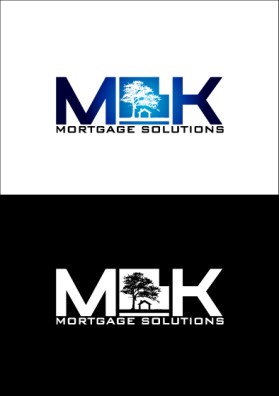
This is really good work. I hope you can think of a way to keep the same effect making the house look more like a "B". Good luck if your interested.
This would've been a frontrunner if you could make the house look a little more like a B instead of a G. Can you try that?
Browse other entries from this Logo Design Contest


Fast. Awesome. Affordable
About the Creative
2
2
16
Other entries by awokiyama:
Similar Entries