

- BACK TO CONTEST
- CREATIVE BRIEF
- ENTRY # 11386
Comments for entry # 11386
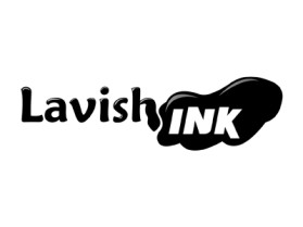
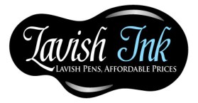
yea, if you have photoshop just use the hue feature on the ink blob layer.
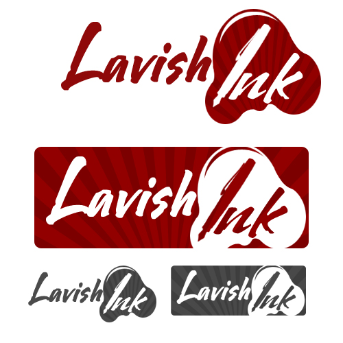
As long as its a large physcial size(height/width), combined with the large DPI...which will allow us to use it just about anywhere, then that should be fine. I assume the blob can have its color changed wtih ease? We won't be using the red striped background. Thanks
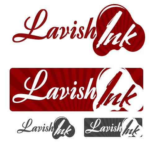
the ink blob and the pen... I already have the pen at a large size but not vector and the ink blob I could make it a larger size easily... the only problem with making it vector is that I don't have illustrator... All I have is photoshop. If there is a way to make it into a vector from photoshop I could do that or I could just make it a larger version.
Jaron, That will probably be fine. We don't need the background red design. As long as we can change the colors, we should be fine. It seems like it would be fine as a vector...there doesn't reallyl appear to be any raster only type properties to it. Can you convert it to vector at all? Really all thats needed to be vector I guess is the ink blob...the rest of it is just fonts. LMK...Thanks
Yes definitely... I do want you to know though, that it is a .psd but that I will remake it at a much larger size at 300 dpi and provide you with both sizes. Also if you want any other designs with the logo I would be more than happy to work with you on them.
Jaron...if we select your design, will you be able to provide the font used as well? There is a possibility we will change the word lavish to another word and want to ensure we are able to do that. Thanks, SSC
Yea, but I'm a logo designer, it's my job to over analyze my own work, haha.
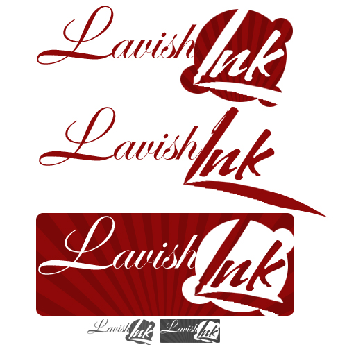
Yea..I would agree. I was thinking the same re the handwritten. It does feel a little bit like a contradiction of the word....but Its also possible we are over analyzing it and splitting hairs. I think chances are most people who view the logo will focus on the creativity of think ink blot more then they would the fact the font might not fit with the word lavish...you think?
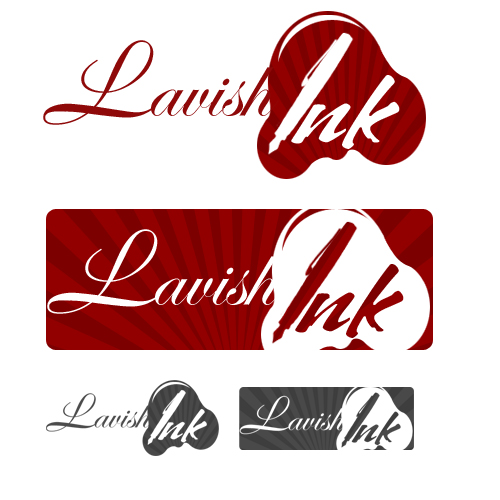
Although, it does look a little more hand written, so I guess it would be fitting for the logo.
I would say that this one is a little "edgier" i guess would be the word... The ink blog, ironically, is about the most professional looking about it. It looks a little more targeted for youth with Lavish being this font, it doesn't suit the word completely. However, in personal opinion, I like this style more, haha.
Browse other entries from this Logo Design Contest
Browse other Logo Design Contest

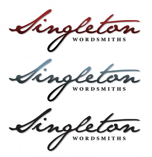
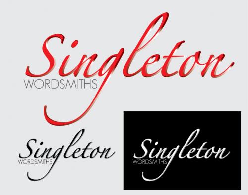
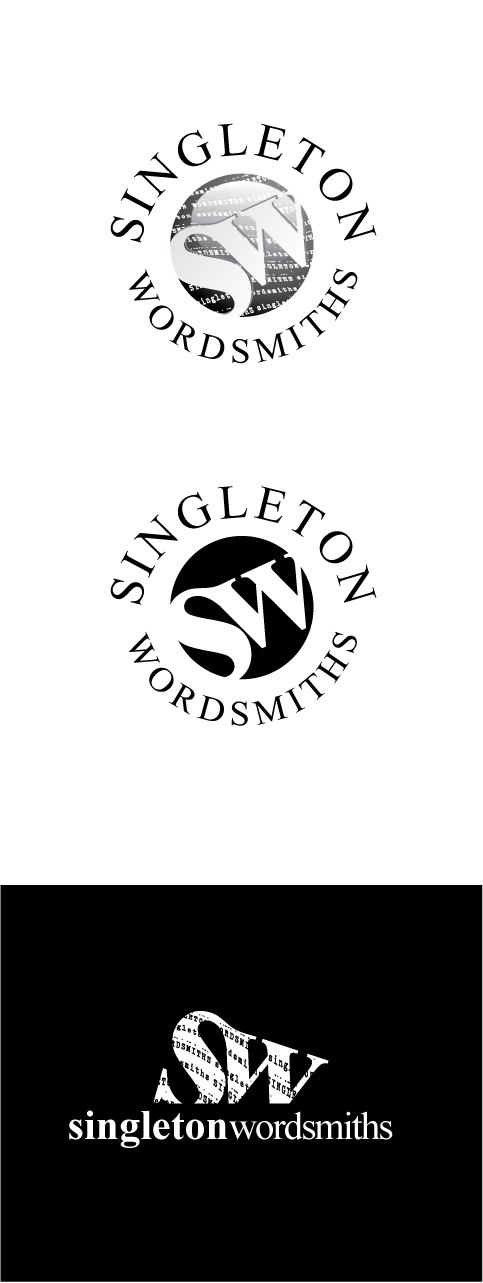
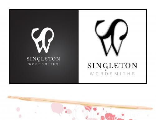
Logo Design Contest: Singleton Wordsmiths
Freelance writers/editors need logo!
$125.00 Prize
212 ENTRIES
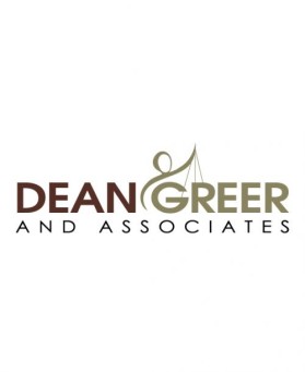

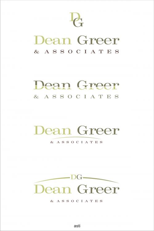
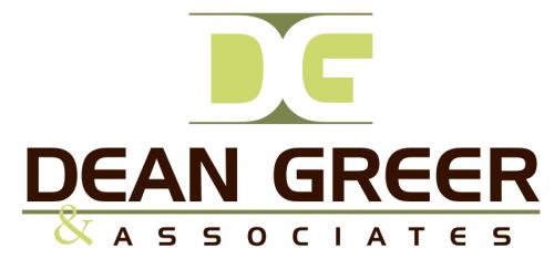
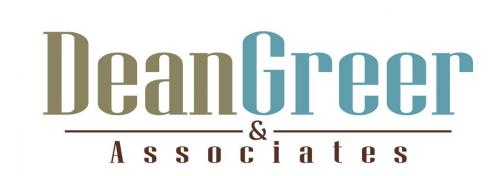
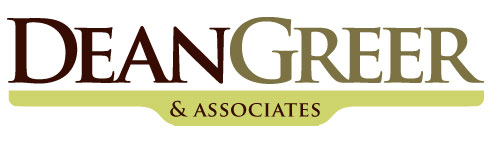
Logo Design Contest: Dean Greer & Associates
Strong, contemporary logo for a law firm
$150.00 Prize
112 ENTRIES
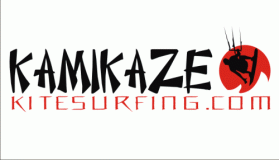
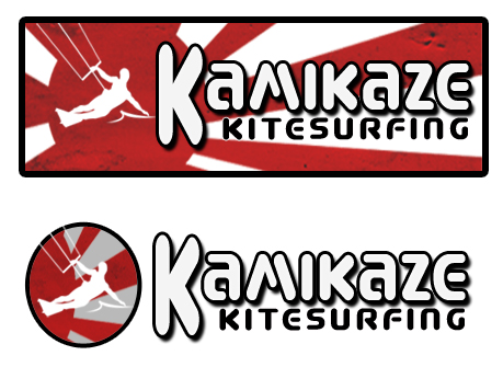
Logo Design Contest: kamikazekitesurfing.com
Extreme sports clothing company
$100.00 Prize
78 ENTRIES


Fast. Awesome. Affordable
About the Creative
1
1
Similar Entries