
KikiWise
by WatanabeStevenCContest received 64 entries and the contest holder has awarded a winner.
- BACK TO CONTEST ENTRIES
- CREATIVE BRIEF
- ALL ENTRIES
Company or website name
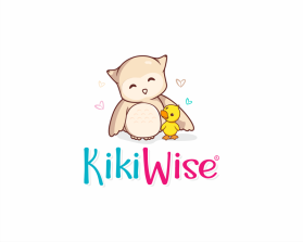
KikiWise
Describe your company and organization and target audience
Theme: Kids YouTube Channel
About: This company is dedicated to teaching kids ages 0-6 basic education. At the same time we educate parents about early childhood development and provide a curriculum with lessons plans for each video. All of our video's are based on a lesson plan that anyone can download and use for their family.
The design should have the following
Logo Icons (characters): There are going to be two characters in the logo:An Owl(Large) and a Duck(small)
***IMPORTANT***We would like an anime style simple drawing with the big owl and the little duck. Here is an image of how we would like the pair to look:
https://img.clipartxtras.com/40c870e8e6aef28127a5555a7f3da9a3_oooo-happy-owls-the-future-of-the-imagination-pinterest-anime-owl-drawing_2700-2000.jpeg
Keep in mind the duck would take place of the little owl in this image.
Character Notes:
- Both Duck and Owl need to have the same style of drawing
- Use the Color idea's in the "Text, Font and color" section below, but keep in mind that these colors are bright and close to primary colors because kids are more receptive to them.
----------------------------
Text, Font and colors
- Colors and word coloration we like: http://www.onextrapixel.com/wp-content/uploads/2012/06/young-american.jpg
- Text should read: KikiWise
- We like how each work is one color
- Font ideas: We have a couple styles we are thinking of. Here are some links to the styles we have in mind:
https://ih0.redbubble.net/image.357890620.3325/flat,750x1000,075,t.u1.jpg
http://www.onextrapixel.com/wp-content/uploads/2012/06/young-american.jpg ( I like how this one has a star incorporated. Maybe there could be a heart like the drawing of the owls above?)
http://www.onextrapixel.com/wp-content/uploads/2012/06/bubalicious.jpg
https://qph.fs.quoracdn.net/main-qimg-79be94f1f7b22f51d9236b964d447e5f
DO NOT USE OVERLY CARTOONISH FONT
----------------------------
Owl Characteristics:
We would like to see a couple variations if possible.
- Color: Same color as image referenced above and we would like to see. However we also like the original light tan color style the original drawing has. If you can show us one with that color variation as well, that will increase your chances of winning.
- Happy eyes: https://png.pngtree.com/element_origin_min_pic/16/07/17/15578b37db6d7a7.jpg
- Tilted Head: https://png.pngtree.com/element_pic/17/01/05/e873757d576e1da80a2583878f370bac.jpg
----------------------------
Duck Characteristics:
- Simple, cute duck: http://wonderduck.mu.nu/images/nnb01-02.jpg
- Color: Yellow or shade of yellow.
- Angles: Front and side angles
- Standing and non-standing if possible
----------------------------
Variations:
Please include different logo variations.
- Horizonal with characters on the left side of the text
- Vertical with characters above text
- Any other creative variations you can think of
This logo will be used for
- Online (Website, facebook etc.)
- Print (business cards, letterheads, brochures etc.)
- Merchandise (mugs, t-shirts etc.)
- Signs (including shops, billboards etc.)
- Television/screen
This design should not have this in the entries
DO NOT USE OVERLY CARTOONISH FONT
What style of logo would you like?
Colors to use in the design
- Colors and word coloration we like:
http://www.onextrapixel.com/wp-content/uploads/2012/06/young-american.jpg
Briefly describe your contest
Kids Logo Contest