

- BACK TO CONTEST
- CREATIVE BRIEF
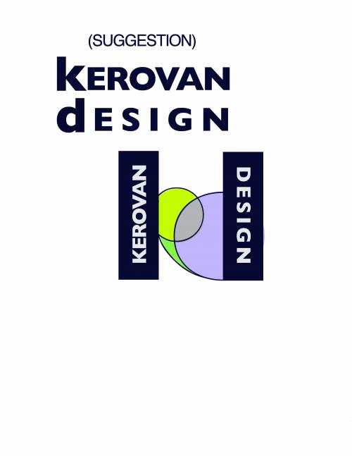
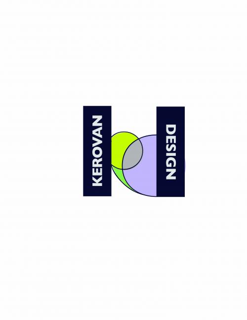
- ENTRY # 8633


Other entries by gozzi (15)
Comments for entry # 8633
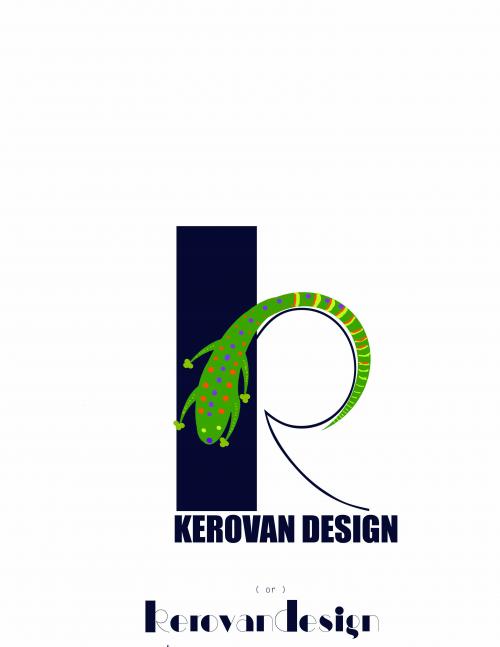
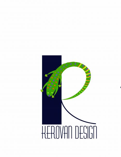
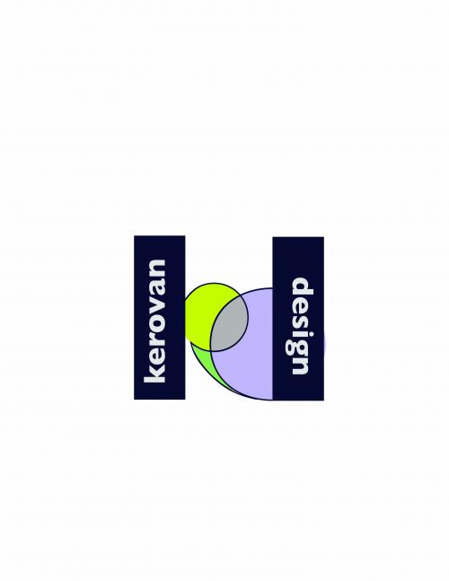
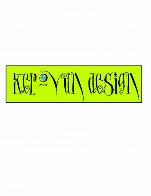
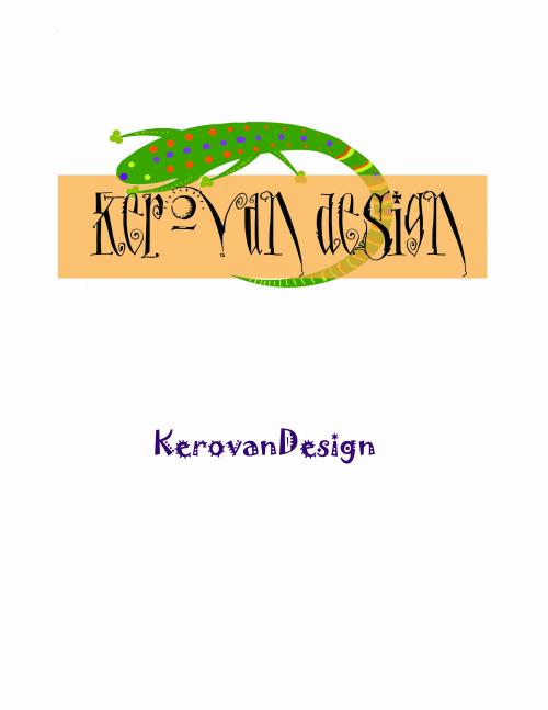
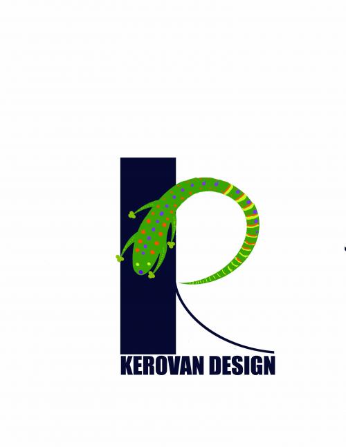
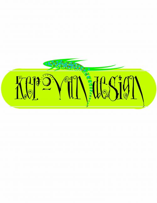
Kerovan
Aug 13, 2008 03:08 AM
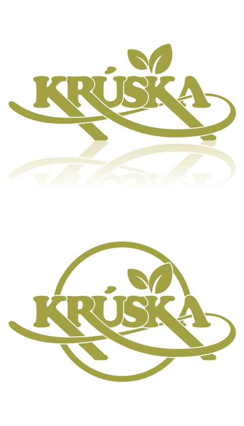
I like it! Really dislike the bottom one though - it looks like one of the earlier designs submitted by someone else using that font. I find it extremely hard to read. The top design is the best one you've done yet! Could you make his tail be the entire top part of the K, and get rid of the blue circle at the top, and kind of curl his tail up in a loop, and the make the bottom part of the K (the line) thicker? I dig this design - good job!
Browse other entries from this Logo Design Contest


Fast. Awesome. Affordable
About the Creative
11
11
58
Other entries by gozzi:
Similar Entries