

- BACK TO CONTEST
- CREATIVE BRIEF
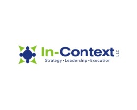
- ENTRY # 354692
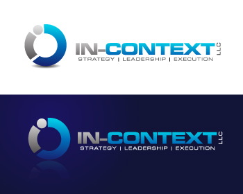


Comments for entry # 354692
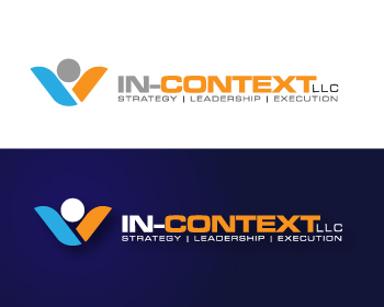
This design has resonated with a number of my reviewers. Her are some thoughts: 1) the size of the symbol seems to be out of balance (too large), 2) want to loose the LLC entirely, 3) can the weight of the lettering be reduced a bit (although others like this) 4) got compliments with your shade of blue, can we push the envelope on colors a bit....what colors are coming in? Blue/gray/orange is starting to feel predictable and tired. Again, your shade of blue did stand out. Thanks.
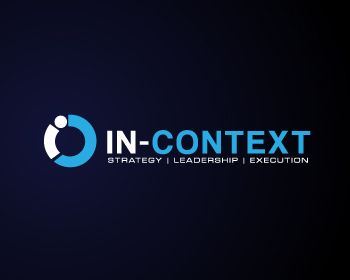
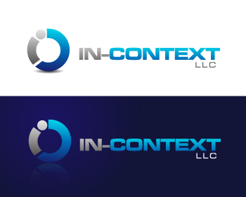
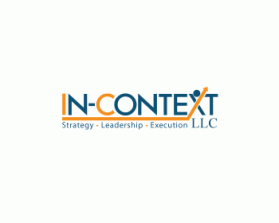
Several liked this design so moving forward with a shorter list. Thanks
Generally the same as above. I think I like the words underneath. In a way the "In-Context" gives context for Strategy/leadership/execution. Mixed feelings about the sideways LLC.
Browse other entries from this Logo Design Contest


Fast. Awesome. Affordable
About the Creative
131
134
605
greycrow Bio
Philippine-based Freelance Graphic & Logo designer.
Other entries by greycrow:
Similar Entries