

Logo Design Contest
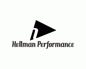
Hellmann Performance
by MasterJereContest received 172 entries and the contest holder has awarded a winner.
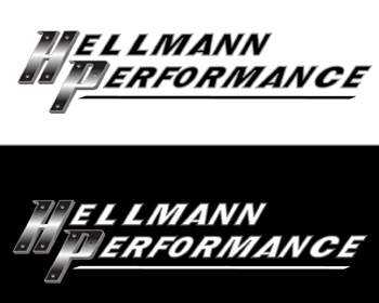
Winning entry by Harrycouk
- CONTEST OVERVIEW
- CREATIVE BRIEF
- ALL ENTRIES
Congratulations to winner Harrycouk ! They were awarded the contest prize of $130.00


Discussion: