

Logo Design Entry # 99013
by thinkforward- BACK TO CONTEST
- CREATIVE BRIEF
- ENTRY # 99013


Comments for entry # 99013
Yes I the document I will send you will an ai. or eps. file if you choose my logo. This means the logo will be in vector format and fully editable. You will be able to move around all the parts well if you have the software needed to make these modifications. I use Adobe Illustrator CS3 but there are several different softwares that can manipulate vector format designs. If you choose my design I can give you a few different variations with "Its easy being green" completely removed or put underneath the design. Best regards, Thinkforward
Thinkforward, Please remove the quote "its easy being green" I think we can add that seperatly. Unless we get the souce file so we can remove it ourself. Then dont worry about it. WE want to have the ability to modify. The text or colors after the fact. Is that possible?
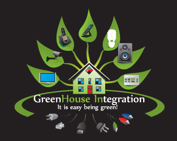
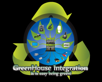
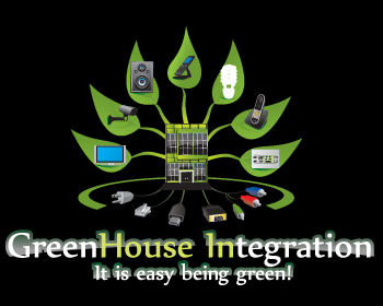
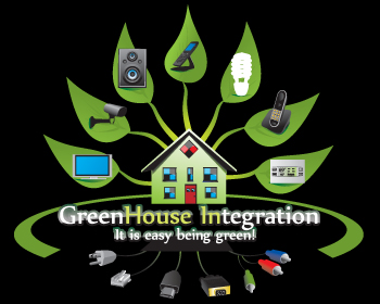
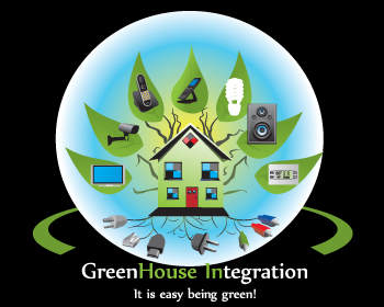
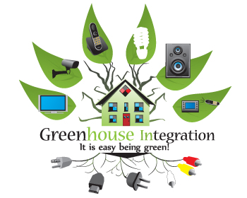
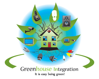
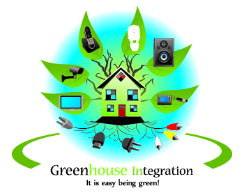
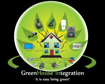
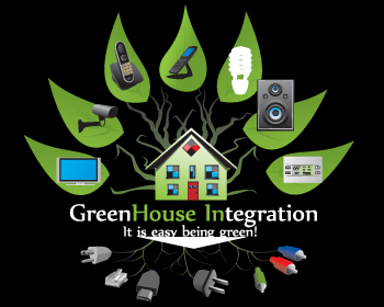
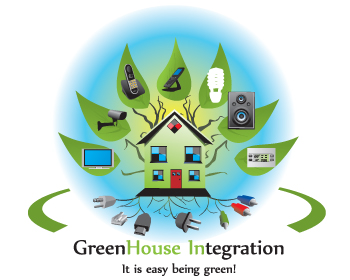
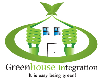
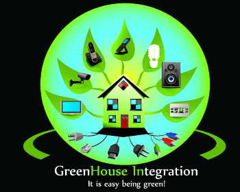
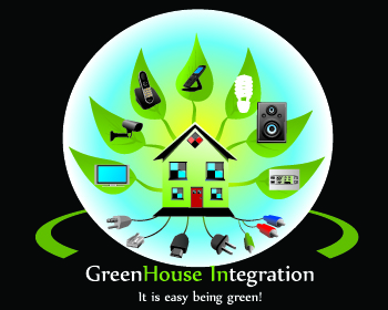
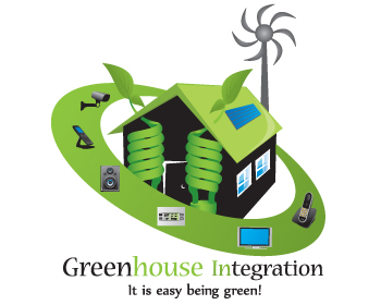
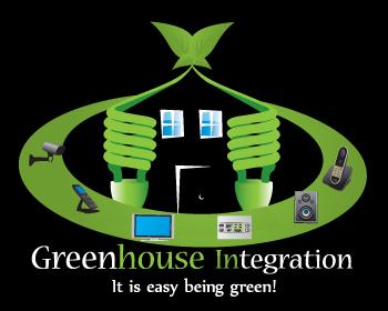
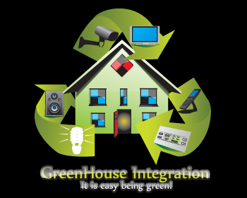
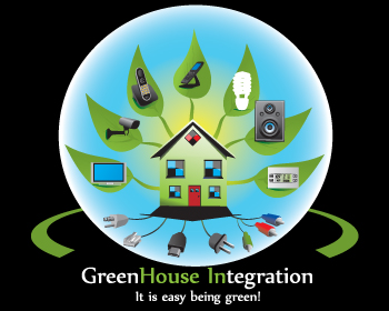
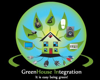
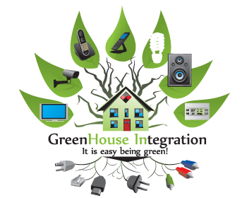
Thinkforward Couple of suggestion and enhancements. I probably made a mistake and asked for some of my closest relatives to give me some feedback. So I got some different perspectives on our concept. On the enhancement side we feel the speaker should be moved to the left side, this might not make it look out of place. So, if it can be swapped with the phone. That would be great. Second, we have respected all the designers input. As explained, I think the best way to get great results is to allow people to do what they do best and get out of the way. So, I want you to run with this as it is your own. You have skills that are just wonderful. The name thinkforward is very fitting for you. We do like some of the more simple logos but we really like yours. Even your simple one we like. The next item is more of a question???? So, I would really appreciate you honesty. Is this logo to busy???? We plan to blow it up very large for our vans. How do you think it will look very large on a van, small on letterhead and business cards. So, I am looking to you for advice. The next item is- As our name is Greenhouse Integration- We also have a great deal of commercial/enterpise business systems we sell and install. Does the house put us in a box that says we only do residential. I am not looking to scrap the idea. I am asking for you advice and opinion. Maybe a tweek to simplify the house a bit and have it more like a stucture would accomplish those goals. Another question, again your in the driver seat- Could you use this recycle ring in one of the other logos? Check this out and tell me if you think this would look great with the other concepts Check this out....http://www.branchetonipod.com/images/recycle_logo_and_globe.jpg I know it goes against what I said about busy. But it looks kewl with one of the other idea concepts. I dont want to confuse you, WE love the black back ground. WE want to tweek that as indicated. WE NEED TO MAKE SURE THAT THE NAME OF THE COMPANY DOES NOT GET LOST IN THE LOGO!!!!! We want the logo to draw you in but we dont want you to get lost and forget the name of the company Last but not least, we thank you for all your hard work as we do all the wonderful designer, it is really hard not to give everyones 5's because we understand the work effort that takes place to design something. WE do it all the time. Dont get me wrong there are a couple I just would not use. But that doesn't mean I wouldn't give that person a 4, because of their time and effort. That count with us!!!! I look forward to the minor changes and inut as requested. Thank you very much, all of us appreciate it... Respectfully, Cliff J
I would love to hear them. Best regards, Thinkforward
Thinkfoward, A couple of question/suggestions.
We absolutely agree with you. You have by far to date exceeded our expectations and we look forward to some minor enhancement that will complete the idea and concept. To date all though everyone has done such a fantastic job. We are gravitating to your designs. We have some input but we just got in from a long road trip and will touch base tomorrow. GREAT WORK!!!!!
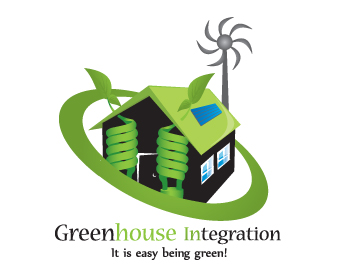
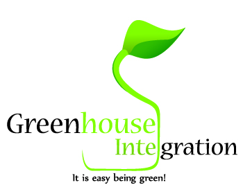
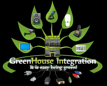
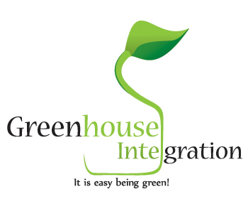
Well I think so far I like this one the best. Obviously my job as the designer is to give you what you want; however, since you asked what I thought I will tell you. I like the composition of this design. Personally I like simple logo designs (I really liked my first design I submitted to this contest). This logo concept continues to grow on me. This design will provide the costumer or potential customer a great idea of what your company does. The work is high quality and very detailed and I would use this logo in an instant if it was my company. Let me know if you would like to see other changes. Best regards, Thinkforward
Browse other entries from this Logo Design Contest


Browse other Logo Design Contest
Logo Design Contest: Pioneer Coffee Repair
Logo for a coffee repair business.
$100.00 Prize
53 ENTRIES

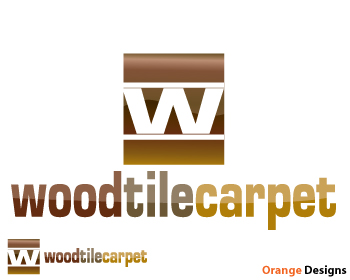
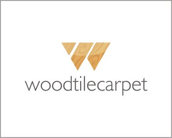
Logo Design Contest: woodtilecarpet.com
need look and feel for flooring co.
$150.00 Prize
76 ENTRIES
Logo Design Contest: The Power Group, LLC
Logo sought for an energy start-up firm
$250.00 Prize
159 ENTRIES

Fast. Awesome. Affordable
About the Creative
7
7
19
Other entries by thinkforward:
Similar Entries