

- BACK TO CONTEST
- CREATIVE BRIEF
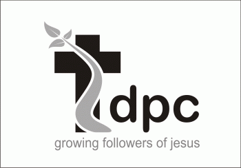
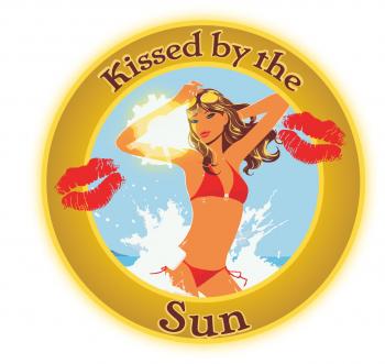
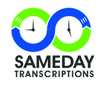
- ENTRY # 54181


Comments for entry # 54181
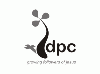
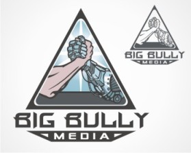
The latest comment on this one from 2 of my co-workers are here: I do like it.... certainly the best of the ones so far however if I was to be picky I wonder if a) there's a few too many elements in it to make it easily reproduced b) that it will be less effective in greyscale eg on our bulletins. ALSO SECOND COMMENT FORM DIFFERENT PERSON: too wonder if it's not simple enough.... I think the term I remember from our previous discussions is "simple lines" or something like that. too much 'activity' makes it less memorable? So I guess a couple of questions: 1. What might a Black and white version or greyscale look like - for when we have to use it in a black and white flyer? and 2: Can it be made any simpler, if you were to mod it to be as simple and least elements as possible to still have the affect, what might it look like? Wayne
Browse other entries from this Logo Design Contest


Browse other Logo Design Contest


Logo Design Contest: Health Record Bank Partners
Health Record Bank Partners
$200.00 Prize
65 ENTRIES
Logo Design Contest: Predator Trail Cams
Logo redesign for upcoming release of ne
$200.00 Prize
186 ENTRIES


Logo Design Contest: Sunshine Nanotech Materials, LLC
Sunshine Nanotech Materials Startup!
$300.00 Prize
83 ENTRIES

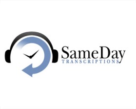
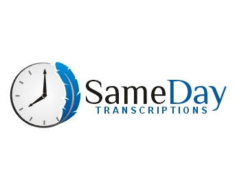
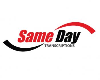
Logo Design Contest: Same Day Transcriptions
Premium Logo Contest
$300.00 Prize
220 ENTRIES

Fast. Awesome. Affordable
About the Creative
7
7
41
Similar Entries