

Logo Design Entry # 696442
by sambel09- BACK TO CONTEST
- CREATIVE BRIEF
- ENTRY # 696442
Comments for entry # 696442

I think it's different and is not similiar design. generic but different implementation. And.. How about you report all the entry cause similiar tree concept.

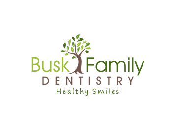
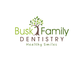
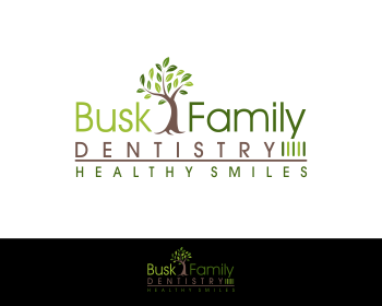
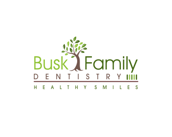
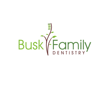
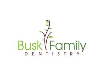
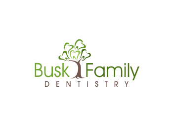
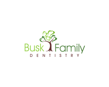
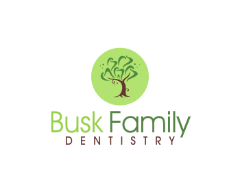
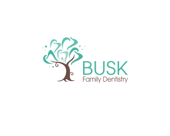
The reason for changing abstract tooth into leaf : We really really like this design, but again, wish that we could use something other than the abstract molars for the leaves of the tree. Otherwise, this design is really good. We like the font and the colors you've used. It looks fresh and clean (comment from CH)

sambel if its withdrawn you cant bring it up. it doesnt count anymore :)
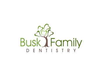
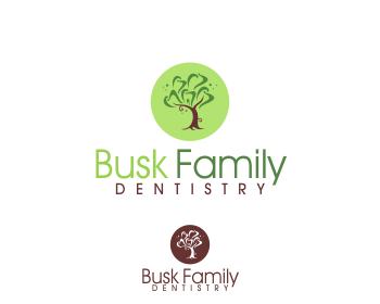
same shape of leaves are file0 file5 has leaves with different greens
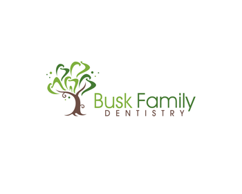
next time i suggest be moe specific about what is copyed. telling that it has the same leaf type not gonna help leaves gonna look the same shape anyway but looking the contest i see that sambel09 used the different color greens on tooth shaped leaves on his design nr: 694384. He just changed the teeth with basic leaf shape

The trees are too similar. There are many ways to depict a tree with leaves. It's a matter of personal option. Something must be protectable and since the concept itself is given by the Contest Holder, the style should be unique.
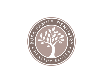
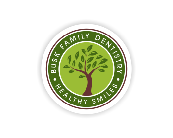
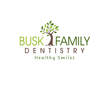
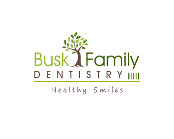
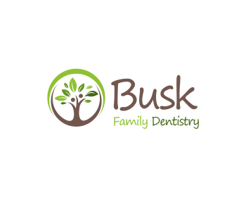
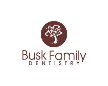
This comment from Contect holder : I like this idea a lot. I think the curlycues coming off the trunk of the tree make it look to whimsical, and not as solid. Could you take them off, and take the tree out of the circle, and have it growing between Busk and Family? We would also like to see a version that used different foliage in place of the teeth in the tree.
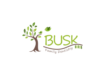
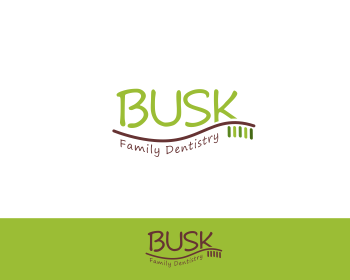
The basic concept : #694384 http://www.hatchwise.com/entry-for-963474-694384-11294 I previously had a Withdraw

I am with plasticity on this one treelly

The tree concept was free to all, since it was the contest holder's idea. The issue is that you copied the style of the leaves, with various green shades and this made your design look incredibly close to mine.
Browse other entries from this Logo Design Contest
Browse other Logo Design Contest


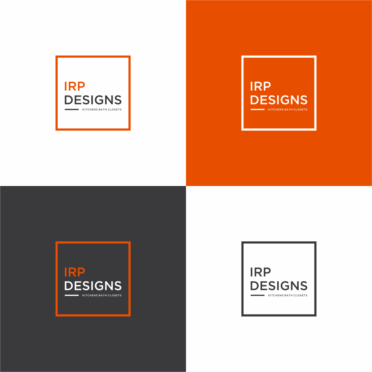
Logo Design Contest: IRP DESIGNS
re doing and modernize the current logo we have.
$150.00 Prize
439 ENTRIES
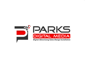

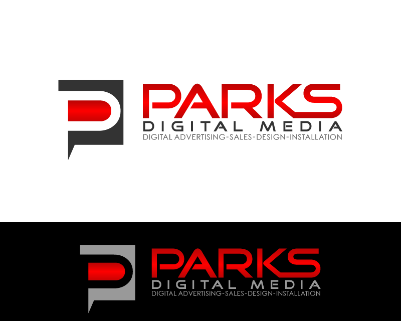
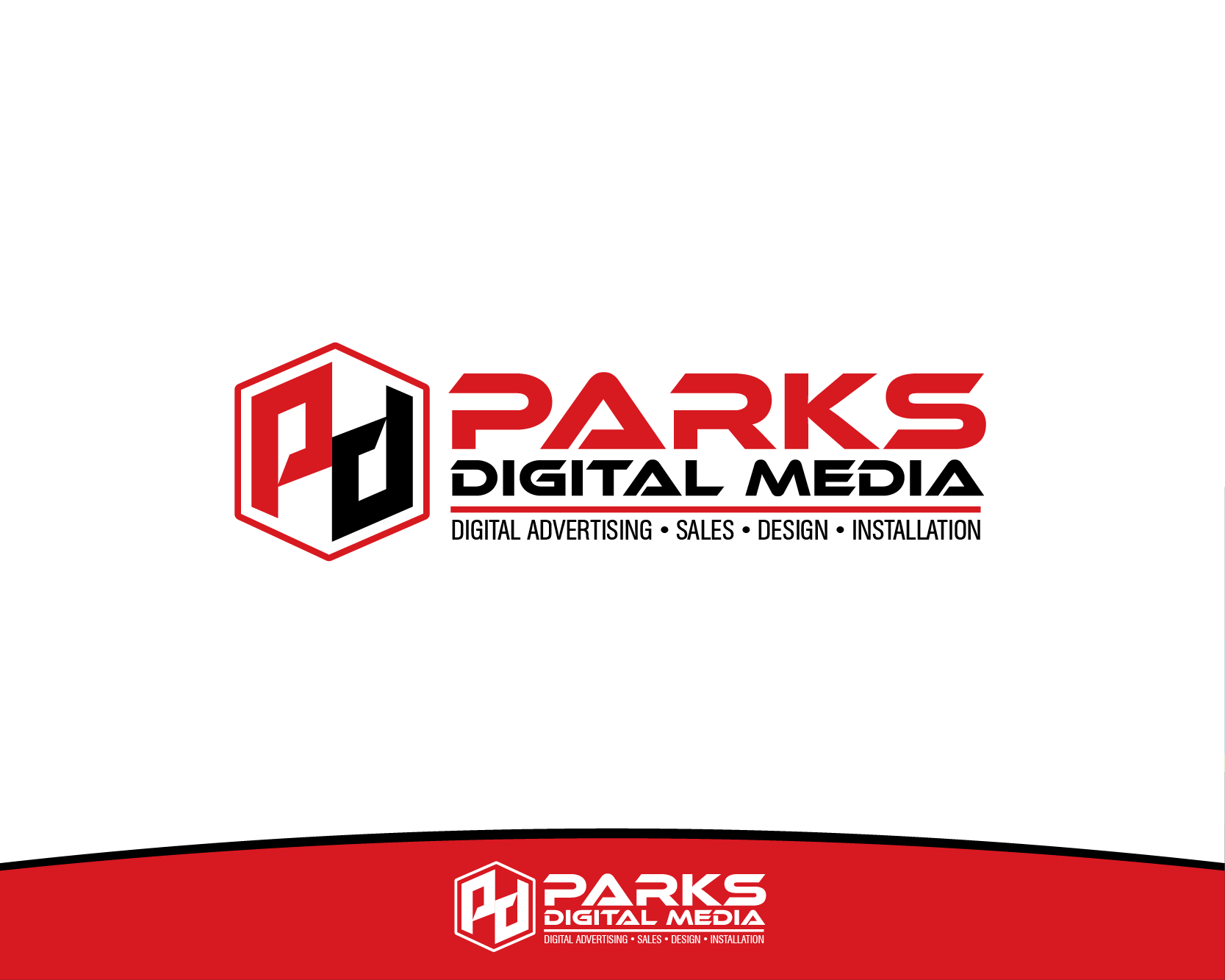
Logo Design Contest: Parks Digital Media
Fresh New Ideas for Digital Advertising
$210.00 Prize
318 ENTRIES


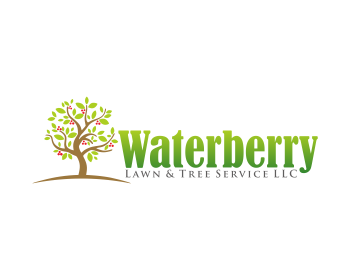
Logo Design Contest: Waterberry Lawn & Tree Service LLC
need logo for my lawn and tree business
$105.00 Prize
40 ENTRIES

Logo Design Contest: Cheltenham Pet Care www.cheltpetcare.co.uk
Logo for Pet Sitter/Carer
$105.00 Prize
48 ENTRIES


Fast. Awesome. Affordable
About the Creative
19
21
105
sambel09 Bio
love a create
Other entries by sambel09:
Similar Entries