Logo Design Contest

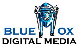
Blue Ox Digital Media

by BrysonExpenseReduction

BrysonExpenseReduction is looking for a new Logo Design, and they're offering $101.00 for the best entry.

Discussion:

user-image
BrysonExpenseReduction Contest Holder
Thank you gj2012 and vaija82 for your submissions. Could you please make the letters on the name even distance horizontally, like my current logo. Or if they are not to be even to fit youridea or concept, please have them match up or aligned a little more cleanly. As well, I would like to see an entire Ox in the logo, and have him in motion please. Id you would like a reference, please look at the Merrill Lynch and Red Bull logos. Thanks.
user-image
falcon_neil Creative
i'll join this contest
user-image
BrysonExpenseReduction Contest Holder
Thanks to everyone for submitting your work. We are really enjoying the designs. Please don't hesitate to get outside of the box, or try design concepts that aren't exactly what we have specified. We understand that you are artists, and as such, you will have more and better creative ideas than us busniess folks. So far, the two designs that have sparked the most attention amongst my group are #19446 by Digiti Minimi and #19566 by aks. Please continue the great work. We really appreciate all of you helping us to make a great logo. Thanks.
user-image
BrysonExpenseReduction Contest Holder
I wanted everyone to see the shirts that we are going to be putting the logo on. It is a Walter Hagen Golf Polo. http://s7d2.scene7.com/is/image/GolfGalaxy/PAPMACJBBIHFPJFK_bblue?$s7product$ We don't know too much about graphics or design, but would like for the logo to show up well against the shirt. Now, if that means that there is a different logo or color scheme for the web than with the appearal, that's fine. Just please let us know your thoughts when you submit. Thanks everyone.
user-image
gozzi Creative
just checking ..you want an ox , not a bull??
user-image
banned_grindhousegraphics Creative
19446 is the best one so far! Very nice work!
user-image
BrysonExpenseReduction Contest Holder
Gozzi is right. My father just looked through the designs and said most of them look like bulls ... not ox. Basically, an ox is a domesticated bull with no balls used for clearing land and work. A lot of the designs have bulls with their head down charging with sharp horns. When we picture ox, we think of a strong, head up, pulling mass, with a presence. Here is a link to a logo that my father really likes. If you can make something like it, it would make him happy. http://www.blueoxlandservices.com/images/Blue_Ox_Logo%20(3).JPG The logo doesn't have to be the same as far as style of lettering, but this is the image of the ox that my dad likes. Thanks again everyone.
user-image
FDS Jareto Creative
im in agreement with grindhouse 19446 is great!
user-image
BrysonExpenseReduction Contest Holder
Thanks to everyone for your submissions. I apologize for taking so long to repsond. I have been out of the country without access to internet and returned home to a family emergency. We have had time to review the designs, and are sorry to say that we have not selected a winner and will be holding another contest. I am very sure that the reason for not choosing a winner is that we were not sure of our design and not clear with you, the designers. Without giving you a clear description, and us having our minds made up, you could not produce what we were looking for ... as we didn't know what we were looking for. We will be holding another contest and this time will be more descriptive, and watch every design, giving feedback to each submission. Again, we are sorry for the inconvinience and would like to thank all the designers for their help and submissions.