

- BACK TO CONTEST
- CREATIVE BRIEF
- ENTRY # 125097

Comments for entry # 125097

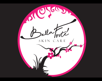
:-) Already designing... P.S to be honest, I just love the combination of black and pink myself.
but I still really like the pink and black :)
Ok, I was hoping to use it for both, but yeah, this is a project for a logo/brand identity, first. I guess I can go from there for product labels, as that all depends on the product. Thanks so much.
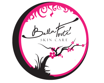
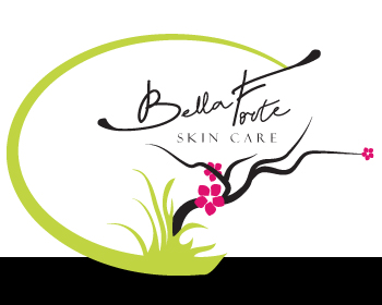
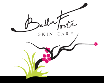
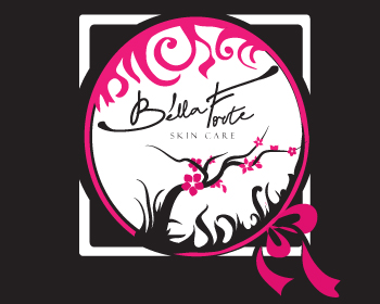
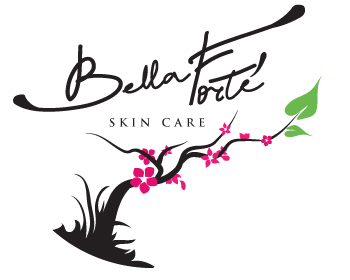
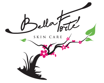
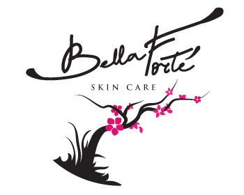
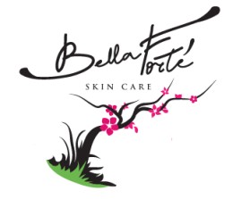
Now I finally will get back to your design. What concerns the latest question - right now its like a label for the products...I suggest to take a tree with flowers as a logo and other elements as a brand identity... It is possible to combine all that in unlimited number of ways. So actually logo, business card, labels, stationary - will all have the same style but slighlty different graphics...and as for the logo, yes I personally think it should be definitely without the circle. I will post new entries with all the changes and suggestions soon :-)
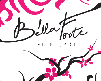
Maybe if the words "Skin Care" were bolder. A lot of people liked the close-up version you did because the wording was very visual: Entry #124893
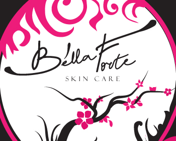
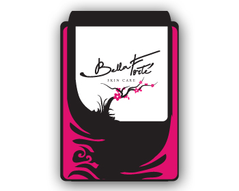
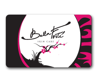
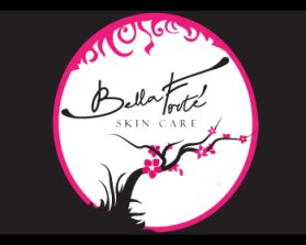
Another question for you, as an artist, will this shrink down well enough to read? For example, if I put this on a business card, will the titles be legible? Would it be easier if it were not enclosed in a circle? I just want to make sure the final sizing is right before receiving the final version and realizing that I can't use it for business cards, stationary, etc.
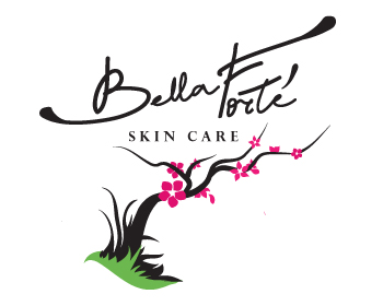
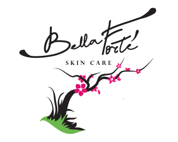
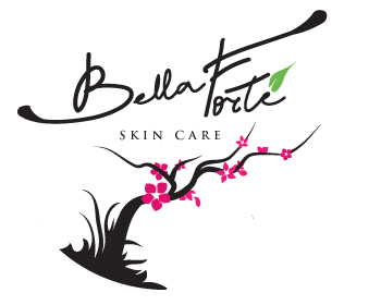
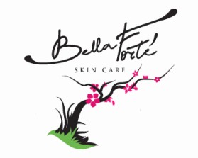
Thanks for the guides, 1)I'll do something with "r". 2)I will experiment with the green, and you can always come back to that version if it will look imbalanced. Will work on it.
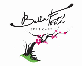
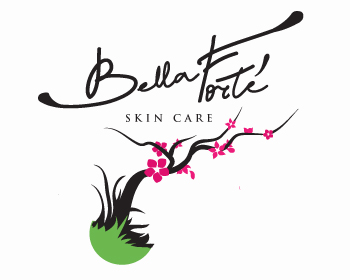
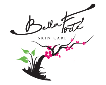
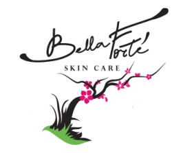
Ok, I received some really valuable feedback: 1) from a distance, "Forte" looks like it says "Foote". Is it possible to make the "r" more defined from the "t" so that they don't blend together? 2) Based on your artistic expertise, would it look strange to have the little patch at the base of the branch in green instead of black? We all like the splash of greenery in the original version, especially since my products are eco-friendly, but love the boldness of this version...but I'm wondering if this would look imbalanced...
Browse other entries from this Logo Design Contest
Browse other Logo Design Contest


Logo Design Contest: Prime Time PDR
Automotive Dent Repair Company Logo
$250.00 Prize
158 ENTRIES


Logo Design Contest: www.datapointmedia.com
Logo Deisgn for New Business Website
$150.00 Prize
176 ENTRIES


Logo Design Contest: Dentistry Secrets
Logo for Dentistry WebTV Show
$265.00 Prize
188 ENTRIES

Logo Design Contest: Mississippi Salt
Image needed for my gift business logo
$100.00 Prize
61 ENTRIES

Fast. Awesome. Affordable
About the Creative
55
55
156
Other entries by Morango:
Similar Entries