
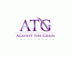
Against the Grain (ATG) Investments. Our website/ blog is: www.atginvestments.com
by bcornell36Contest received 24 entries and the contest holder has awarded a winner.
- BACK TO CONTEST ENTRIES
- CREATIVE BRIEF
- ALL ENTRIES
Company or website name
Against the Grain (ATG) Investments. Our website/ blog is: www.atginvestments.com
Slogan or Tagline
No information provided.
Describe your company and organization and target audience
ATG (Against the Grain) Investments is a small group of main-street private investors outside of the typical Wall Street culture. Our target audience is potential clients and other investors who are seeking an independent, unique investment perspective. Right now we are a small investment club with a blog but have hopes of building a strong track record and eventually building an investment company dedicated to building wealth for individual clients.
The design should have the following
Ideally the logo would be a little edgy and creative but still appropriate and professional relative to other investment companies. A clever logo with the letters "ATG" and a grain/ wheat stalk with the full company name below might be cool but I don't want to limit the creativity of all the designers out there as they may come up with something much better!! Overall we want the logo to project professionalism, trust/ integrity, and a little edge/ creativity. Tall task, but we have faith in the designer community!
This logo will be used for
- Online (Website, facebook etc.)
- Print (business cards, letterheads, brochures etc.)
- Merchandise (mugs, t-shirts etc.)
- Signs (including shops, billboards etc.)
- Television/screen
This design should not have this in the entries
Please avoid the color red.
What style of logo would you like?
Colors to use in the design
Purple, Grey, Black, White
Briefly describe your contest
Against the Grain (ATG) Investments