

Graphic Design Entry # 2111130
by IDesign Place- BACK TO CONTEST
- CREATIVE BRIEF
- ENTRY # 2111130


Comments for entry # 2111130
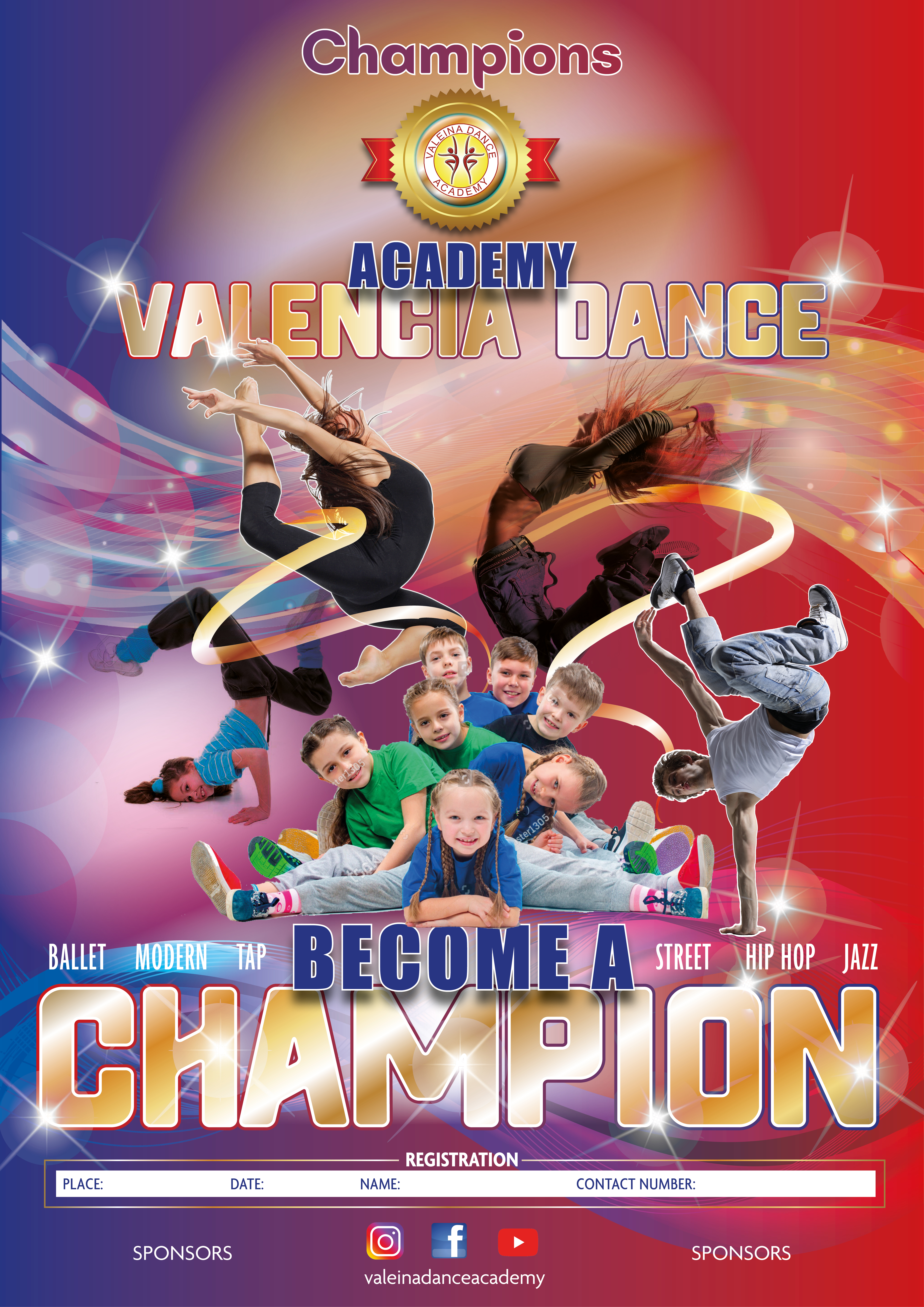
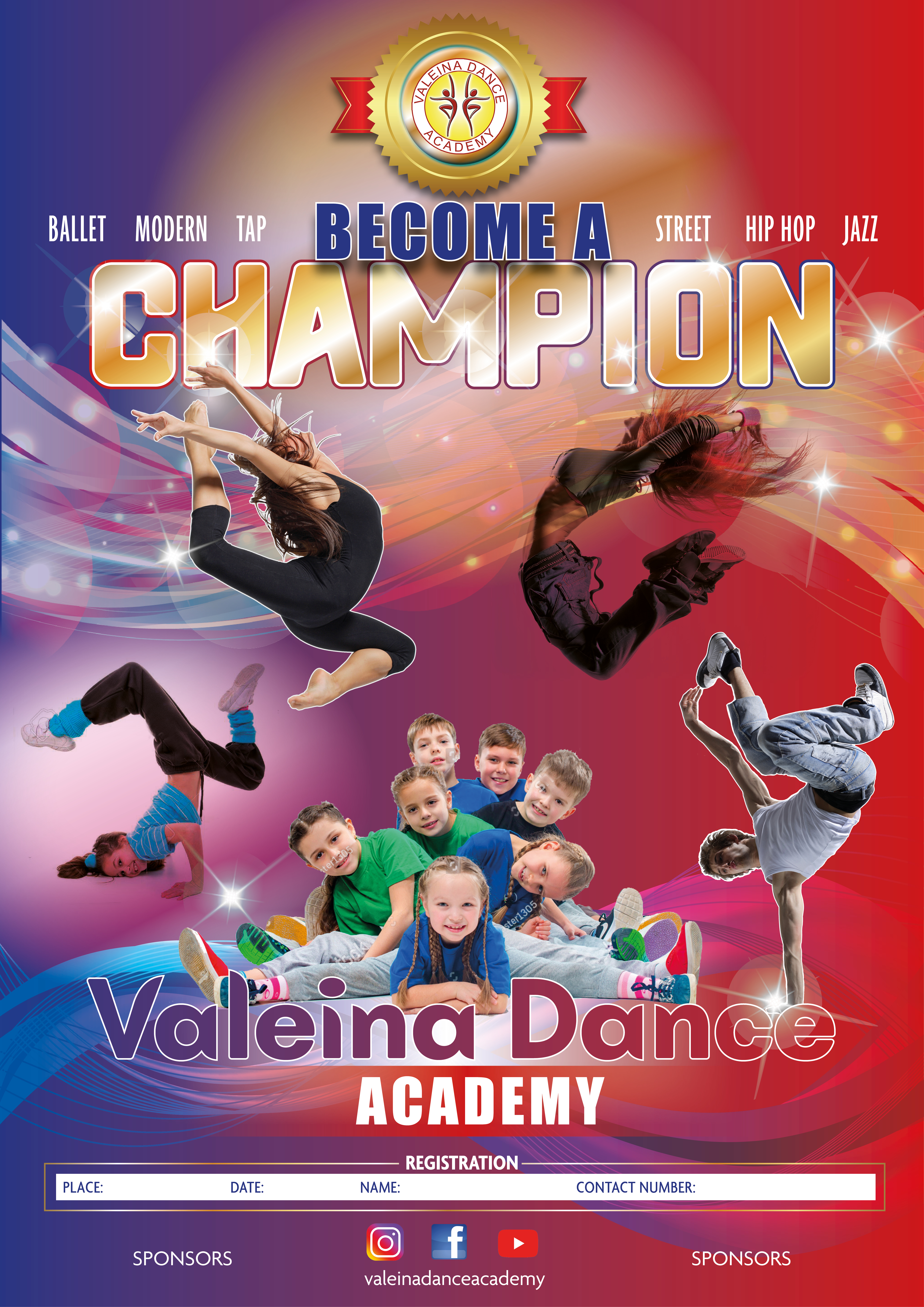
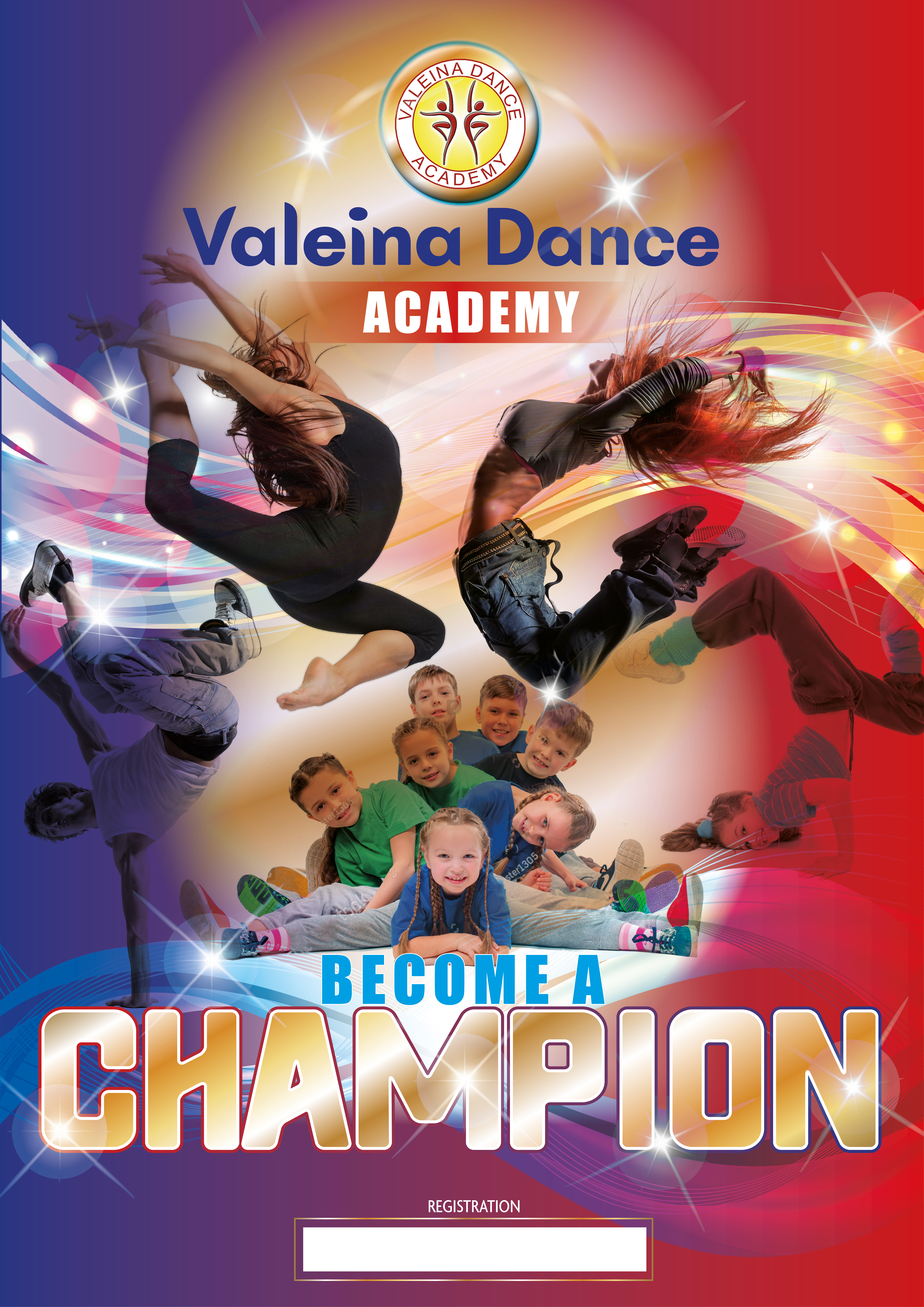
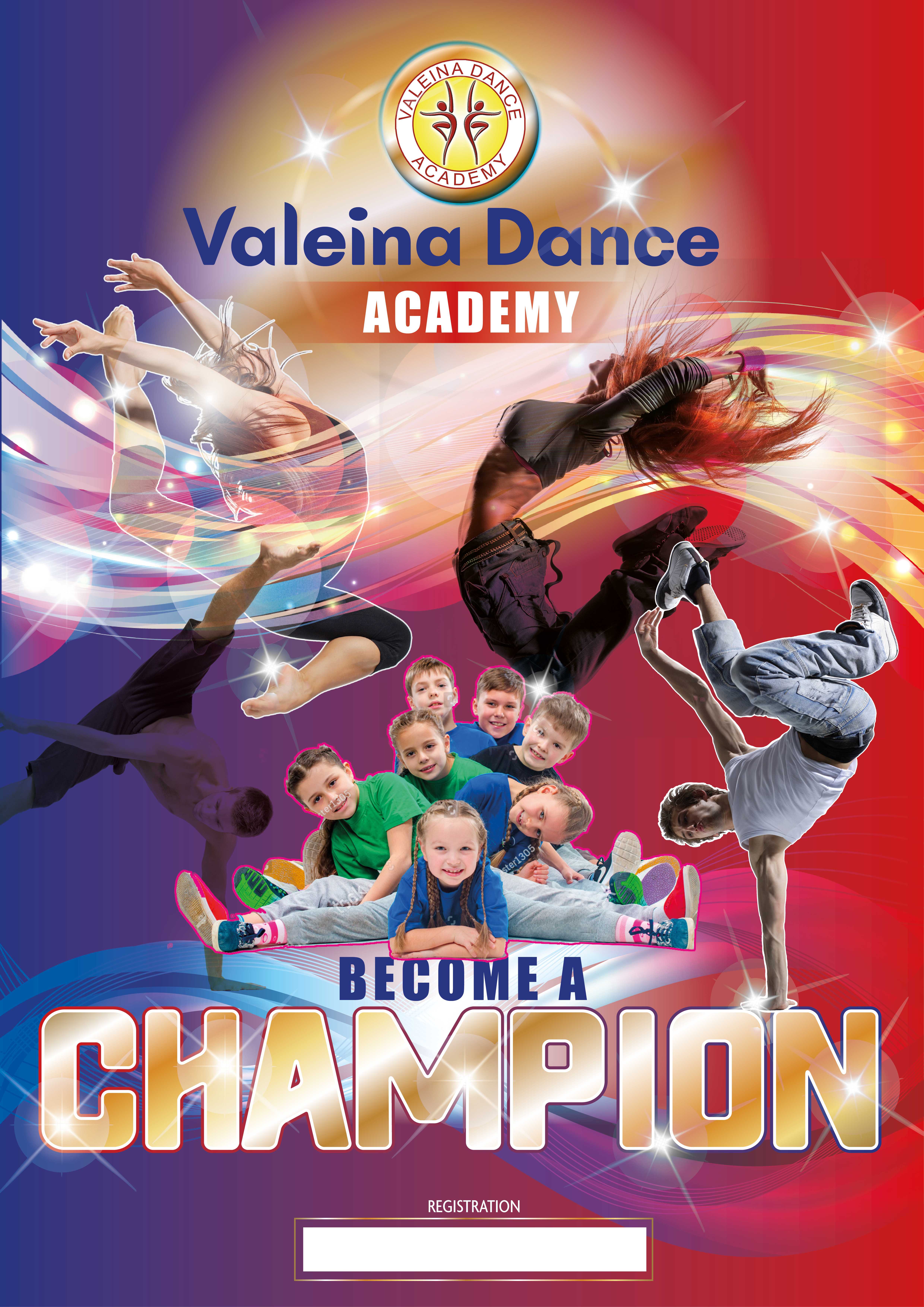
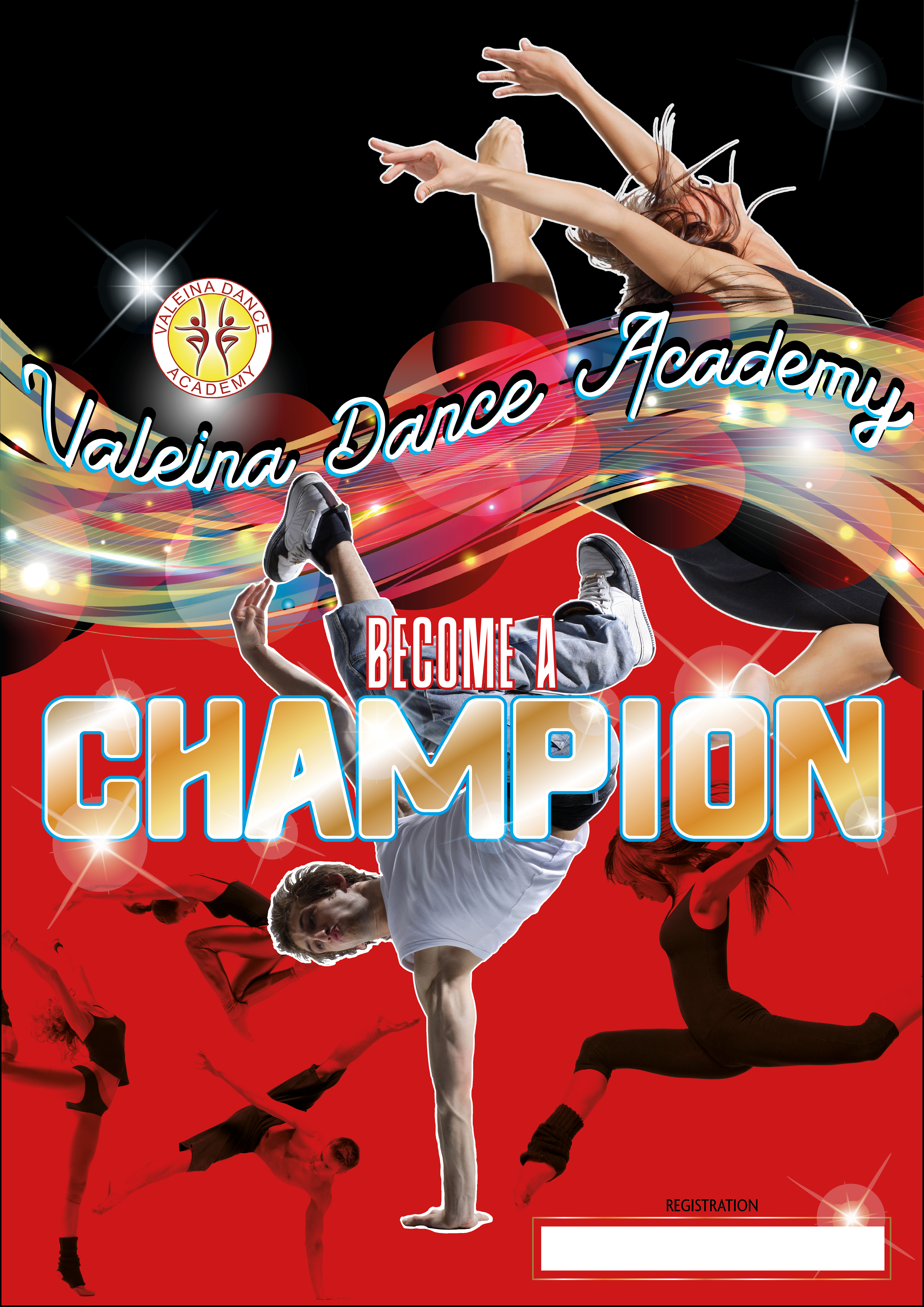
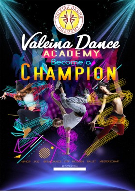
Hi IDESIGN PLACE, I want to share with you an additional idea.. > we liked this entry of you because of intensitiy of colors > and a little bit more "free space" > I for myself liked the design and color choice of the left hand corner.. I want to offer you here some ideas - if you have time and energy - I mean it is worth trying.. > please enter the dancedisciplines in the left hand down corner - so that the guy jumping is looking on them (bring them in a "list"-form .. one under the other.. > Please bring in the insta/facebook/youtube link in the richt hand upper corner.. so that the jumping girl is looking there.. > pleas give it a trial to switch the valeina dance with the champions .. which means .. valeina dance stands big in the center (I hope there will be enough space) and the "become a champion" slogan .. stands with the medal which would fit fine.. I hope you find a nice solution to do that.. > please create in the right hand bottom corner a bigger Infobox... white an recktangel with rounded angles.. more high than broad.. > then .. only the kids and community-thing is not in .. but we can give it a trial what it looks like then.. and maybe we find an additional solution to pack it in.. (idea.. maybe some kids in the right hand corner behind the "info-box" like standing behind an board an looking from the backside around to see what is happening in the front - "on the board".. ??.. so if you have time and energy.. this would be my impulse to you.. Best regards!
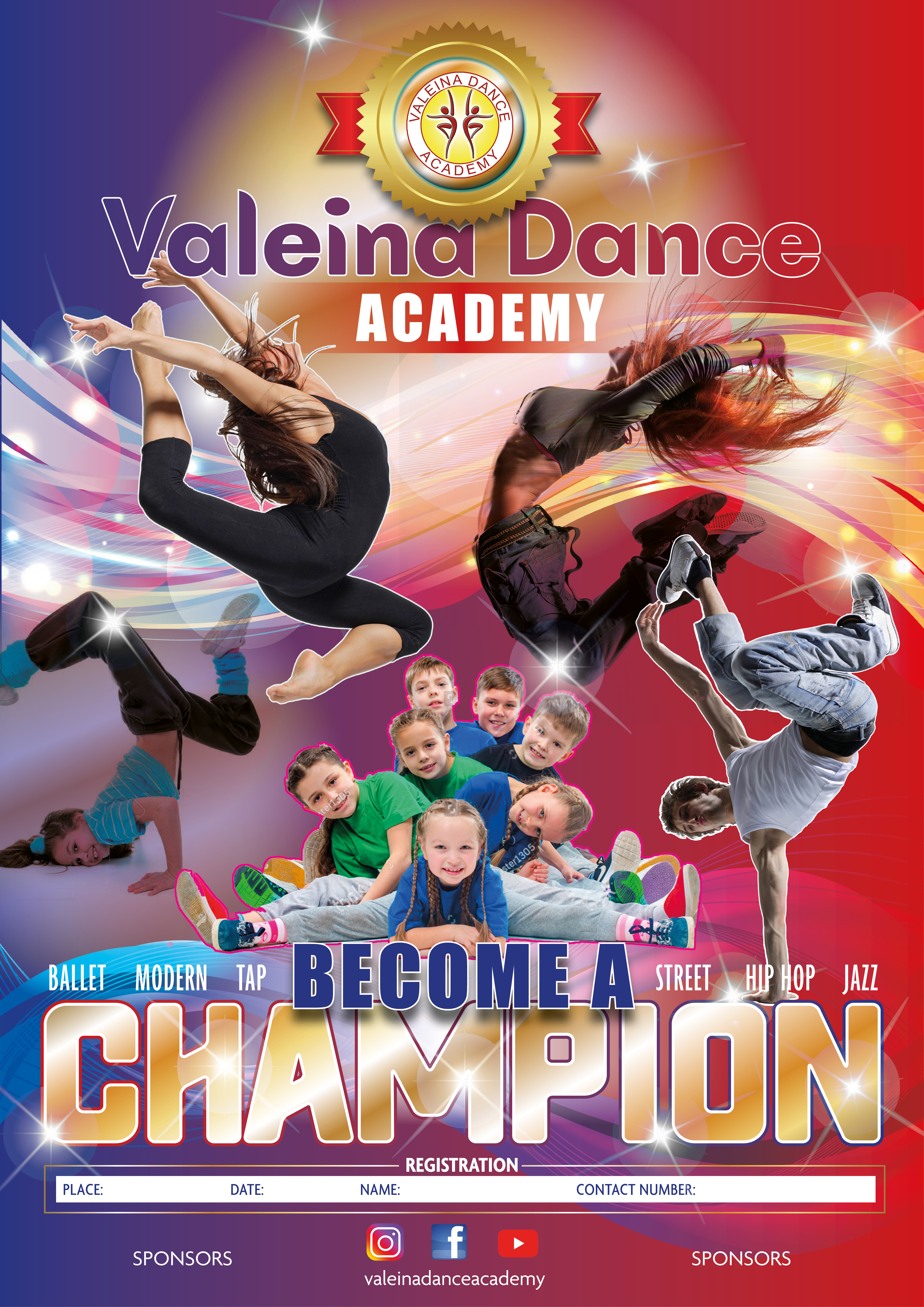
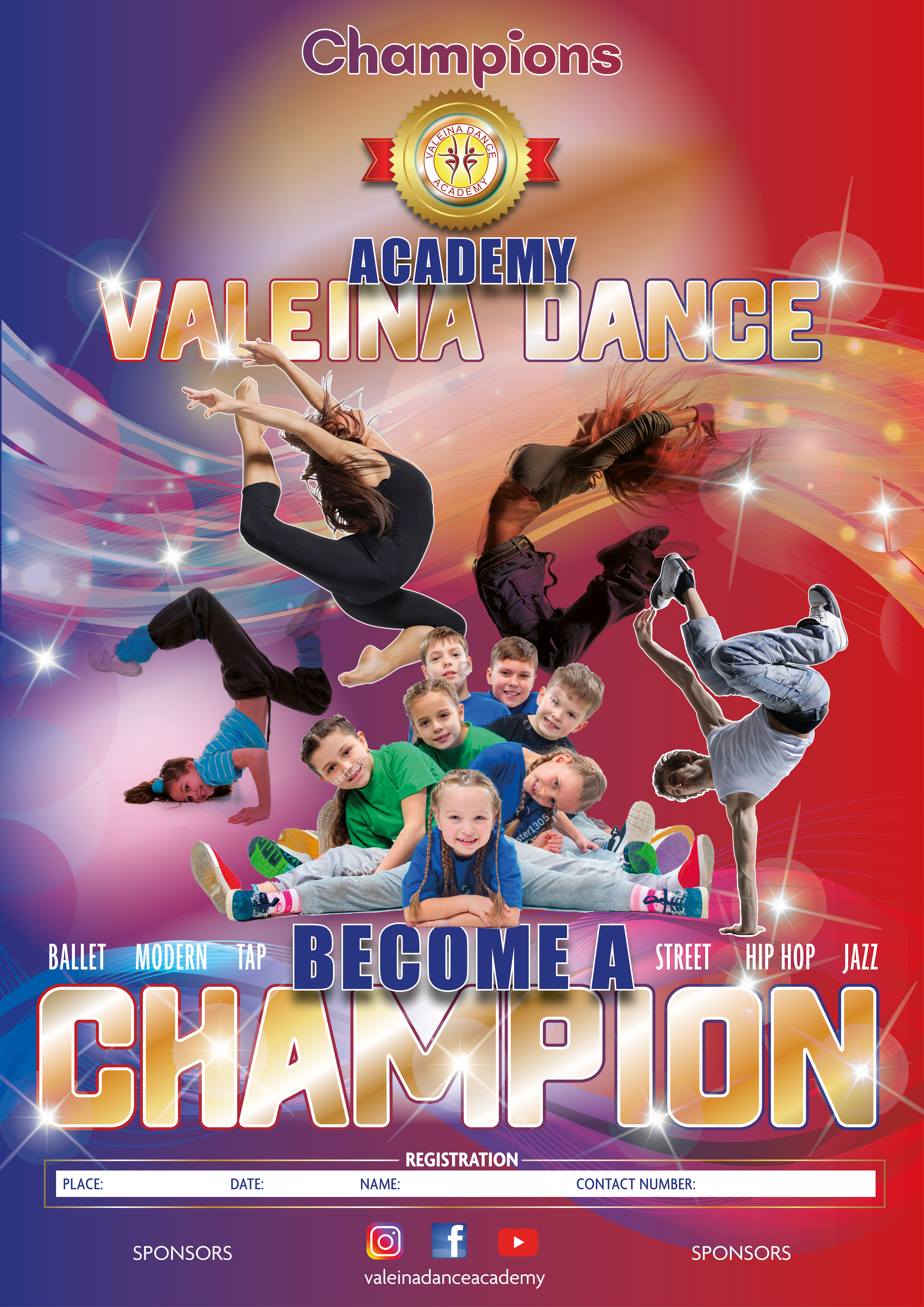
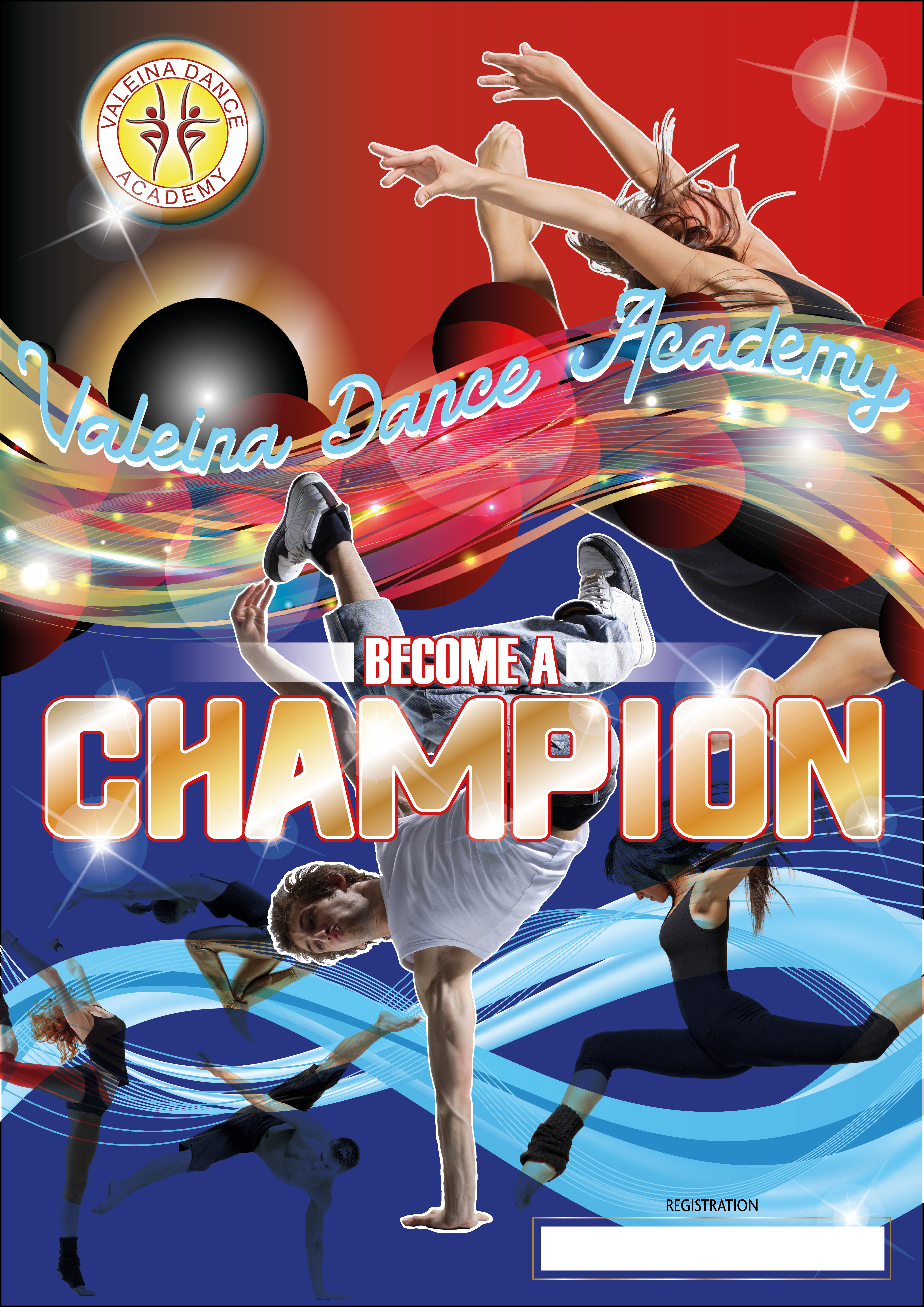
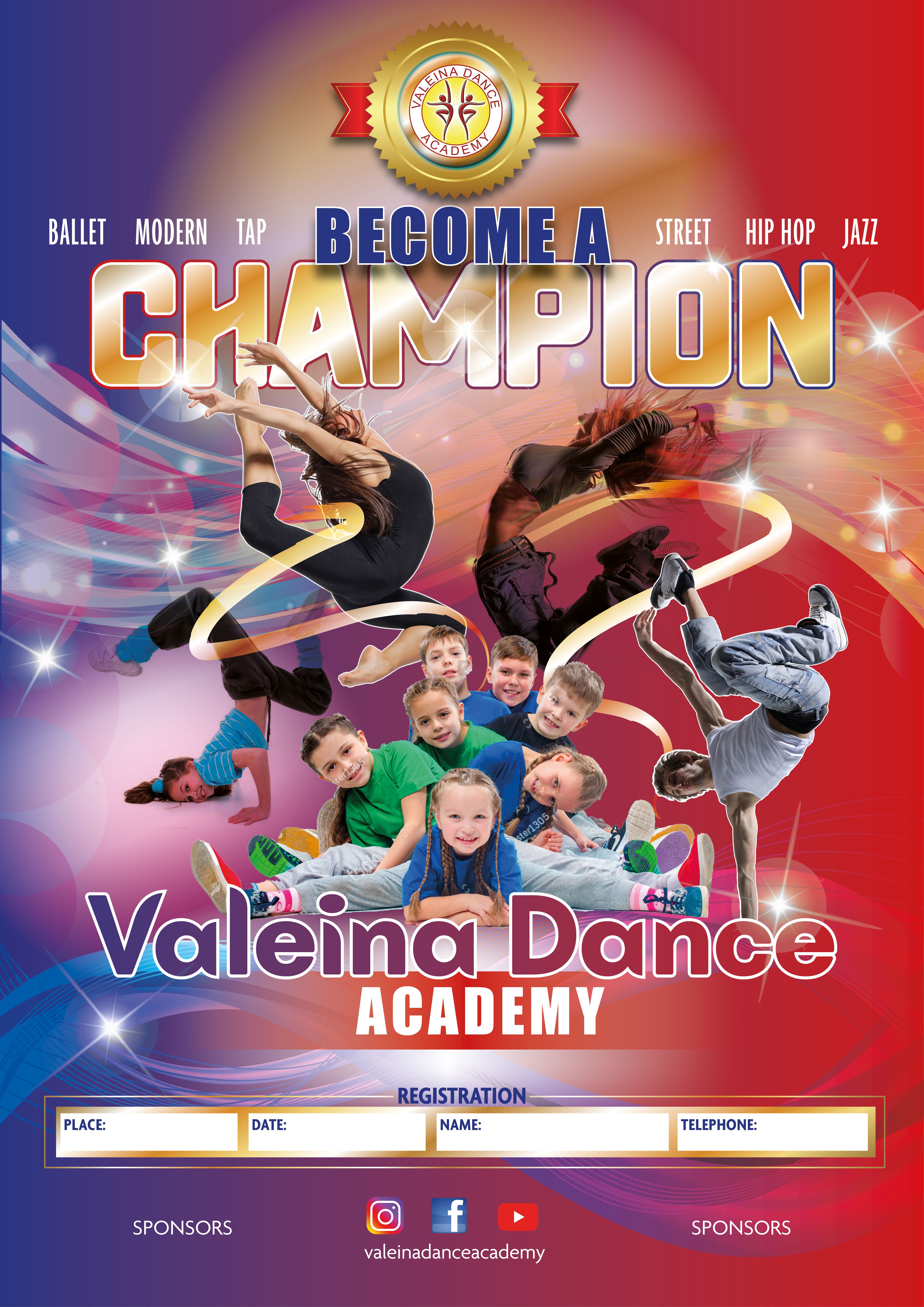
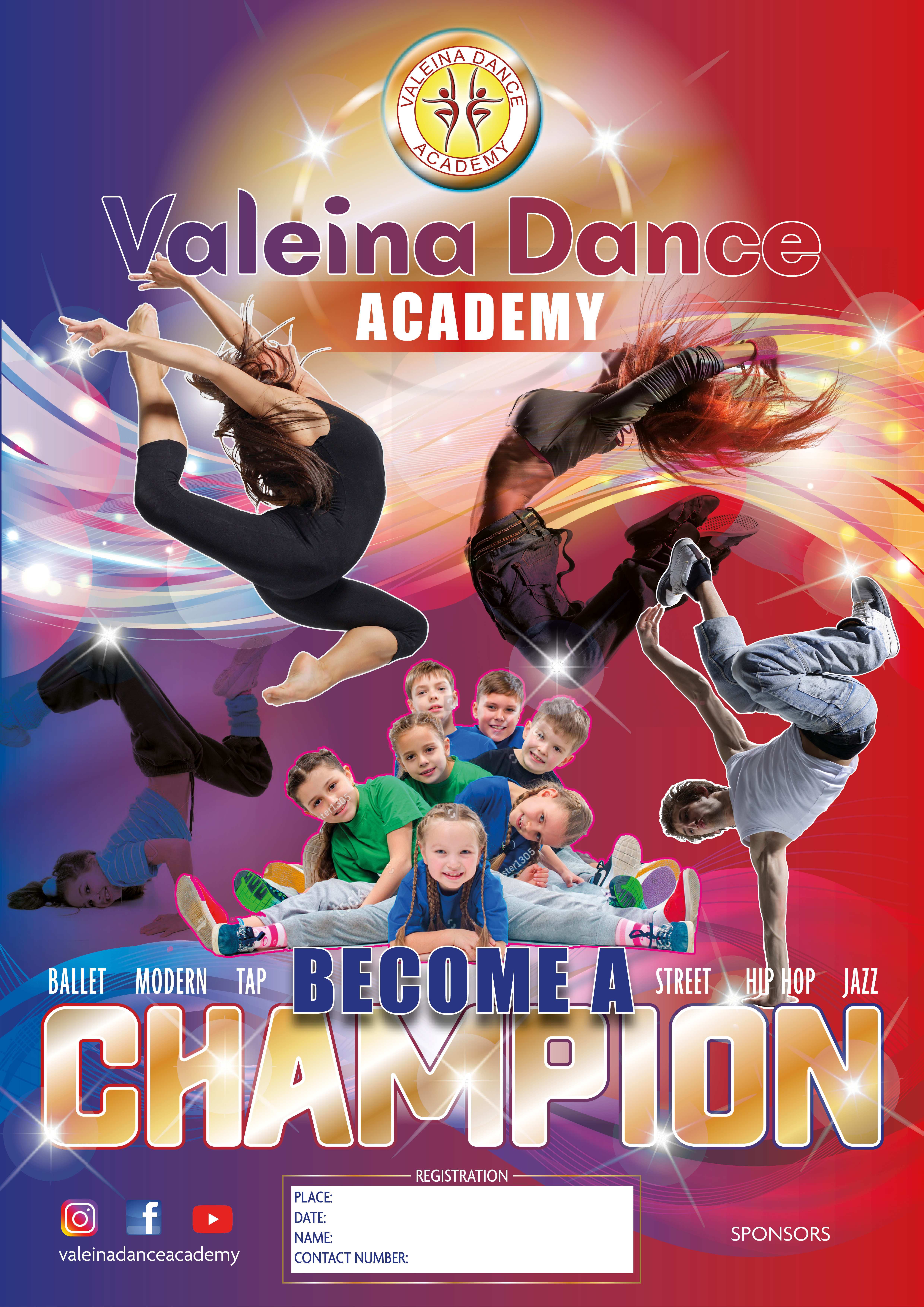
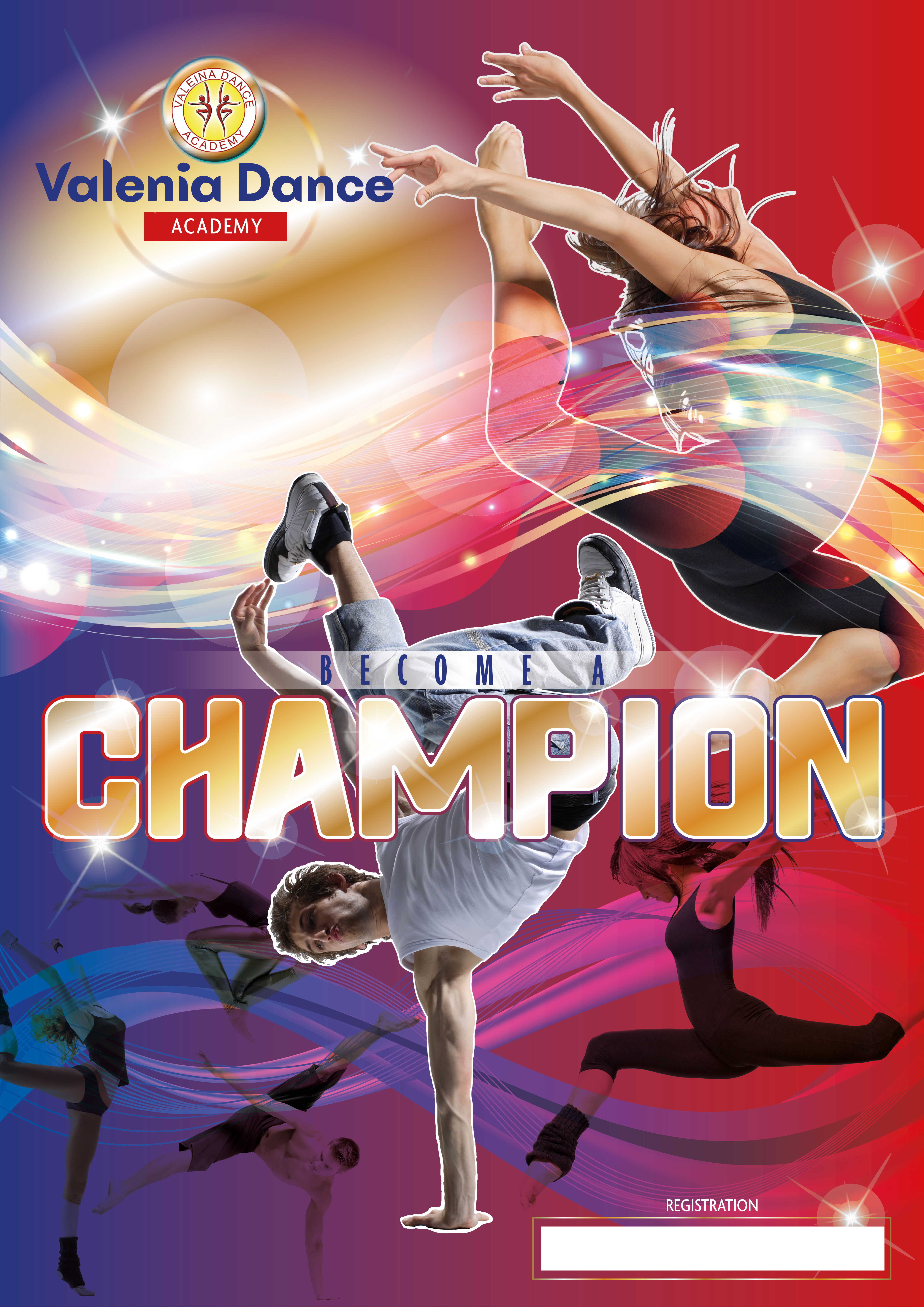
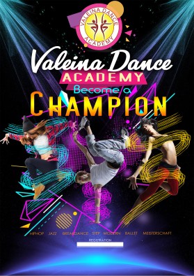
Hi, IDesign Place, thank you for your entries, yes also for us Imy wife and me) this entry of yours was our frist choice >in summary I rate it appr. 7,5 of 10.. What do we like? > strong colors.. > the word champions is nice in the centre and stron and golden .. I like the idea > the wind-waves are interesting elements to bring dynamic and movements and ... better than in other veriations.. you have the wave on the left side behind (!) the dancers an on the right sight in front.. which is better than "only front" .. only front is for me.. difficult.. covers maybe to much space.. > I like in somehow the logoversion with the golden surrounding.. which make it easier to combine it to other colors.. > there is a nice variaty of styles an movements.. > I like the girl in the right hand corner and you featured her very nicely! What can we improve? > one thing I thought.. .. if the girl in the right hand upper corner would be on the left side.. she would look into the picture.. in this version she looks outside.. and the energy goes.. "away!.. maybe change positions.. bring her left.. and the valeina dance name logo part right?. or mirror her?.. > the logo and name sequence.. could be bigger.. we will use the poster also on the street .. I have concerns.. that people coulndt recognize it WHO IT IS:. > the word "Become a" is interesting implemented.. but .. not easy to see .. in more of your versions.. I mean we need a solution where we can read it more easily.. > i like your thoughts about word - and connections of glances.. but I mean in this point we can find further improvements.. WHO looks where and what do they see.. and in the moment I'm missing a little bit a clear center.. there is a lot of diversity.. but I try to bring it "together" .. maybe a change of positions .. where the actors look more together can help to create a feeling of "dancing together" than "each of its own".. Thank you for your entry! and if we have so many dancers.. then I mean we can or must use also a kids dancer! to show.. that we are also a childrens dancing school.. thank you.

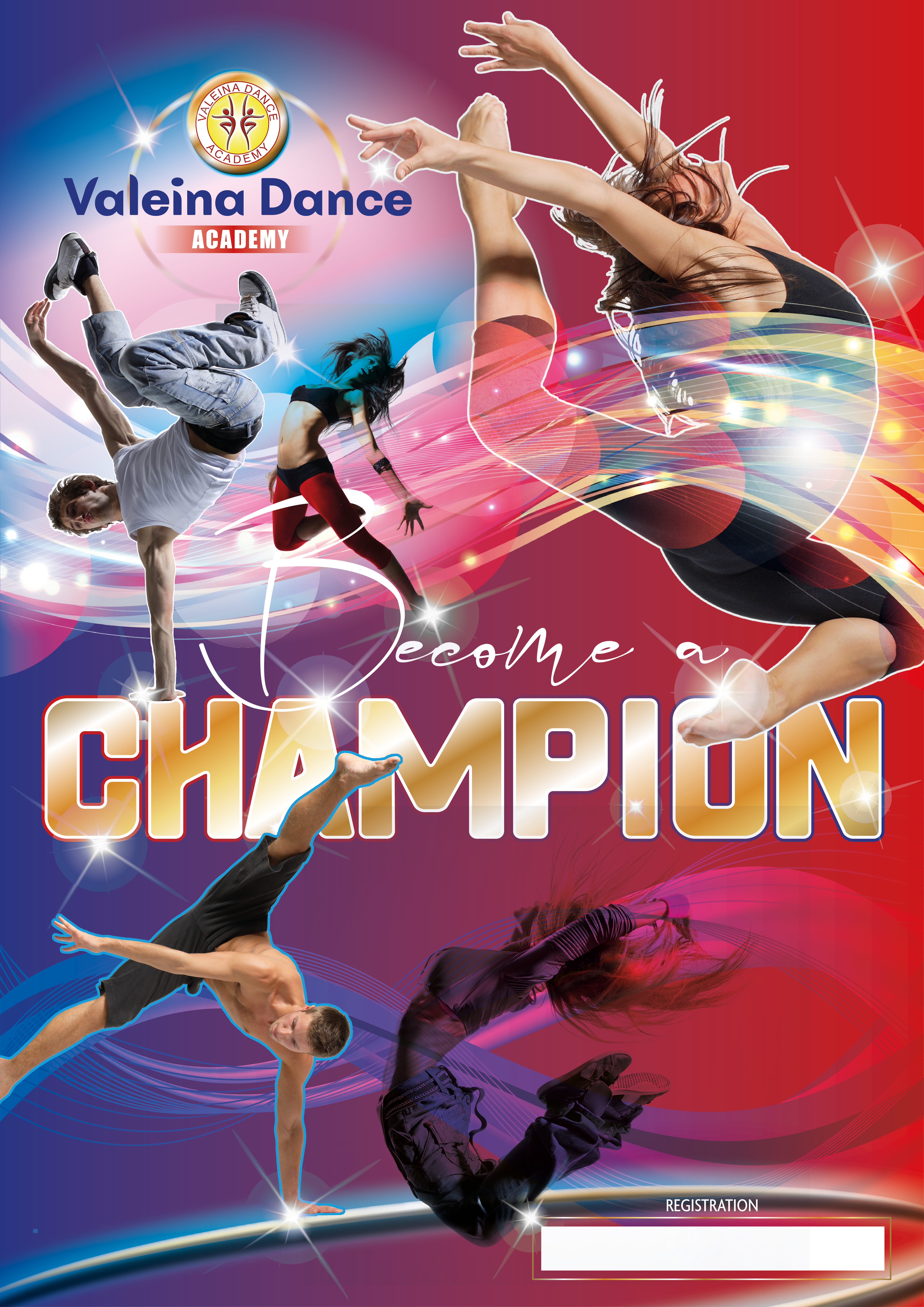
Hi, I've submitted quite a few designs, although my personal favourite from my submissions is this entry. The word 'CHAMPION' is in gold to emphasise competing, winning etc. The dancers are all reaching for the stars and have been positioned to create movement across the whole poster whilst directing your eye to certain words. The dancers are also interacting with the words - again to draw the eye in and really take note of the overall poster.
Browse other entries from this Graphic Design Contest
Browse other Graphic Design Contest


Graphic Design Contest: House of Light Global
House of Light Global Logo
$150.00 Prize
209 ENTRIES
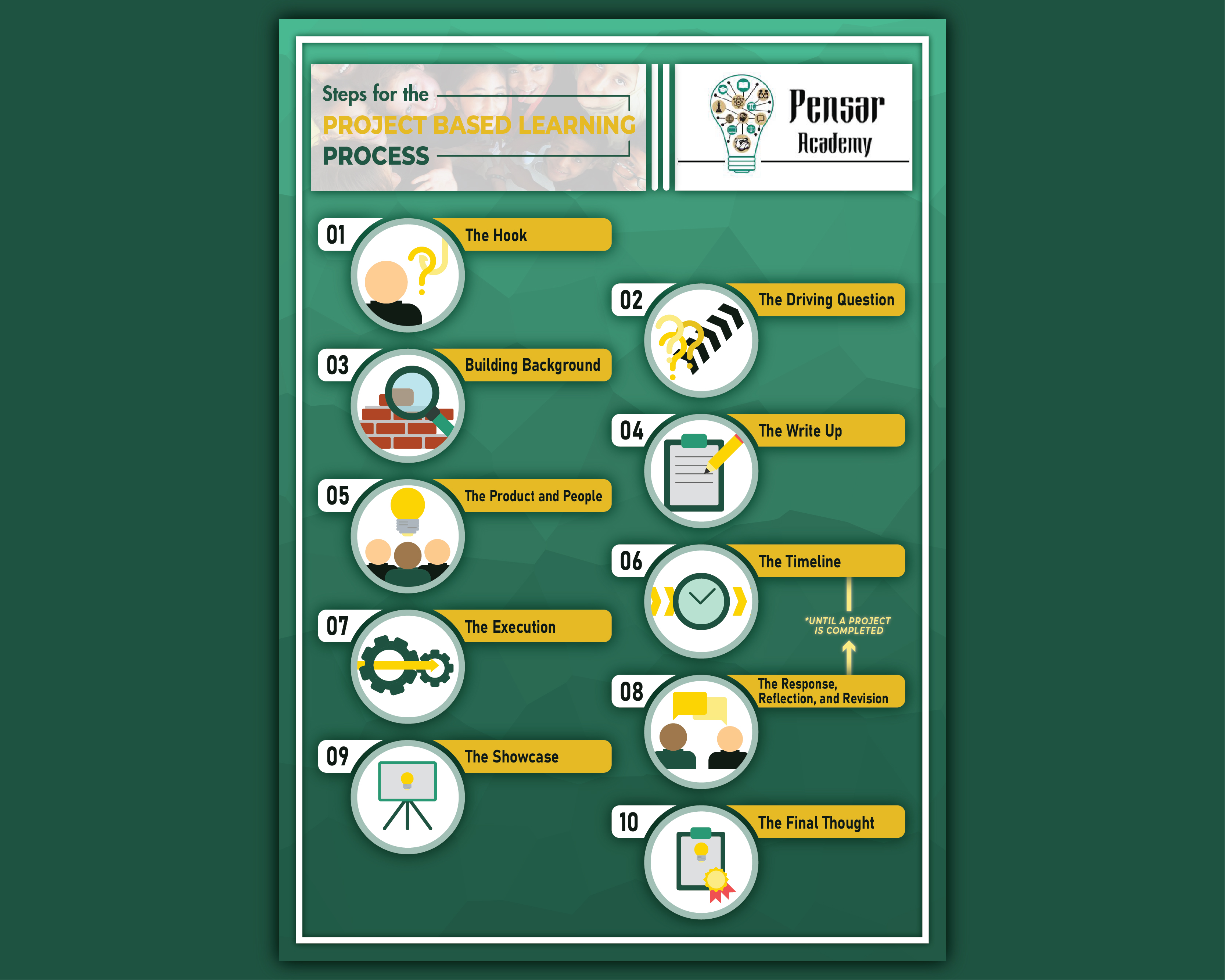
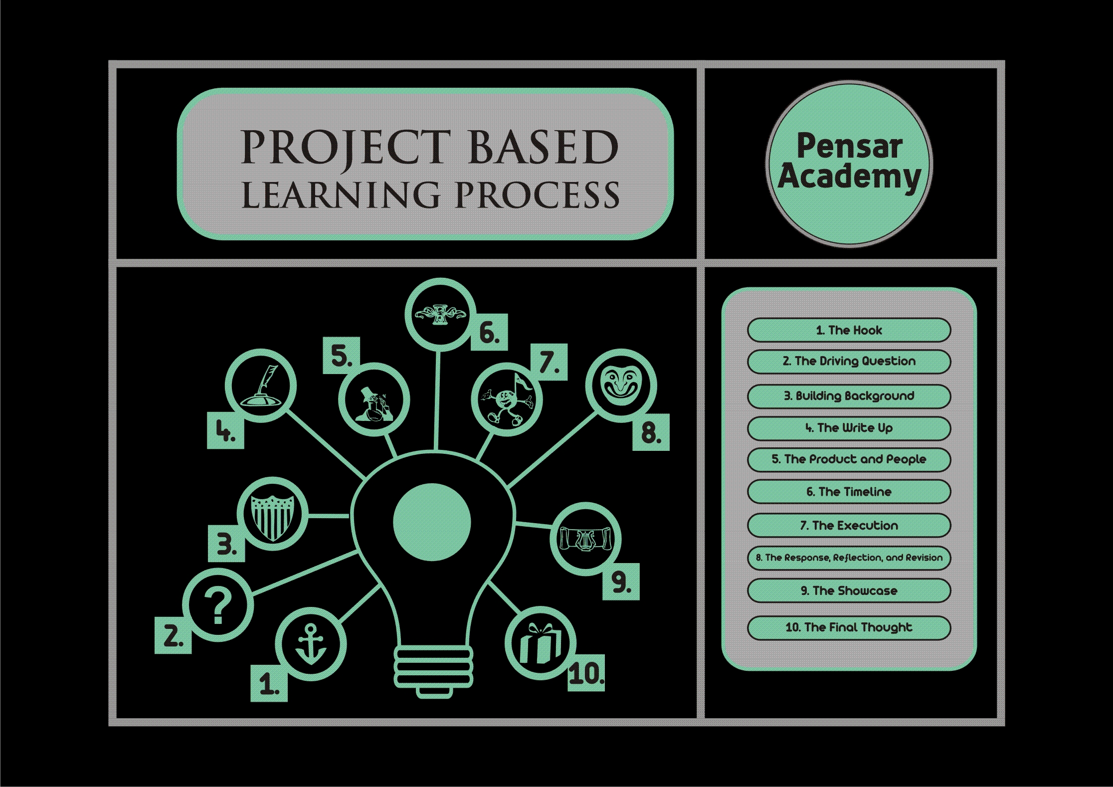
Graphic Design Contest: Pensar Academy
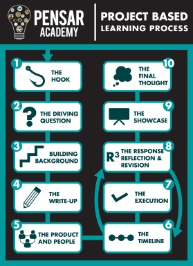
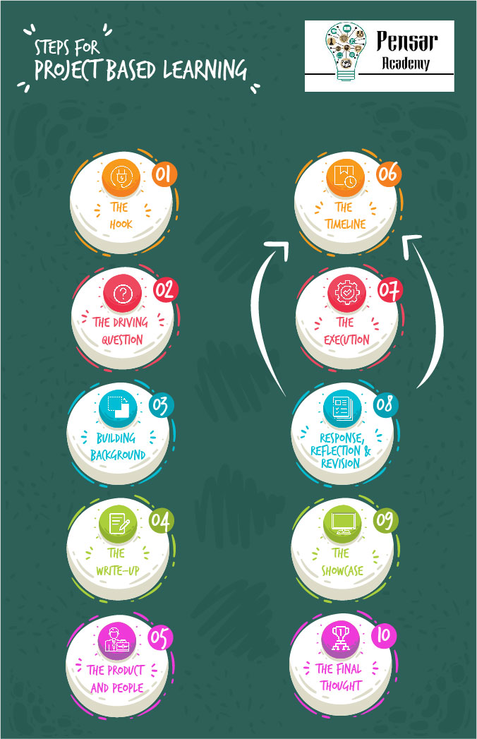
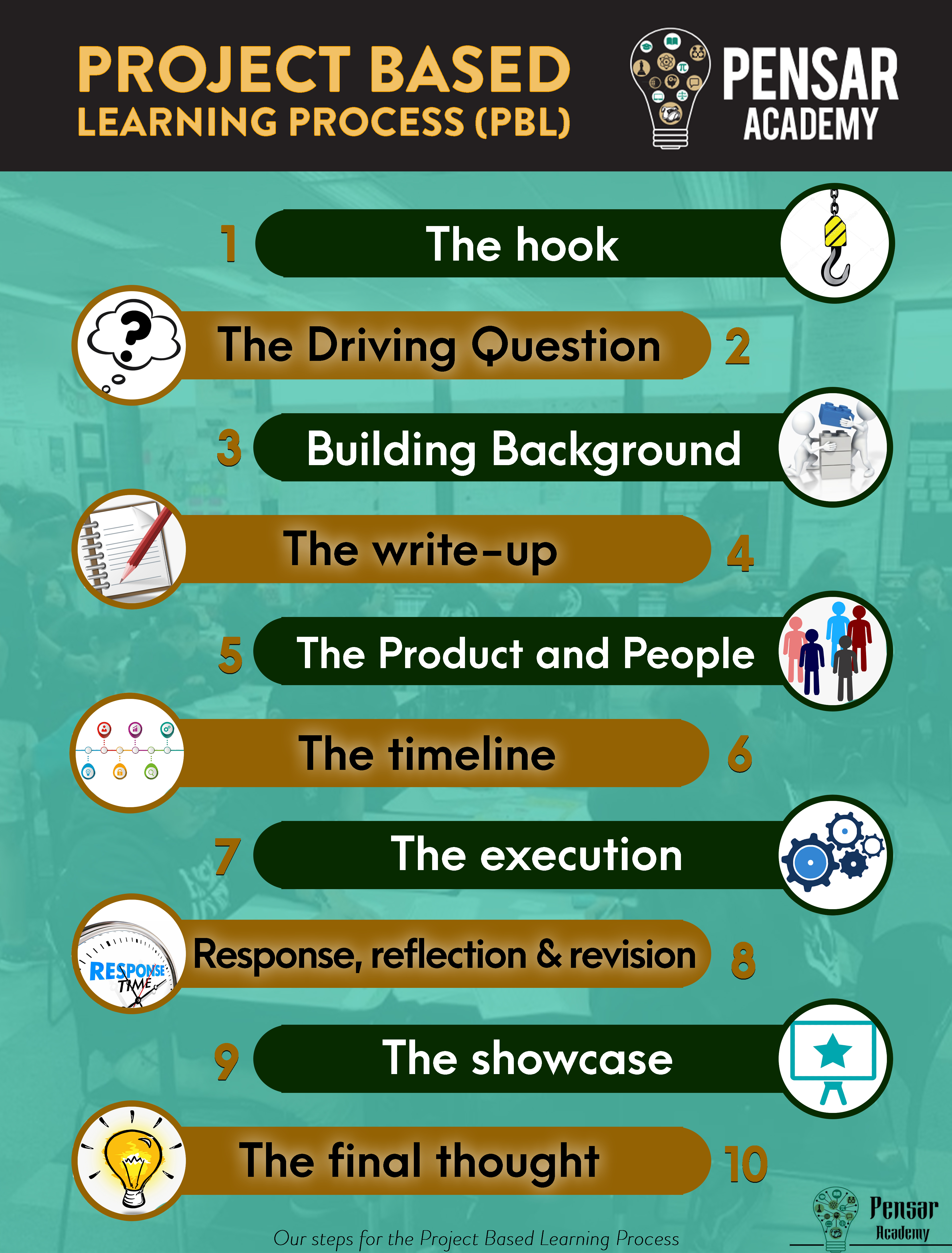
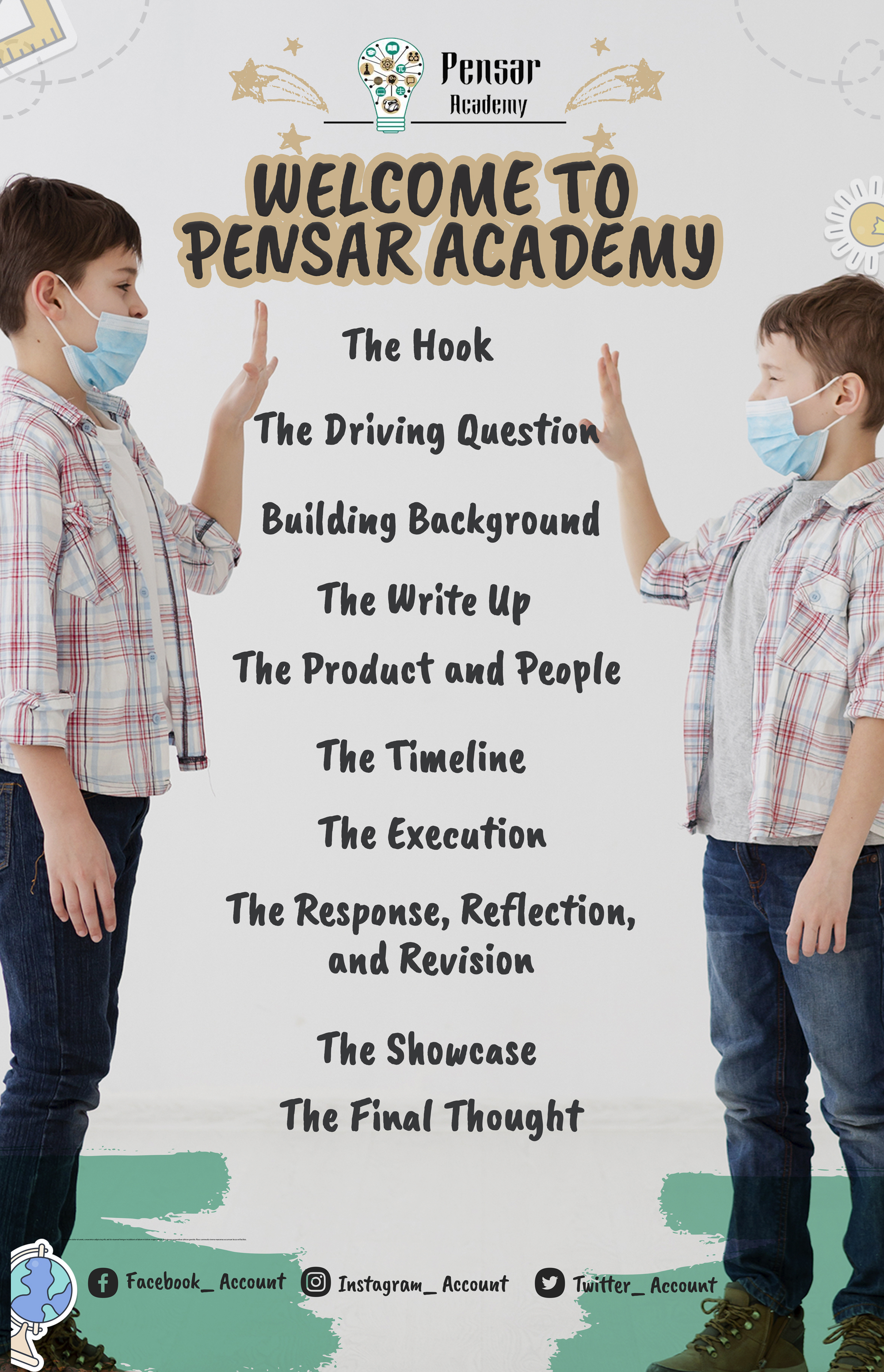
Looking for a poster design for classrooms that showcases our PBL Process at Pensar Academy. Pensar Academy is the premier project based learning sch
$150.00 Prize
43 ENTRIES

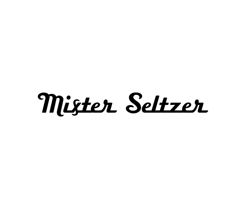
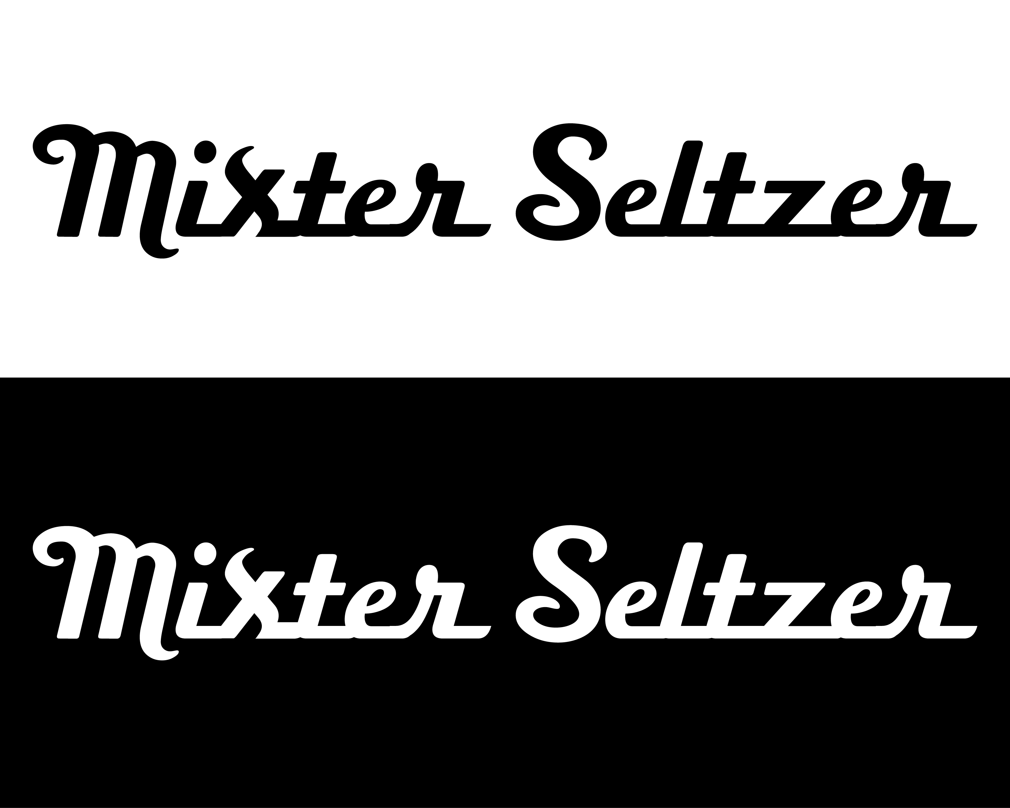
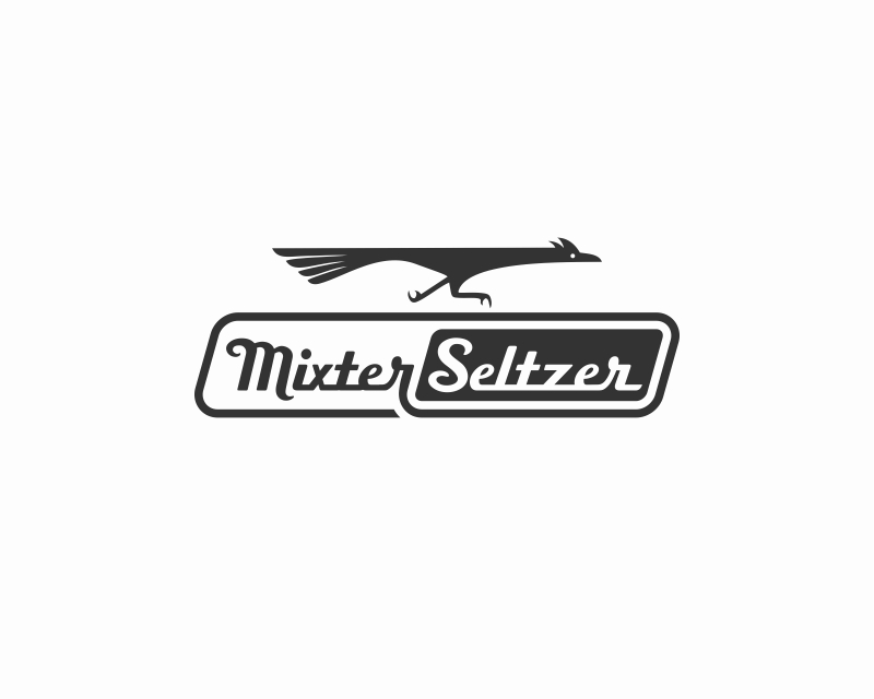
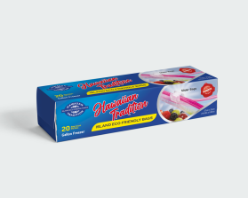
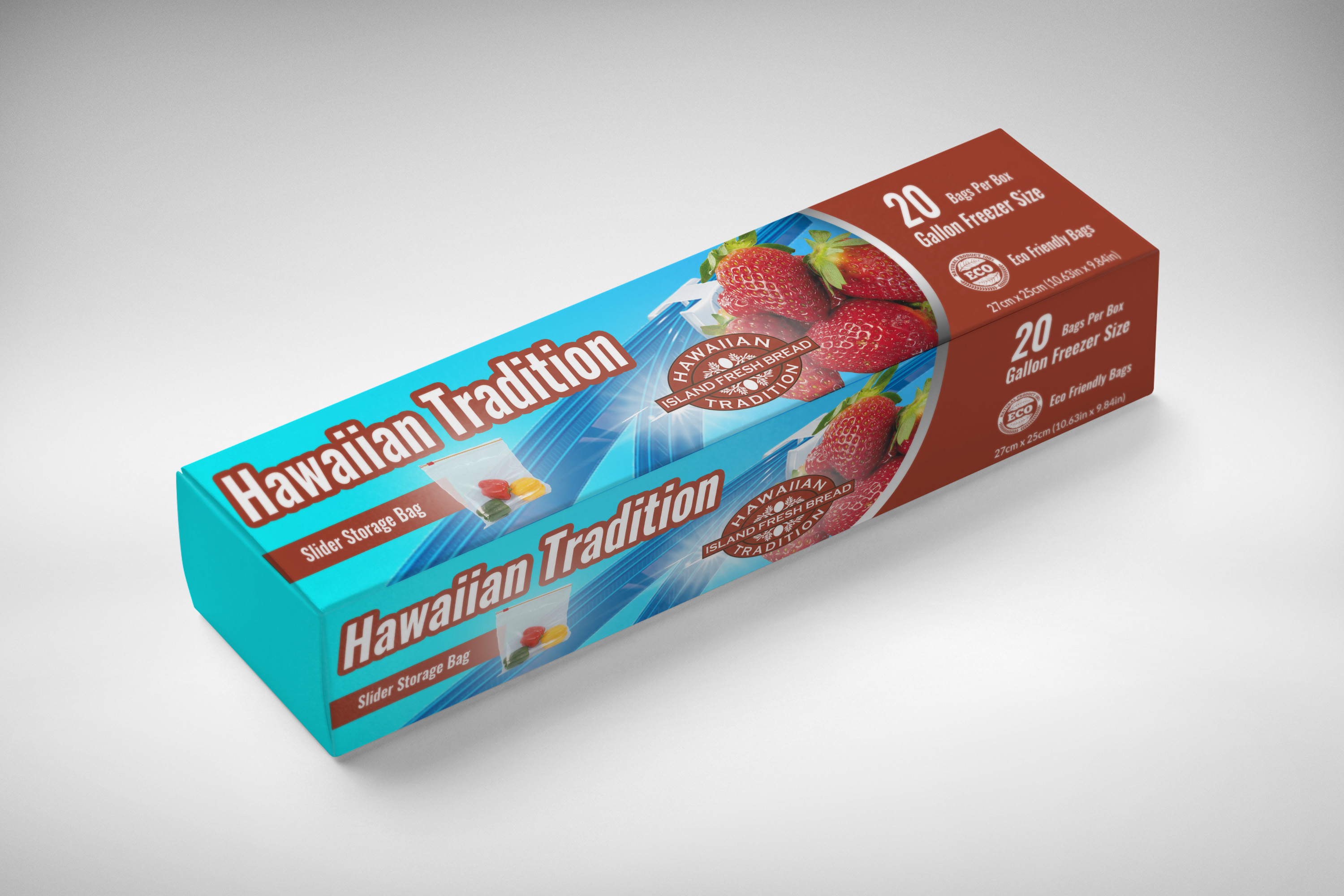
Graphic Design Contest: Mixter Seltzer
Replace the letter S with the letter X, in a creative/cleaver but non-confusing style. Our preferred font is Boxer Script.
$150.00 Prize
239 ENTRIES
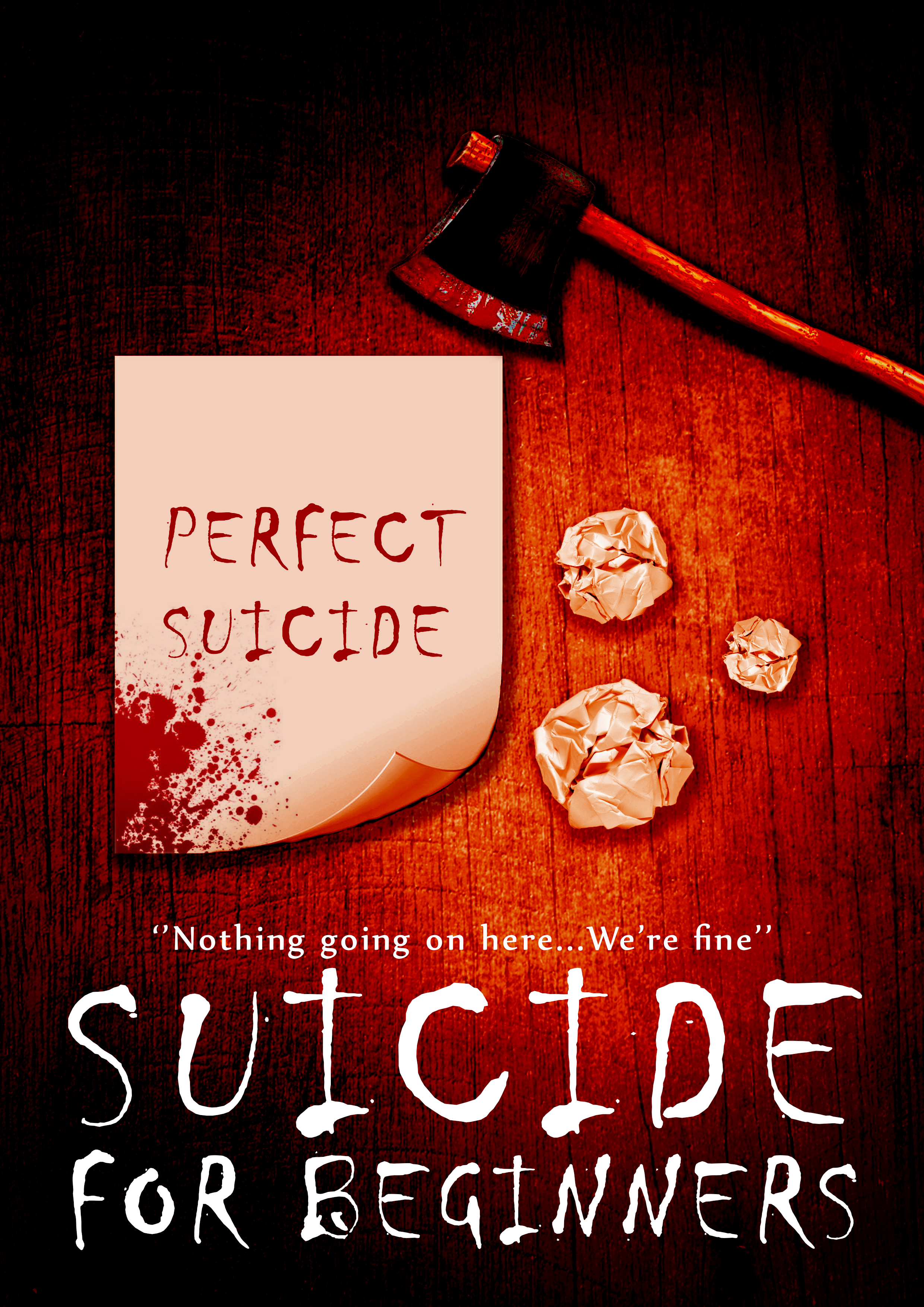
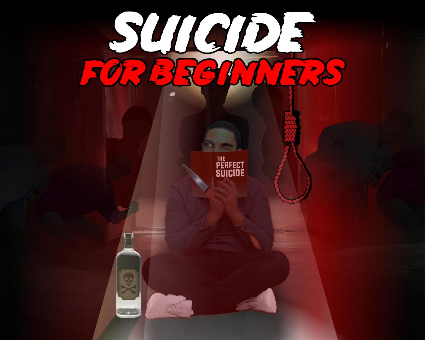
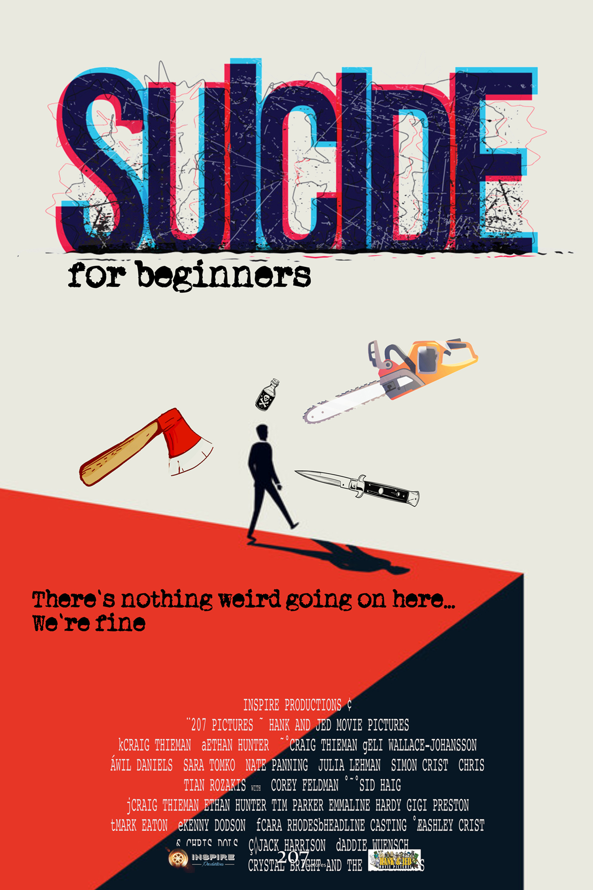
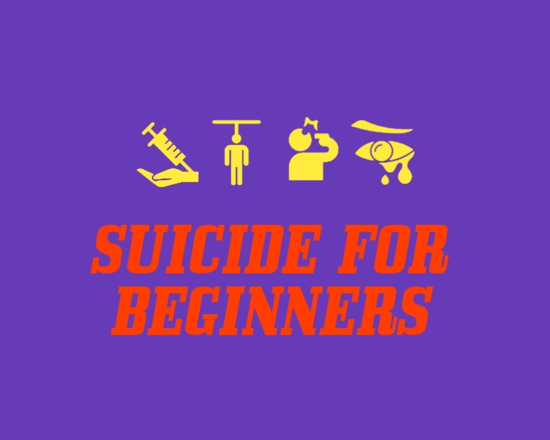
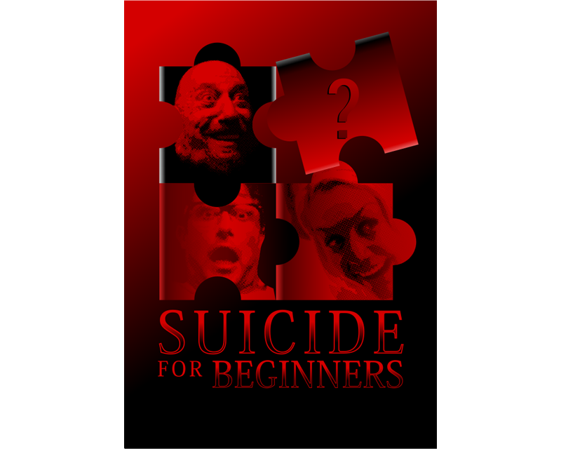
Graphic Design Contest: Suicide for Beginners
SUICIDE FOR BEGINNERS
$300.00 Prize
316 ENTRIES


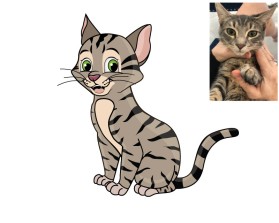
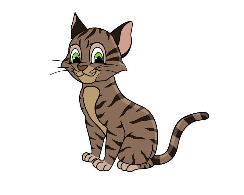
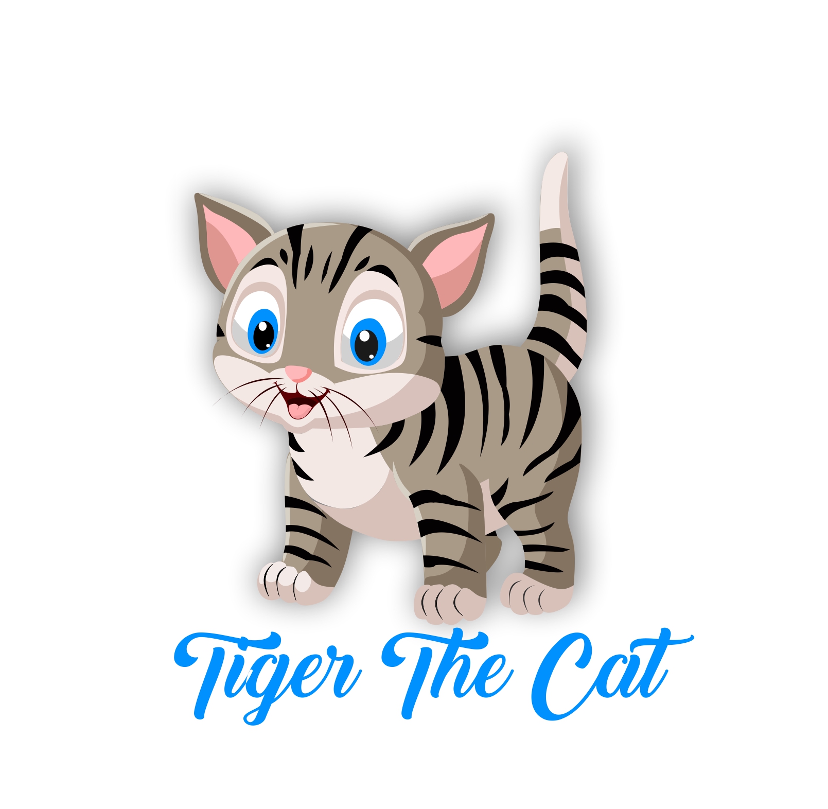
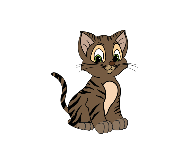
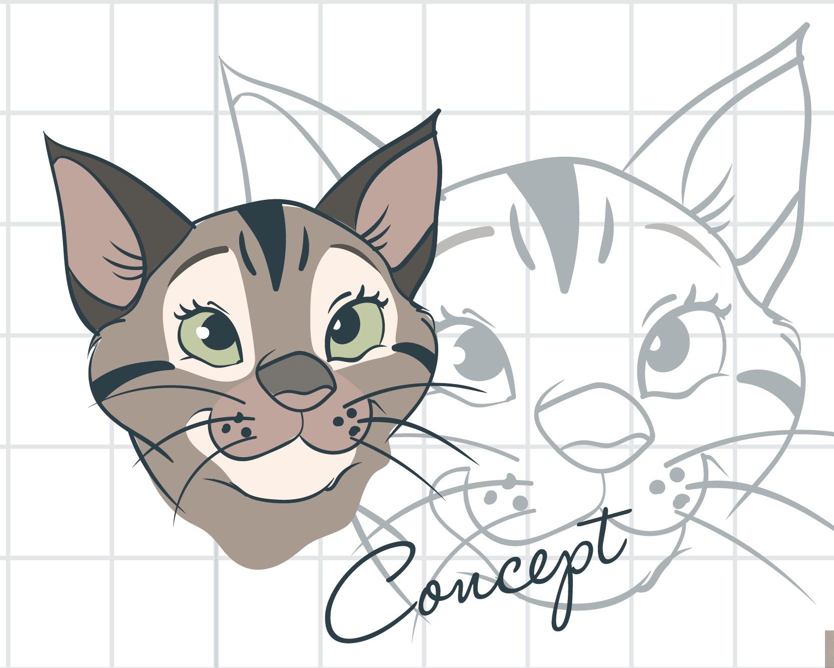
Graphic Design Contest: Tiger the Cat (children's book character)
Tiger the Cat -- Disney Style Cat Drawing
$350.00 Prize
195 ENTRIES

Fast. Awesome. Affordable
About the Creative
9
11
70
IDesign Place Bio
Hi I'm Cat and I'm a degree qualified Graphic Designer. I enjoy creating logos, typography, illustration, packaging design, brochure design, web design, social media promotion, marketing and photography. Previous clients of mine have included global Pharmaceutical Companies, Government, Premiership Football Clubs, and Universities.
Similar Entries