
Kumo
by voltadesignContest received 63 entries and the contest holder has awarded a winner.
- BACK TO CONTEST ENTRIES
- CREATIVE BRIEF
- ALL ENTRIES
Company or website name
Kumo
Links to the website
www.voltabiotech.com
Describe your company and organization and target audience
Volta Biotech is the parent company. Kumo is a cannabis vape cartridge brand.
Target audience are people that vape cannabis, typically younger people.
https://kurvana.com/ I LOVE the style of the K and MAYBE how the u and r are combined.
OLD NOTES FROM WHEN IT WAS A "FINESSE" DESIGN CONTEST - I still like the typography and these ideas
https://www.finessespasalon.com/ like the typography
https://www.finessespasalon.com/ interesting logo
https://thedieline.com/blog/2019/5/15/the-top-13-cannabis-brands-we-saw-at-hall-of-flowers I like the kurvana typography
The design should have the following
I like the logo to look good in ANY COLOR and prefer something really similar to Kurvana with something that makes it a little different.
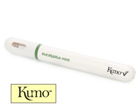
1. Show logo on vape pen
https://imgur.com/8mfEKAe the flavor (bliss) should say eucalyptus mint and instead of dosist put kumo with the V ONLY from the volta biotech logo (it should show Kumo V)
https://imgur.com/a/RcfUnb3 volta biotech black logo ***i like the black logo so it lets kumo and the flavor be the focus - the green logo is acceptable too***
https://imgur.com/a/7lTU9YY volta biotech logo with depth
https://imgur.com/a/Hfp2G5q volta biotech green logo
2. Show logo on vape cartridge
https://imgur.com/a/t9S7jse example cartridge
Briefly describe your contest
Kumo Logo/Packaging Design Contest