News and inspiration for entrepreneurs and creatives, plus updates on new developments at Hatchwise.
Home / Blog Posts / New L.A Rams Logo Gets Negative Feedback
Hatchwise is #1 in Creative Custom Logo Design and Eyecatching Marketing Material Design.
New L.A Rams Logo Gets Negative Feedback
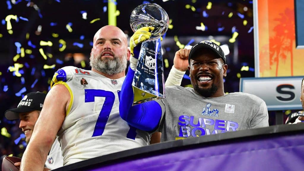
The Los Angeles Rams heard the stadiums cheering as they won Super Bowl LVI 23-20 against the Cincinnati Bengals in front of a home crowd this past Sunday. This Super Bowl win was especially important for the Rams since it was their first as an L.A. team and their second Super Bowl win in franchise history. This win has many L.A. Rams fans reminiscing on the history of the team and more than a few have thought back to a time when the Rams managed to successfully anger an entire fanbase.
For those of you who were too caught up in the pandemic and lockdown during this time to pay attention to what was happening in the sports world or have simply managed to forget about it, let us help to explain how the Rams managed to upset their fans with what should have been a simple logo redesign.
The Start Of A Rebranding
This redesign took place in a few different steps unfolding until the team was officially rebranded. In March 2020, at the same time when the world was going into lockdown and everything was still uncertain, images of the Los Angeles Rams new logo were leaked online. This rebrand had been in the works since 2016 when the team relocated back to Los Angeles so there’s no denying that the brand had quite a bit of pressure on them to impress their fans and they were preparing to unveil the new look before the 2020 NFL Draft.
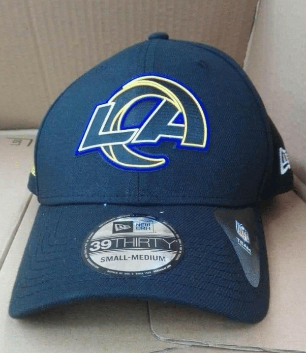
This rebrand started with a teaser the team shared on Twitter. Following the teaser, a leaked photo circulated on the internet, showing the new logo on a hat. This was when the hatred of the new logo started, with many fans hoping that the new logo wouldn’t be confirmed.
The Rams Chief Operating Officer Kevin Demoff, who was on a campaign promoting the NFL draft when the images first hit the internet, had a similar reaction to seeing the leaked images as the team’s fans did.
“It was like a bad courtroom sketch,” Demoff commented on the images. “I was disappointed because there are some resemblances to our new logo that will jade some people when it is revealed but it had the wrong colors, the wrong shape and it didn’t have any of the details that make this logo unique and we think will resonate with Rams fans.”
Why Was The Rebrand Unsuccessful?
There are a few reasons why this Rams redesign was so unsuccessful and why fans were upset when they first saw it. The first and one of the main issues with the colors was the color choices that were used.
Simply put, the colors were just all wrong for the logo.
The leaked photos didn’t include the classic colors of blue and yellow, which makes a huge difference when it comes to the team. The logo shown on the cap in the leaked photo featured the logo in gold and neon purple. After all, blue and yellow is the colors that are not only associated with the team but are what the fans prefer to represent the team.
“The one thing we heard consistently from our fans over and over in the process was they had a real preference for blue and yellow and the horns,” Demoff remarked. “The people said the Los Angeles Rams were about blue and yellow and the horns. We really took that to heart and that was the design premise that we started with. There is also a different subset of fans that liked blue and white, so we have also included white as our third color because it does play a part in our history.”
The Shape of The Logo Confused Fans
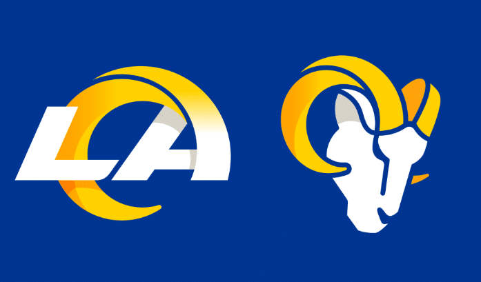
Another critical response to the leaked image that the fans spoke about was the intended ram horn. This part of the design was confusing to many fans since it resembles both a lightning bolt and the letter ‘C’. The issue with this is that the Los Angeles Rams share both a stadium and city with the Chargers. After all, if you were to show someone the logo without prefacing the conversation with exactly which team it was representing, they would be confused.
The Grand Opening
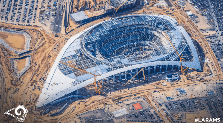
At the time when the rebrand was announced the Los Angeles Rams were coordinating the grand opening of their newly constructed SoFi Stadium in the 2020 NFL season with the launch of the rebrand. Shortly after the images of the logo leaked on the internet, the Rams unveiled the new logo by streaming it on their website on March 23rd. Originally the unveiling was planned to coincide with the zodiac sign Aries which symbolizes the ram but due to the pandemic, the Rams had to adjust their plan to an online unveiling.
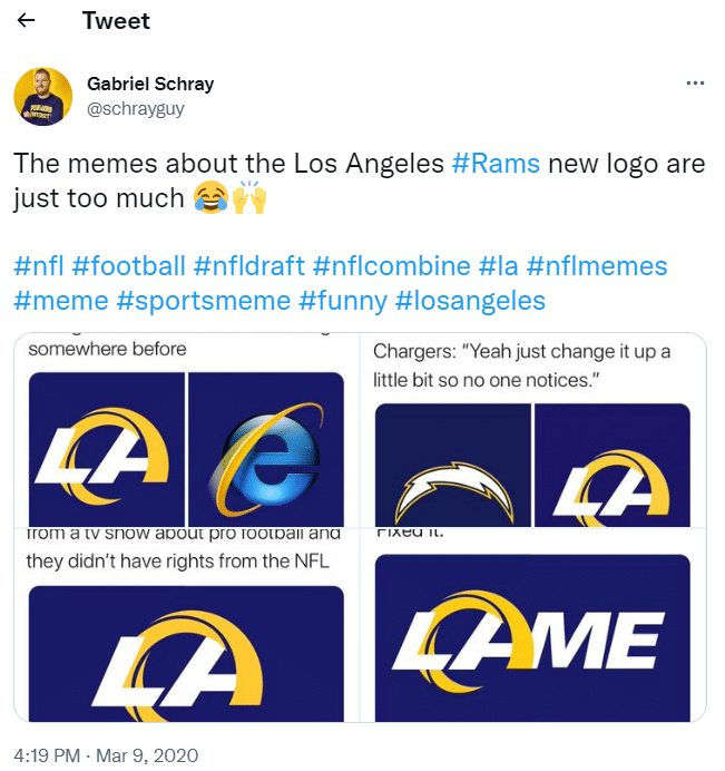
After the official rebrand was launched it was clear to fans that the images that had been leaked previously were only a prototype for the larger rebrand that was unveiled. The logo was improved a little in the final version; there was some gradient shading incorporated into the design and the yellow and blue color scheme made a reappearance. However, the shape issue was not resolved. Quickly looking at the logo gives the logo appears to suggest ‘LAC’ which can quickly be confused as a logo for the Los Angeles Chargers.
Considering that the two teams share a stadium as well as a city, they don’t want to confuse fans. If there’s one golden rule when it comes to team logos, it’s that you don’t want to look like you’re playing for a different team.
Criticisms Of The Logo
The LA Ram’s new logo received strong backlash for more than a few reasons and, although much of it seemed to be justified, the timing also had a great deal to do with the harsh criticism. After all, when the logo was first launched there wasn’t much else going on in the sports world and people were seeking any new form of entertainment during lockdown at the beginning of 2020. It’s fair to say that any redesign would have received its share of mockery if launched at this time and Twitter probably would have gone crazy over any new design seen.
However, with that said, it was pretty bad and most of the criticism on the internet was justified.
Eric Dickerson, former Rams star running back and vice president of business development, shared his thoughts on the new logo when it was launched. Twitter seemed to be where most of the action was happening and Dickerson didn’t hold back with sharing his thoughts on the new logo with fans.
Dickerson commented, “someone said it looked like a penis. It did. That says it all right there. That should be enough for the Rams to say we messed up. We’re going to keep what we got.”
In response to seeing the backlash and the new logo, Dickerson tweeted that he, “reviewed your comments regarding our new logos and share in your disappointment. I’ll be speaking with the teams on our behalf.” in the same tweet, he also shared an alternate design that had been designed by a Rams booster club and asked people to vote for the one they preferred.
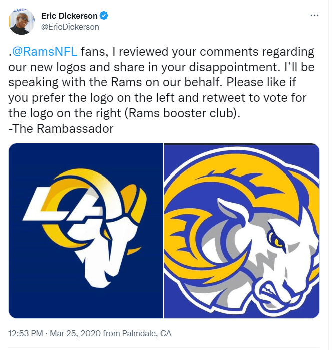
However, despite what seemed to be Dickerson’s best efforts to side with fans, the Ram’s didn’t listen to him or their fanbase. “I spoke with the Rams front office on behalf of our great fans and former players,” Dickerson shared with the fanbase on Twitter. “Unfortunately, the front office is set on their new logos.”
Despite the backlash that the logo received, the obvious criticism on Twitter at the time, and even online petitions forcing the team to change the logo, the brand didn’t feel it necessary to change the logo and assumed that the logo would grow on the fanbase over time.
The Rams chief operating officer Kevin Demoff seemed to sense that there would be shock over the new logo, even before it was launched. “I’m sure it will be a surprise. It will be changed,” Demoff said. “But lots of things are, and I think it’s a change that our fans will come to know and love over time.”
The Rams have held to this statement, not changing the logo despite the criticism from the fanbase. After nearly two years with the new logo, we don’t see the Rams changing their logo anytime soon and we certainly don’t see them bringing back the old logo that was loved by so many. And after all, the fans didn’t seem to hold resentment towards the team when they were cheering for them at the Super Bowl LVI.
- Mosi A.
- February 18, 2022

