


Brands create logos to exemplify their values, hoping that they will catch on and help to establish an association between the corporate images and their business. These logos must be memorable, attractive, and speak to audiences. And sometimes businesses hit the mark. Other times, they not only miss it – their aim is so far away from what the image they intended to create for their organizations.
Sometimes these misses are due to simply being dull. Other times they are wholly inappropriate and work against the values the business encompasses. Here we share ten examples of logo design gone wrong.
The Catholic Church’s Archdiocesan Youth Commission
Of course, the logo intended to represent the assistance the Catholic clergy offers to the youth of the church. But with long standing scandals that threatens the church’s image, this designer and the church could have given this one a little more thought. When designing your logo, step back and see what others could be seeing.
The Instituto de Estudos Orientais

This colorful, and questionable, logo was supposed to represent the sun rising behind a yellow building. The two black lines that form the roof takes this logo right off the right path. While they surely had pure intentions, testing your logo out in a small group could probably help you avoid this type of oops!
Spain’s Clinica Dental

Well, without the name of the clinic next to it audiences probably wonder exactly what service is being offered.
Massage Therapist

Spacing matters! What should be a logo for a massage therapy service looks more like an offer to massage a rapist.
Arlington Pediatric Center

We’re not sure what’s going on here. What is meant to be a child being led by an adult looks more like a pedophilic image that, without the business name, leaves the public wondering.
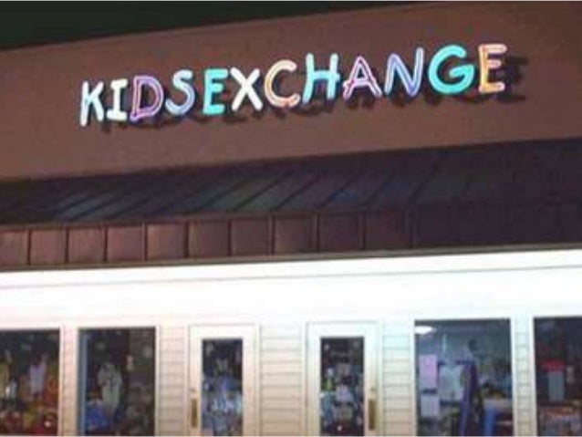
The Kids Exchange

Again, spacing really left the name of this business up for interpretation. Kids Exchange or Kids Sex Change? You be the judge!
Kudawara Pharmacy

What should represent the K in this pharmacy’s name looks more like two figures getting a little to close in public.
Click Lovers

This company is all about repairing computers. But the first word, “click”, reads differently depending on how closely you look at it. This logo gives this business an entirely different image and offers readers a few laughs.
Office of Government Commerce

This one is supposed to represent a government entity but seems to give the finger to all who see it.
The Computer Doctors

Another computer service logo gone wrong. While they appear to be using a mouse in their logo, the mouse looks more like something reproductive.
These ten examples of logo design gone wrong probably offered a few chuckles, but we hope they delivered the message. It’s important to take your time, look at your logo from different angles during the design process. Also, consider the political and social climate and what other issues your organization has dealt with in it’s past. And of course, use fresh eyes and make sure that the message you’re trying to deliver is what’s being said in your logo.