


Good marketing depends on good branding, and good branding is all about logo design. If you want to create a new logo for your company, or if you want to reimagine your existing logo, take a look at successful clothing companies.
Clothing brands want logos that embody the identity they’re trying to sell. Whether it’s hipster, diva, prep, sporty, or luxury, there should be a style attached to the logo. Logos have to project a specific style in a small space.
These ten clothing brand logos are unique, send a message, and embody the style of their clothing in a memorable way.

Nike
The iconic Nike “swoosh” is recognized all around the world. It uses two colors, black and white, which project an image of confidence and self-assurance. The logo immediately brings the associations of “athleticism” and “winning” to mind because the word “Nike” itself is all caps and very bold, which develops the image of power and strength.

Levi’s
The classic Levi logo consists of a red rectangle that has slanted sides and a bottom line made up of two waves. Inside the rectangle, in white, the word “Levi’s” stretches across the rectangle, with each letter the same height and size.
What’s most remarkable about the Levi logo is the bold red that jumps right out at you. When you combine the red and white of the logo with the blue of their famous jeans, you get a truly American brand.
GAP
The GAP logo is also unmistakable and unforgettable because of its boldness. Featuring three white letters on a field of blue, the logo is simple and loud at the same time because of how each letter demands attention.
Of course, between each letter there is a gap of space that further emphasizes the brand name.
Ralph Lauren
Ralph Lauren’s logo projects a different image from the three we’ve described so far: one of old-fashioned values, tradition, and class. In their logo, between the two names that make up the brand, there sits a symbol of a polo player with his wooden mallet raised high, poised to swing. The image conjures up associations of luxury, class, and refinement.

Hollister
Hollister is another clothing brand whose logo will never be confused with another. The maroon color of the bold name, and the seagull perched above it, are unique and distinctive. The seagull immediately draws the association of the beach, flight, and freedom, while the bold name symbolizes confidence.

Calvin Klein
There’s a simplicity and elegance in Calvin Klein’s logo, which features just two lowercase letters, close to each other but not touching. Below them is the brand’s name stamped in a simple font underneath. The first line in the lowercase “k” is taller than it would normally be, which adds to the elegance of the logo.

Kate Spade
Kate Spade features a simple but distinctive logo, similar to the Hollister logo in that there is an image above the brand’s name. A small, rounded spade (a clever allusion to the designer’s last name) sits above the all-lowercase brand name. The spade is tiny and cute, which reflects the brand’s target audience.
The all-lowercase name of the designer sits above the all-uppercase NEW YORK underneath. The contrast is striking. By using only lowercase letters in the most important words, the designer’s name, the brand shows its commitment to modernity.
Chanel
The Chanel logo is perhaps the most famous logo of all. With two intertwined, back-to-back bold black Cs sitting above the all-uppercase name, “CHANEL,” there’s no mistaking this unforgettable logo. Through its association with the luxury goods the brand sells, the logo has come to represent class, sophistication, and French fashion.
Alexander McQueen
The Alexander McQueen logo is memorable for its simplicity and cleverness. Both the designer’s first and last name are written in all capital letters, with the text of “Alexander” slightly smaller than the letters of “McQueen,” so that they take up the same amount of space.
The most remarkable feature of the Alexander McQueen logo is that the “C” in “McQueen” is contained inside the Q, which represents the cohesion of the brand. Everything works together for a smooth and elegant design.
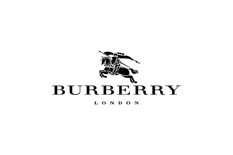
Burberry
The Burberry logo also can’t be forgotten. Unlike the other logos on this list, it emphasizes the image more than the name of the brand.
The image is a symbol of a knight on horseback carrying a pennant. The horse is mid-gallop and outfitted with elegant accoutrements, as is the knight, who is wearing a plumed helmet. The image sits above the brand name, and for the text the designers used a serif font, which instills a sense of tradition and trustworthiness.
The brand name is in all-uppercase letters, which again emphasizes confidence, and underneath it, spaced out and in much smaller text, is the name of the city where the brand is headquartered: London.
In Conclusion…
These ten brands, which range from popular American clothing names to exclusive London designers, may seem very different, but they share one thing in common: unforgettable logos.
Whether it’s a bold wordmark or an intricate and elegant design, each of these clothing companies has found a way to express their unique style in a small amount of space.
Can you think of any other clothing or fashion logos that you won’t forget?