News and inspiration for entrepreneurs and creatives, plus updates on new developments at Hatchwise.
Home / Blog Posts / Featured Design Contest: Splitting Edge Axe Throwing – Axe Throwing Company
Hatchwise is #1 in Creative Custom Logo Design and Eyecatching Marketing Material Design.

Featured Design Contest: Splitting Edge Axe Throwing – Axe Throwing Company
Today’s featured design contest showcases logo concepts for an axe-throwing company. Our client, Charlie, owner of Splitting Edge Axe Throwing, was hoping to give his current logo a facelift. He offered a prize of $360 and received a whopping 672 total contest entries.
Charlie requested that the design be classic and simple, with maybe a bit of western flair. He wanted specifically to have axes in the image, as well as the company name and year of establishment, and to please not include any images of people or guys with beards. The color scheme is limited to black and white, or perhaps blue, white, and red, but no “crazy colors”.
Let’s take a look at some of the designs Charlie received.
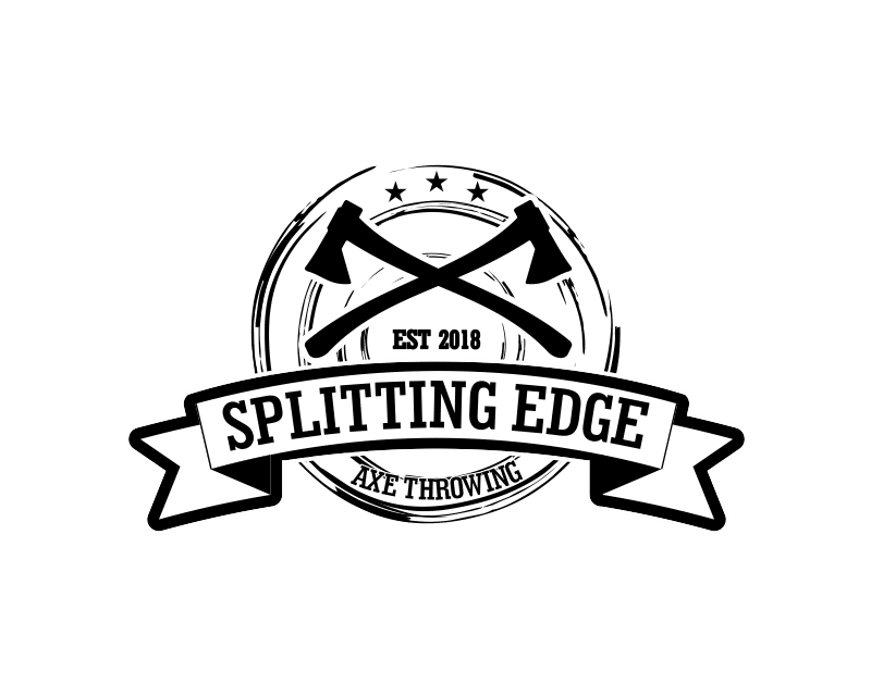
Two crossed long-handled axes are centered along the top of lightly sketched circles. The delicate lines of the circles contrast with the bold edges of the ribbon laying across them, with the words “Spitting Edge” written in a western style font.
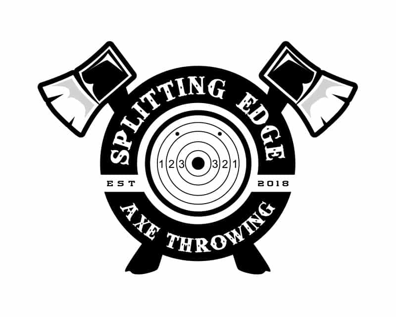
Two axe heads fan out over the letters of the company name. Again, we see western lettering, stars, and a ribbon, making it look like something out of a wild west saloon.
The hand in this image looks strong and powerful. Sort of like if John Henry threw axes instead of hammering steel. A nice variation on some of the other concepts submitted here.
This logo looks like it could double as a standing target, with the bullseye at dead center.
While this design does incorporate the crossed axes and sawblade circle from the original logo, it is definitely an upgrade in terms of style and substance.
In this concept the axes are placed one above the other rather than crossed. The words are splitting the target in two. The shading on the axes gives them a rustic, pencil-drawn look.
There is a hand-stamped look to this circular design. The three trees give a western lumberjack feel to the whole motif.

Sometimes our designers submit concepts as they would appear in use. Here we see how this design would look carved into a wooden sign or building. A simple, classic design that gets the job done.
While most of the concepts submitted used the black-and-white color scheme, some did experiment with the alternative colors the client suggested. Here, the red color emphasizes the bullseye in the center of this simple but creative design.
And the winner is…
After viewing pver 650 entries, Charlie awarded the prize to mazzehhh, the designer of this concept. It is definitely an upgrade from his original logo, and will give the whole brand a makeover. While the design is even simpler than the existing logo, it is more sophisticated and professional looking, which will make the brand even more memorable. With so many great choices, it couldn’t have been easy settling on a winner, but we think Charlie made a great choice.
Check out other Logo Design contests:
Maine-Ly Lobster – At Maine-ly Lobster they specialize in delivering fresh live lobster directly from Maine to the southern States. Their storefront location will be in Myrtle Beach South Carolina where they will sell live lobster to the public as well as delivery to local restaurants in the grand strand area.
Rebel Mountain Ranch Boer Goats – Rebel Mountain Boer Goats is a Boer goat breeding/show animals. Agriculture based.
Thompson’s River Bend Farm – Hemp farmers and have branded products under another name. This logo was for their farm for their sign, business cards, shirts, hats, etc. General use where the farm name is needed.
Manolo’s Cafe/Manolo’s Cuban cafe & Eatery – Small-scale Cuban coffee shop new to the area of Estero, FL with a history of shops in Miami since 1972. It is a 600 sqft area inside a gas station.
Will provide all types of Cuban coffee, pastries, and sandwiches along with contemporary coffee beverages. The target audience is the neighboring outlet mall, neighboring college,a residential community. and before and after work traffic flow of people.
Hardwork NYC, LLC. – Hardwork NYC, LLC. is a community-based staffing agency. Their goal is to seek hardworking individuals with the desire to work in fields across a number of sections and industries but may not have had to opportunity to show their talent. They are a firm that will seek, train, and place individuals who are looking to show off their skills and talent.
- Katie
- December 18, 2022


