News and inspiration for entrepreneurs and creatives, plus updates on new developments at Hatchwise.
Home / Blog Posts / Awesome Boutique Logo Designs
Hatchwise is #1 in Creative Custom Logo Design and Eyecatching Marketing Material Design.

Awesome Boutique Logo Designs
When you think of a boutique retail store or a boutique service business, it calls to mind an exclusive, unique experience and on-trend designs. The same should be said of their logo. In today’s world, big box stores are going out of style and people are returning to the mom-and-pop local businesses for their needs.
As a boutique business, you need a logo that reflects the care and attention you put into your business. You’ve put your heart and soul into your company and your logo should reflect that.
There are many ways to achieve an eye catching boutique logo. Here are a couple things to keep in mind while developing a design.

Typography
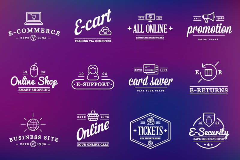
Your logo is, in many ways, the face of your business. It even has the name on it. And because it has your name on it, you need to choose the right typography. For a boutique store, you don’t want stock typography or fonts. There are better options for you. Consider some of the following:
- For a modern, sleek and clean look, go with a modern, minimalistic type.
- To add a bit of nostalgia to your business, use a vintage-inspired or romantic style of type.
- Do you have the cutest little baby store on the block? Maybe a sweet flower shop? Or maybe a delicious cupcake shop? Try something cutesy to invite your customers inside.
- If you want to make a big impact with just the name of your business, go with something bold, big, and loud. Let the words stand strong on their own.
- For more of a hipster, handcrafted vibe – maybe for a boutique craft store – try something handwritten. It will help your customers get the sense that you had a hand in making everything in the store.
- Don’t be afraid to play with different fonts and sizes and colors of type in your logo. The juxtaposition of different styles can draw a lot of attention.

Symbols
Symbolism can be a powerful thing in a logo. It’s an effective way to show what your business is about in a clear, simple, easy-to-understand way.
- To keep with a modern theme, try a geometric shape, symbol or outline. It pairs well with a modern font and when you keep it minimal, there is nothing for the meaning to hide behind. It will help your business appear cutting edge and trendy.
- There’s always the option to go with something literal. For example, if you have a real estate business, you could have the symbol of a house in your logo. Though it’s literal, it will never be misunderstood and no one will ask what your business does.
- To keep with an all-natural or healthy vibe, try adding something from nature, like flowers, trees, or leaves. It will lead the viewer to call to mind the beauty of the outdoors and keep them feeling that your business is more organic than the competitors, something that could be a deciding factor for some customers.
- Animals are a great way to incorporate symbolism. Each animal has certain qualities we associate with them and you can really add a personality to your business by utilizing those associations by putting an animal in your logo.

Colors
Colors make a big impression on people. Certain colors mean certain things and cause different impressions of your business. How you use color is just as important as the symbols or the typography of your designs.
- Regardless of what color you choose, sticking with a monochromatic logo will give you an air of modernity and help your customers feel like they are the first to know about the next big thing. It implies that you aren’t hiding behind a flashy logo – all you need is one color.
- Take some time to search through places like Instagram to see what colors are especially popular. For a logo redesign or a new logo, that’s a great way to make sure you are staying with the times and not falling into an outdated color palette.
- Remember to keep it simple. Nothing will turn off the customer’s eye like an overly garish, flashy logo that clashes with itself. Be conscientious about your color choices and judicious about how many colors you choose. It’s better to go overly simply than overly extra.
- KaseyVanDyke
- November 10, 2020

