News and inspiration for entrepreneurs and creatives, plus updates on new developments at Hatchwise.
Home / Blog Posts / Featured Design Contest: Singletary Fishing Co.- Fishing Mascot Design Contest
Hatchwise is #1 in Creative Custom Logo Design and Eyecatching Marketing Material Design.

Featured Design Contest: Singletary Fishing Co.- Fishing Mascot Design Contest
Every company is a brand, and no brand can rise to the top of its respective niche without a proper, eye-catching logo. With Hatchwise, not only do new businesses have an opportunity to work with creatives that design brand logos that resonate with a specific customer base, they provide a few options to choose from. The most innovative and enjoyable way to get you these designs: contests.
Singletary Fishing Co. came to Hatchwise with an idea of what they wanted, removed all limitations for the design, and when the entries were reviewed, selected the perfect logo they knew would be easy to recognize and that spoke to the angler in all of us. If you are curious about what they had to pick from, take a look at a handful of the contest entries. A lot of thought and heart went into every one of them.
Who They Are
Singletary Fishing Co is a startup that has the goal of uniting enthusiasts of fishing, open water, and outdoors under one banner. They love to fish, to be on the lake, to feel the sun, and experience the exhilaration of a whopper tugging on their line and hope to enrich the sport with their distinctive approach to the fishing industry.
What They Asked For
The client’s needs were simple. With a business named Singletary Fishing Co, it wasn’t hard to pinpoint a direction for the designs. Yet, because every logo must be unique, they asked for a few small details to be incorporated. They wished for a mythical figure to be added to the logo, such as Chiron, mermaids, mermen, or even something as simple as a fish jumping. Three things they absolutely needed to see were fish, water, or a person with a fishing pole.
And The Entries Were In
16 creative entries made it into the contest. Only one found its way will be the logo for the company. Let’s take a look at the contestants.

Checking all the boxes, we can see a merman fishing, a trout on his line, and a satisfied look of a job well done all over his bearded face. This might be a little more cartoony, but that doesn’t detract from the distinctive way it is all put together.
Again, we see the circular background, blue is prominent throughout to symbolize the water, and all in all, the design is well-reasoned and admirably drawn.

Fishing can be fun and relaxing, but when it’s a battle between you and beasts of the deep, it can be a little intense. This merman shows this intensity in his firm scowl, letting you know he is here for business. His pole is whipping, the fish is out of the water flailing for dear life, and there will be no mercy.
This design shows a dedication to the task at hand, a drive to succeed, but without the enjoyment of the chase, only in the result.

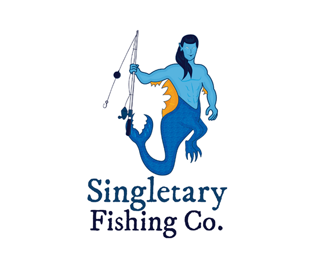
Of all the designs, this one is the most basic yet still hits the points the client requested. The character is ready to fish with pole in hand with the body to chase down the fish if it tries to escape. He is smiling, looks to be eager to get his line in the water, and embodies a half-merman/half-nymph design, which means this might be another version of Chiron.

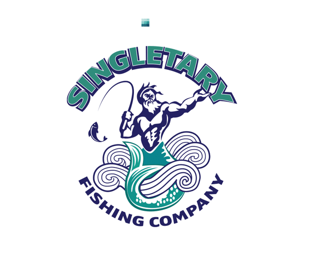
The creative kept to the circular theme but went a step in a very logo-centric direction by wrapping the business name around the curves while putting a well-drawn merman within. He even looks to be holding up the business name with his powers from the sea.
The fish is small in comparison to other designs but with respect to the merman, the scale makes sense. Water rolls around his fin, he has that intense god stare, and it is evident that the battle was long and arduous to land this fish.

#3063757 by DEBDAN
The only entry to feature a mermaid, the designer played on a universal love of these mythical creatures. Yes, it does play to a more Japanese take on the idea, giving the logo a cartoony and somewhat sexualized look, but it balances well with the circular orange background, the palm tree, and the active waves, which speak to an island paradise. She hasn’t caught a fish yet, but she looks happy to wait for one to bite.

The designer had some fun with this one, showing a fellow having a good time as he spends the day pulling in lunkers. From the look on his face to the whimsical font of the business name, there is a lot to be admired in such an entry.
The only issue is it is a little too cute, too fun, and while fishing is an enjoyable sport, this gives the design little to be respected which will turn off true anglers that take the sport seriously.

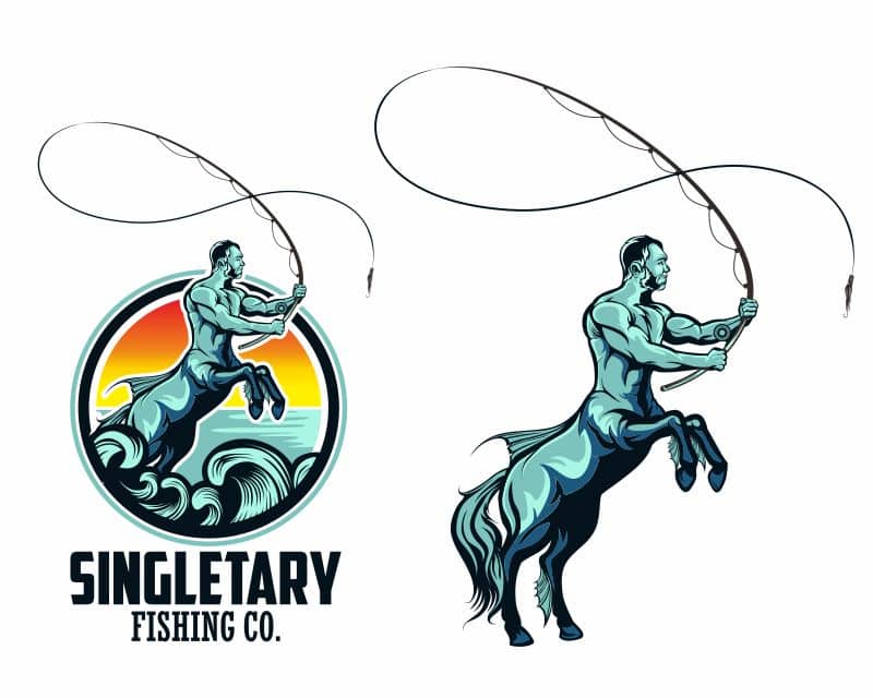
Chiron certainly wants that bass. Feel his intensity in the glare he gives it as he rips it from the water. There is quite a bit going on in this one. First, we have the centaur and his catch, a largemouth bass, which is a prized catch for many seasoned anglers and will speak to their desire. Sunset in the background, islands, sea birds, and clear blue water reinforce the overall design very well.
Again, we see the circular pattern holding it all together. What makes this especially unique is the lettering for the business name. It’s clever, grabs the attention, and is hard to duplicate making it very unique.
The Winning Design

The creative who designed this entry ran with the mythical request by using a Chiron, who is technically a Centaur, although his mother Philyra, a sea nymph, gives him a unique connection to the water.
He was known as the wisest of all centaurs, was a prolific hunter, as was his wife, Artemis, Goddess of the hunt. He certainly looks like he is hunting for a mighty fish in this entry. The circular border and big block lettering were a nice touch.
Check out other Mascot Design contests:
TrashCots Proof Of Concept – We are a new start NFT company looking to find a good designer to work with us on a large project. We are testing the waters with Hatchwise to find a quality designer that can help us with the remainder of the project by starting a sampling of our desired end goal.
Eposly – They already had a “logo” but they wanted to have a “brand character”. They work in the Salesforce ecosystem and Salesforce has pioneered the use of brand characters. Such as, “Astro”, “Codey”, “Appy”, and “Einstein”. They wanted a “friendly” brand character that fits with their mission and logo colors.
Tiger The Cat (Children’s Book Character) – A children’s book author looking to pay the winning designer good money to produce a series of children’s books starring the character Tiger the Cat.
Jerky Ben – He makes a beef jerky product. Right now he plans on selling from his house but he may decide to sell in local stores and online. His jerky is high-quality jerky and comes in a variety of flavors. The brand element for the product is him, Ben. He lives in a tight knight community and is well known. he does a lot of community work and is involved in a lot of community projects. He is known to be funny, outgoing, loves life, loves people kind of guy. That is why the name “Jerky Ben” is a funny name.
Pretzel Cafe – A snack company with currently 3 locations located in large-scale indoor shopping malls. They make Pretzels! Big, fresh, hand-rolled pretzels!
- Rosie
- June 5, 2023

