News and inspiration for entrepreneurs and creatives, plus updates on new developments at Hatchwise.
Home / Blog Posts / Featured Design Contest: Open Air Farms – Farm Logo
Hatchwise is #1 in Creative Custom Logo Design and Eyecatching Marketing Material Design.

Featured Design Contest: Open Air Farms – Farm Logo
Logos are the backbone of any company. They are the face of the brand, the first impression that customers get, and the visual representation of the company’s values.
At Hatchwise, we understand the importance of a strong logo and take every contest seriously. We believe that every logo needs love and attention to turn out the best and serve its purpose.
In this blog post, we’ll share one of our favorite recent contests with you. We’ll showcase a few of our favorite entries while also looking at what the client requested and the winning entry.
What Was Requested
Hatchwise creatives are no amateurs when it comes to contests. They know that before submitting their entries to the contest, they need to read the contest brief that describes what the company is looking for and shares a bit about themselves.
And that’s exactly what they did.
The client, Open Air Farms, is a small, sustainable farm in Detroit that focuses on regenerative farming and building community through food. They wanted a clean and simple logo, yet natural and rustic. They also specified that they wanted no cartoons. And as for colors, they wanted natural earth tones like grey and cream, green and cream, or even some purple.
Hatchwise creatives used this information to guide them with their designs and ensure that the client received a logo that would suit their brand and they would love. Let’s see how they did with a few of the top entries below.
A Few Of The Top Entries

This design is a perfect blend of simplicity and vibrancy. The bold black background with the company name in the center immediately catches the eye. The farm setting in the circle is the highlight of the design, with a red barn and a windmill adding a pop of color.
The blue sky and green grass in the background provide a refreshing contrast. The rooster above the company name is a clever touch, adding a touch of humor to the design.
Overall, this design effectively communicates what the company does while also being visually appealing.

This next design is an awesome and simple logo. It’s got a soft green color scheme with a circle in the center featuring a plant growing out of a field.
The company name is displayed around the circle with a green line. The background is an off-white, almost yellow color, which matches the plant and field.
This gives the logo a cohesive and stylish look. The design is clean and minimalistic, giving it a sleek and classy feel.

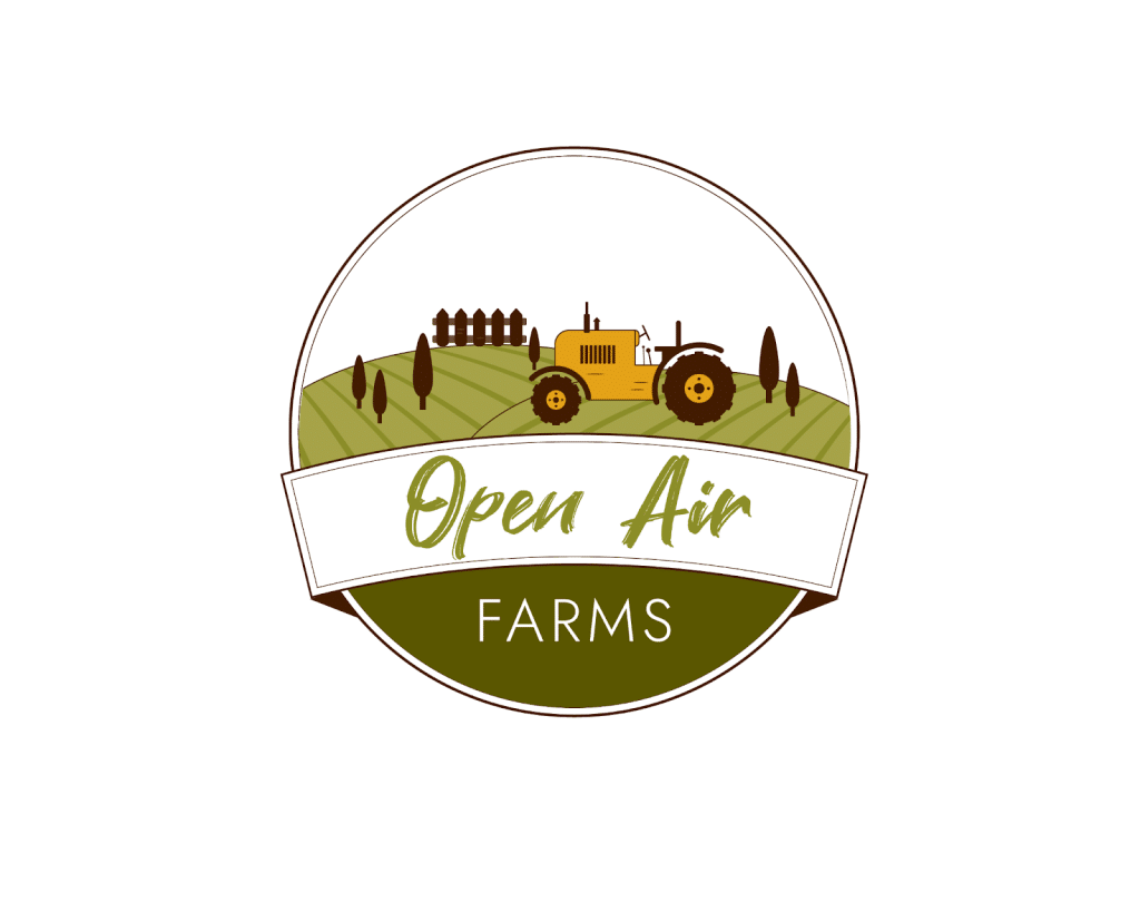
This next entry definitely takes the design in a unique direction. The circle shape with the setting and company name inside is a bold move, but it works.
The green company name inside a white ribbon pops against the clean white background. And that tractor in the field on the top of the name? Genius.
The little brown trees and green fields add a nice touch of detail. The star of the show, the yellow tractor, really stands out. The last part of the company name in white on green beneath the ribbon ties everything together nicely.

The design features a black-and-white logo with a small blossoming plant above the company name, which is displayed prominently in large black letters.
The design is showcased on a white background, creating a striking contrast that draws attention to the logo. The simplicity of the design exudes a sense of style and class while remaining bold and eye-catching.

This entry goes in a different direction with its color choices and design. The name is shown in dark green and all capital letters, with an orange wheelbarrow above and a green plant coming out of the top. The design is shown on a white background and ties together perfectly to create a stunning logo that does its job. The font used for the name is bold and strong, standing out against the white background.

This design opts to go in a different direction by not including any form of a circle and instead making the company name the center of attention. The company name is shown in a splattered light green, and above it is shown grass with a wheelbarrow with a flower coming out the top. This part of the design is shown in brown on a white background, creating an overall simple yet effective logo.

The design showcases the company name prominently in big, bold black letters at the center. On top of the name, a vibrant green color depicts plants and grass, while a rising sun behind a black rooster adds a touch of elegance.
The color scheme is simple yet striking, with a vibrant green and a soft yellow on a white background that stands out. This unique, classy, and iconic design makes it instantly recognizable.

The latest design option features a green circular badge with the company name split in half white and green, set against a green and white background of small plants.
The circle’s center holds the company name, with three white stars below it. The design is presented on a clean white background, making it look polished and classy.
The Winning Result

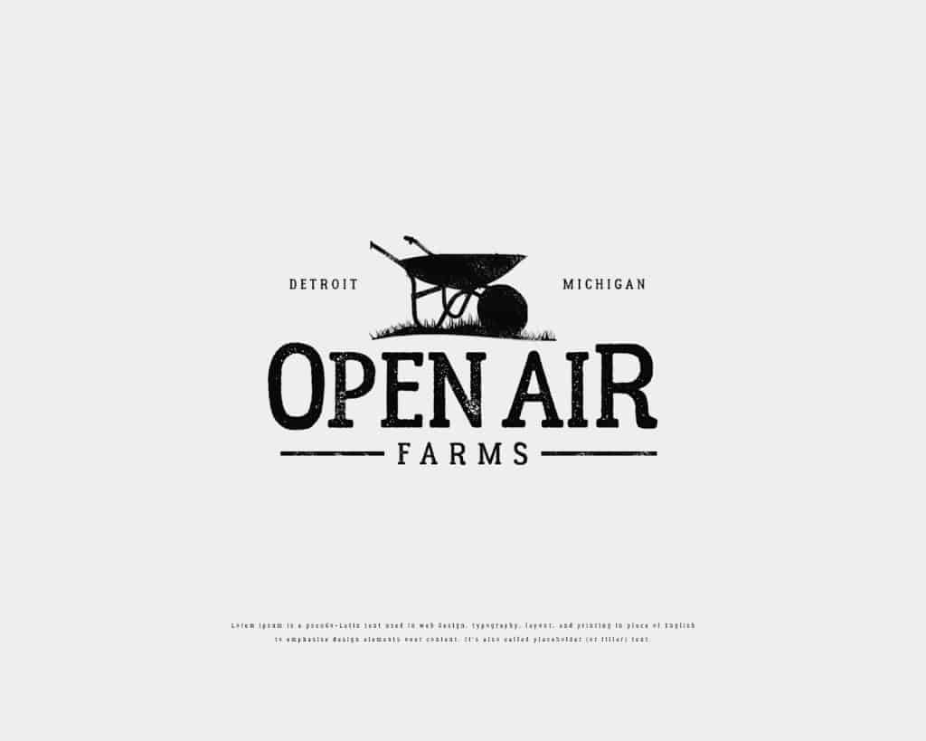
The client has finally picked a winning entry for their logo contest after reviewing over 280 entries. The winning design is simple yet captivating, featuring a wheelbarrow on top of the company name with the words Detroit Michigan on either side.
The design is in black and white, with the first part of the company name in large letters and the second part in smaller letters with a line on either side of the last word. It clearly represents what the company does, and the simplicity of the design makes it stand out.
We’re always thrilled when yet another client receives an awesome logo that they love and use, as is the case with this design!
Check out other Farm Design contests:
The Farm…And Beyond – A small farm (3 acres) with chickens, alpaca, lemon trees, and grown fruit, veggies, herbs, etc. Potentially going to set up a shop (online and for markets) to sell things such as jams, marmalade, pickles, pottery, and basket weaving.
Moonlight Farms – The company is a farmhouse wedding venue & campus (animals, barns). They offer twilight and moonlight weddings. The feel of the company is very natural, outdoorsy, and farmlike.
Nutrient Dense Farm – An aspiring Biodynamic farm grown from the heart of universal love.
Root Cause Farm – A small urban organic farm selling fruits and vegetables to the neighborhood near the farm. The farm aims to make healthy, affordable food available to the local community, ultimately improving the health of local residents and building a community around the farm.
Stevens Family Farm – A small market gardening farm serving a local community.
- Mosi A.
- April 16, 2023

