News and inspiration for entrepreneurs and creatives, plus updates on new developments at Hatchwise.
Home / Blog Posts / Featured Graphic Design Contest: RA – A Marijuana Company Logo
Hatchwise is #1 in Creative Custom Logo Design and Eyecatching Marketing Material Design.

Featured Graphic Design Contest: RA – A Marijuana Company Logo
Our team at Hatchwise loves their work, but they especially appreciate the opportunity to explore different designs in detail. Designs are one of the most exciting aspects of our job, and the creatives here never fail to impress us with their detailed designs. Every week, our employees are tasked with looking through the hundreds of contests that Hatchwise runs, and this particular one caught our attention. In this blog post, we will discuss the client’s request, the results they received, and a few of our favorite entries from the contest.
What Was Requested
When starting a contest at our company, clients begin the process by always filling out a contest brief describing what they’re looking for and a little bit about their company. In this case, the client was a marijuana company launching a brand with two product lines – vape cartridges and pre-rolls. The brand name was RA, derived from the Egyptian sun god, as the sun is necessary to grow weed. The client specified that they wanted the design to be warm and welcoming, while also including a catchphrase that explained the benefit and purpose of the product.
The Entries Submitted

The first entry is a sleek and simplistic design on a mockup background. It features just an R and an A in medium blue with a straight line down the middle. This design is clean and classy, with minimal elements that draw attention to the stark color choice and the simplicity of the design. The overall effect is one of class and sophistication.

The next entry submitted is a simplistic yet visually complex design. It features a clear R and A on a dark blue background, set against a white paper mockup. The contrast between the two colors creates an eye-catching look. Above the top part of the square is a grey line, adding an extra dimension to the design. All the design elements work together to create a stylish and classy look that is still minimalistic.

This entry focuses on the A in the company name, showing a complex version of the letter on top of a circle. The design relies on blue and grey on a white background, using unique color choices to help the design stand out. The color choices are muted while establishing a strong and signature look for the design. The A is out of the ordinary, establishing a unique and characteristic look for the brand.

The next entry offers the client three different color versions of the same design, allowing them to choose the one they like best for their company. The design is simple and modern, featuring a unique A-shaped design with a 3D effect. The design stands out against the chosen background and is presented in blue, white, and dark blue. This allows the client to see how the design will look in the different colors and make a more informed decision.

This entry displays the same design on two different sizes of product packaging. The design is unique yet classy, using dull tones of mustard yellow, dark grey, and light grey, with white lettering. The company name is shown in small letters, with a circle above it that features a mountain. The background is grey, with a line of yellow at the top and bottom of the packaging. This combination of colors and design elements creates a cohesive and attractive look.

This design opts to go in a different direction, featuring a circle with a blue outline. Inside the circle is a white R and A that are interlocked. The circle is split in two, with one half in blue and the other in grey. The font is strong and classy, drawing attention to the letters as the main character. The colors are subtle and classy, not drawing too much attention. The white background shows the design to stand out and remain classy.

This next design features a unique font with a thick R and A on a white paper background. Rather than a line, the A is represented by a grey circle, with the two letters touching to create a signature look while still allowing them to stand out. The design has a signature appearance while also being modern and easy on the eye.

The last entry in our list features a much more vibrant design than the others. It has a blue background with white letters spelling out the company name. Above the company name is a yellow square with a smaller design inside it. The creative submitted two different mockups of the design that show how it would look on different-size products. This design emphasizes the importance of color in product packaging and how it can make a product stand out.
The Result

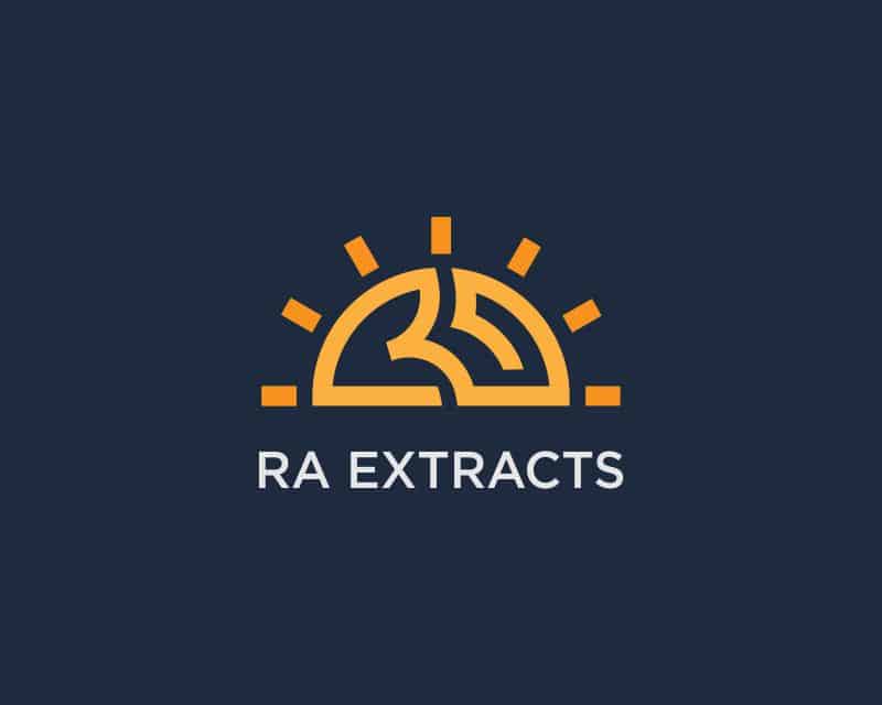
This creative opted to go in a different direction with their design, utilizing an orange design above white letters to create a unique and eye-catching look. The company name is white on a dark grey background, making the orange design stand out in contrast. The orange design has a sun effect, combining the sun with rays from the side. This design is both classy and stylish while being simplistic and elegant at the same time.
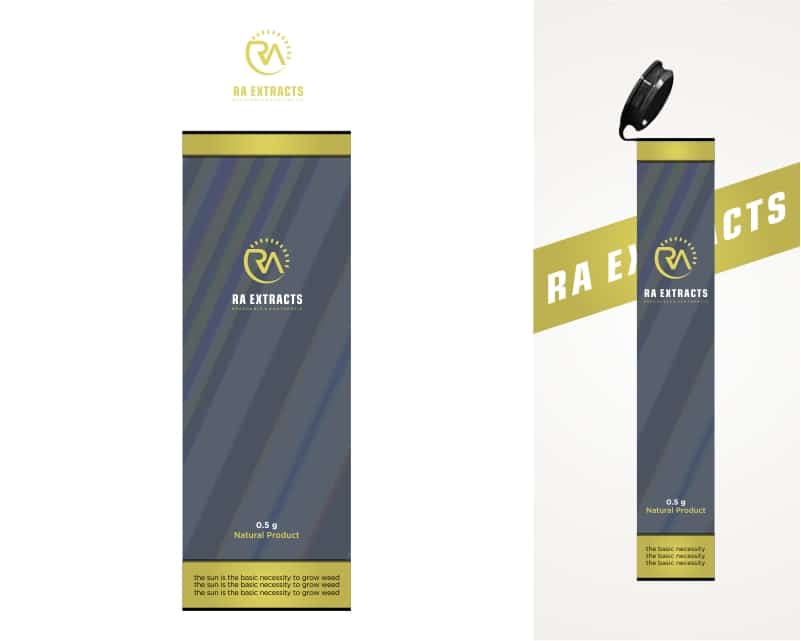
While the client ultimately chose this design as the contest winner, they also requested a packaging design, which was submitted below.

Selected as the “official” winning entry, this design features the above logo on a thin, long tube package. The background of the design is dark blue, with the sun design above the company name. There is a larger sun design in white near the bottom of the tube, and below that is a yellow mountain design. On the other side of the design, a small rectangle is featured with a small setting inside. Above the package, various interesting designs and shapes stand out, helping to combine the overall aesthetic.
Check out other Vaping Design contests:
Vape This – Looking for a vaping company logo, with the colors blue, black, and chrome with a blue flame.
Pell City Vape – A new VAPE or electronic cigarette store. They are looking for a logo and business card design.
Vape Vendor – Looking for something very brandable/memorable. Thinking big picture, they would like minimal colors for cost-effectiveness in the future. Would be applied to stickers, packaging, and print down the road.
Vapes Direct Online – Their product lines are always growing to meet the demands of the latest trends. Because they are based online, they can pass the savings directly to the consumers. They pride themselves to offer the most competitive prices in the market without lowballing the competition.
The Smoking Nun – Looking for a logo with a certain amount of irreverence. Target audience 25+, probably upper quartile earners, taste for the finer things in life and the occasional treat to self.
- Mosi A.
- February 27, 2023

