News and inspiration for entrepreneurs and creatives, plus updates on new developments at Hatchwise.
Home / Blog Posts / Featured Design Contest: Consensual Improv – Improv Comedy Troupe Logo
Hatchwise is #1 in Creative Custom Logo Design and Eyecatching Marketing Material Design.

Featured Design Contest: Consensual Improv – Improv Comedy Troupe Logo
Your business’s logo is your prospective customer’s first impression of your brand. It’s what will either draw them in to learn more, what will catch their eye and stop them in their tracks, or what may do the opposite and keep them away from finding out what your brand is all about.
One of the biggest mistakes brands can make is not paying attention to their company’s logo design. The good news though is that when you work with a company like Hatchwise, creating a perfect logo has never been easier.
How Hatchwise does this is quite simple. You simply create an account, fill out a custom creative design brief outlining your business and vision, and then creatives from all around the world will immediately begin working on your custom logo design. As the designs come in, you can provide feedback until you find the perfect logo.
One of Hatchwise’s recent logo contests was for a company called Consensual Improv. Consensual Improv was on the hunt for a new logo and that is just what they left Hatchwise with. After receiving more than 580 entries, Consensual Improv found exactly what they were searching for.
Want to learn more about Consensual Improv’s experience? If so, you came to the right place. Below we take a deeper dive into their experience with Hatchwise.
What Was Requested
Consensual Improv is an improv comedy troupe that is based in Aspen, Colorado. In the creative brief, the client described how Consensual Improv’s shows were interactive and hilarious, involving the audience throughout each show. Previously, the client was using a logo that was simple and didn’t capture the essence of what they were all about. When the client came to Hatchwise, they shared that wanted a logo that included the brand’s name, but including their tagline, “Making The Funny Since 1987,” was optional.
The client was open to letting the designers get creative. All they wanted was a logo that was exciting, playful, and fun, but beyond that, they were open to ideas. To help with inspiration, the client provided an image of Colorado’s flag where the “C” could serve as inspiration, and they let the designers know that previously electric blue was a primary color, but whatever color that is chosen should be one that “pops.”
Consensual Improv shared that they plan to use their logo online, across social media, on merchandise, signs, and print materials. Because of this, it was important that whatever logo was designed, could also be versatile across many mediums. With all of this information, Hatchwise’s team of creatives was ready to get to work. As mentioned above, Consensual Improv was provided with more than 588 entries to choose a winning design from. Keep reading below to see not only some of the top entries but the winning design as well!
A Few Entry Comparisons

This entry used the brand’s former primary color, electric blue, in conjunction with a new eye-popping color, pink. Additionally, this designer also incorporated the client’s tagline into the design. Beyond that, the designer played around with different stylistic elements. For instance, the “V” includes a microphone on the lettering, and to the right of the logo are three lines that resemble sound waves. The designer provided the logo on two different background colors to give the client different options for viewing the design.

This design incorporated blue into the logo, yet it wasn’t the electric blue that the brand formally used. In addition to blue, the designer also incorporated white and yellow. The designer played around with the “O” to make the letter resemble a megaphone and the font choice was a bold and powerful choice. This logo was more corporate and professional than the brand was envisioning, but it provided the client with a nice point of comparison.

What makes this logo design stand out is the new, electric coloring. Instead of blue, the designer introduced the client to two new colors. The lettering resembles a neon sign that can often be found outside of many theaters, tying the design back to what industry the client works in. While this wasn’t the winning design, the client appreciated how this designer took what was outlined in the creative brief and provided an original, new logo.

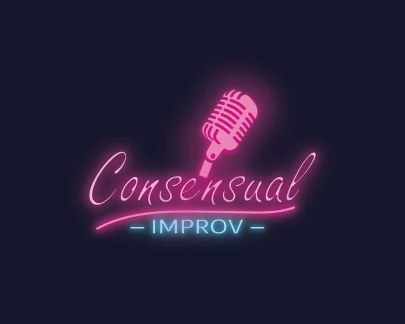
For this entry, the designer went down the retro path. The lettering is still in electric colors (blue and pink), but the cursive is like what you might have found decades ago outside of a jazz club. The image of the microphone helps to convey what the client is all about and this logo stood out because it was different than many of the other logo design entries.

This entry may not have been the winner, but it stands out for its refreshing take on the client’s logo. This design feels current with the coloring and use of the emoji. While the colors may not be “electric,” they complement each other nicely. The designer was intentional with every detail of the design. The client’s name sits in a word bubble, signifying that improv is all about talking, and the word “funny” in the client’s tagline is the same yellow color as other components of the design.

This design resembles the coloring of some reputable comedy clubs that already exist, but with new stylistic features. The designer played around with the lettering to incorporate different symbols for the “C” and “e,” and the word “Improv” is written in an entirely different lettering. The simplicity of this logo would allow for it to be versatile across a variety of marketing mediums, which is what the client wanted.

This entry stands out because it looks drastically different than many other entries. The two colors used for the design tie back to what the client asked for – essentially bright colors that pop. The designer incorporated a microphone into the letter “O” helping to convey to viewers of the logo what “Consensual Improv” is. The lettering is a bold font that stands out and the two circles that enclose the client’s name resemble an element of Comedy Central’s logo, helping to signify that this brand is all about comedy.

While not the contest winner, this logo design immediately gets us to think about “Rated R” comedy – which is exactly what improv often is. The designer opted to include the company tagline, but the designer failed to include any colors beyond white and black. While this logo stands out due to its simplicity, ultimately the client was looking for more coloring.

This entry was one of the few entries that included more than just two, electric colors. This designer opted to include pink, blue, and yellow as part of the design. Like with other designs, this designer also elected to use a font that resembled a light-up neon sign. Because of that, it’s easy to picture this logo on a sign outside, as well as across other marketing channels. This logo is also unique because it breaks up the word “Consensual” into three lines and the logo design is more circular, rather than horizontal.

This designer attempted to include all the elements outlined in the creative brief into one logo design. This design also included three colors – green, pink, and blue. Blue is the primary color, and the designer incorporated a “microphone” as part of the lettering. The designer played around with different fonts and enclosed the entire design in pink, horizontal lines. This logo has a lot going on, but it did pay attention to the creative brief and provided the client with a different take on what they were looking for.
The Winning Design

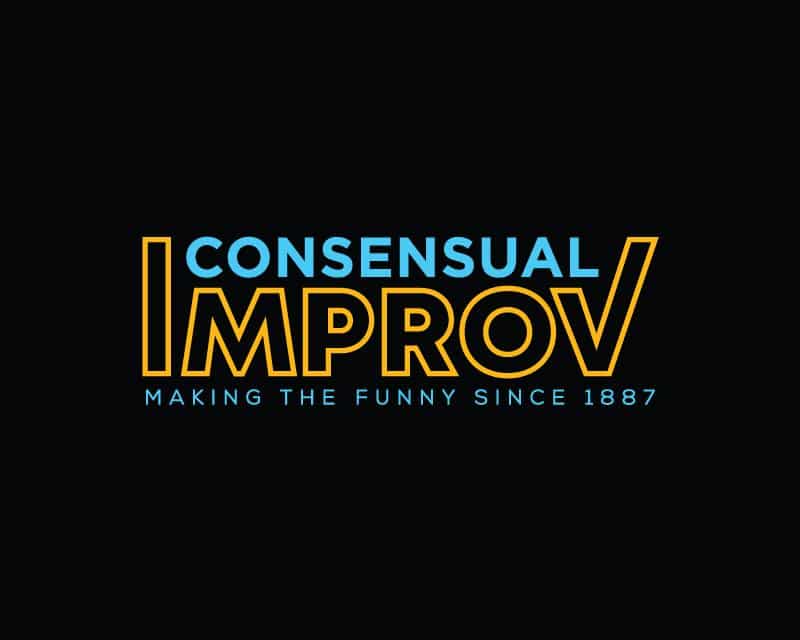
After receiving hundreds of entries, Consensual Improv decided on this design as the winner, and the designer was awarded $230. The designer had a dialogue with the client and mocked up this logo on different background colors and mediums. What made this logo design stand out was how powerful and eye-catching it was, with simple features. The “I” and V” of “Improv” frame the lettering in “Consensual” and both colors are bright and pop. The use of electric blue allows those who have been loyal to the brand to still associate this new logo with the brand they know and love. The designer also incorporated the tagline into this design in a way that made sense.
This winning design was everything the client was looking for and Consensual Improv can now use this logo wherever they choose!
Check out other Logo Design contests:
Fresh Princes Of Gotham – A club volleyball team name. Needing a design for a shirt back and front. The team name is inspired by “Fresh Prince of Bel-air” .
As I See It (Podcast) – Dr. Jeff Kegarise is a leader in the eye care industry and is launching this podcast to offer patients more education and to discuss the patient experience. He needs a new logo for his podcast.
Citrine Build Group – A general contractor in San Diego California. They focus on high-end new home construction and super custom remodels $500k US up to $5,000,00 US. They are a design-build in-house company that helps its customers with the complete process from start to finish.
Dawes & Co Decatur – Home builders, real estate agents. Buy and flip homes, build homes and assist clients in buying/selling homes. Looking for a logo for this business.
Glamping Unplugged– A glamping (glamorous camping) campground. They feature high-end $30K geodesic Dome tents on a creek in North Carolina. Their target audience is hipsters and campers and families and dogs.
- Kayla Ferria
- January 23, 2023

