News and inspiration for entrepreneurs and creatives, plus updates on new developments at Hatchwise.
Home / Blog Posts / Featured Design Contest: On The Low Towing – Tow Truck Company Logo
Hatchwise is #1 in Creative Custom Logo Design and Eyecatching Marketing Material Design.

Featured Design Contest: On The Low Towing – Tow Truck Company Logo
Creating a custom logo is no easy undertaking. That’s why many companies decide to partner with Hatchwise. When a client works with Hatchwise, they are leaving all the creative work to a team of creatives from all around the world. Once a client fills out a creative brief, their contest can start. All the clients will be required to do is choose which design they want to move forward with. Sounds easy enough, right?
One of Hatchwise’s many clients is On The Low Towing (OTL). OTL came to Hatchwise in hopes of finding its brand’s visual identity through a logo. By the time their contest was done, that’s exactly what they had.
OTL received a range of logos with different styles, font choices, images, color choices, and more. Learn more about their experience with Hatchwise below.
What Was Requested
OTL was on the hunt for a logo that would capture the attention of potential customers early. OTL’s target audience includes anyone who needs a car towed and the company was happy to use its shortened company name, OTL, if that made the logo more visually appealing. OTL’s criteria were broad and only focused on a color scheme of black, blue, red, grey, and/or white.
As OTL reviewed the logo designs, the company kept in mind that they were looking for a logo that would be versatile across their online channels (website, Facebook, etc.), as well as their print materials (business cards, letterheads, brochures, etc.). The client also noted that they appreciate a graffiti-style font and encouraged creatives to push the envelope with their designs.
The Hatchwise creative team got to work on this contest right away and provided countless designs for OTL to choose from. You can check out the top entries for this contest (and see the winning design OTL went with) below.
A Few Entry Comparisons

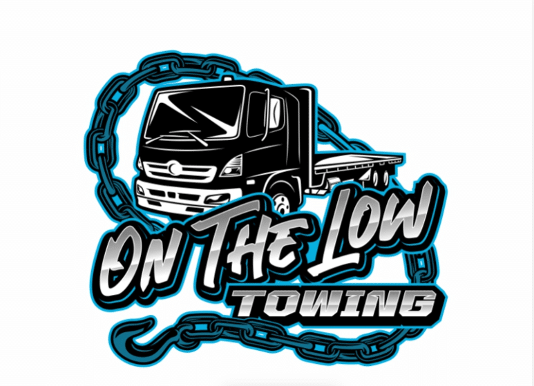
This entry may not have been the winning entry, but it was a close contender. This creative incorporated the color scheme OTL asked for and created an image that directly ties into the brand. With any great logo design, you want the design to be a taste of the business, which is what this logo does. As you can see, this logo not only includes the company name in a bold font, but it also includes a car on a tow truck, and the entire logo is framed with a tire chain.

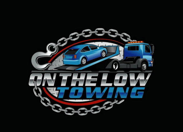
While this entry incorporated many of the requested colors, it failed to include any red components like the first example. This logo has playful features with the font choice and animated chain that circles the tow truck. Instead of including a car being loaded onto the truck, this logo relies on making the tow truck the focal point.

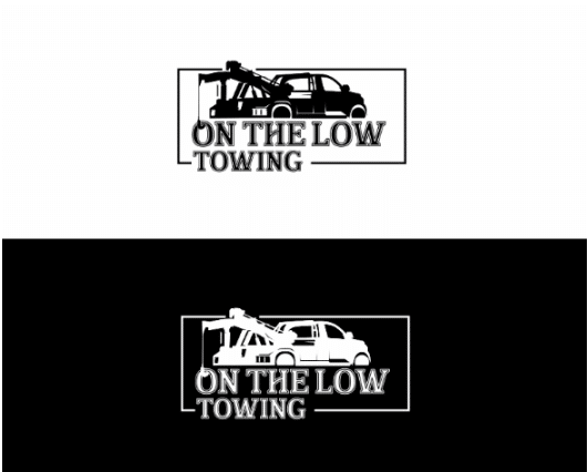
This custom logo design has a more professional tone. By sticking to only black and white, this design is versatile no matter the medium it is being printed on. The simplicity of this logo helps make this design stand out. With the choice of either using a black or white background, these classic design elements forego any trendy colors or design features. As a result, this design will likely stand the test of time.

After the client provided feedback that the brief was only an outline and that creatives could step outside the box with different colors, this design was submitted. This custom logo design stands out because it is unlike the other submissions. The design is incredibly versatile and could easily be printed on stickers, hats, t-shirts, websites, and more. The blue and green coloring is a nice contrast to the orange and the font choice stands out, making the company name easily identifiable.

This entry incorporated some of the colors the client requested, but how it used the client’s company name is where this logo design stands out. Instead of placing the lettering below or above the tow truck like many other designs, this creative opted to use the words to make the shape of the tow truck. While the chain helps to provide a border to the design, it is also an intentional design element, as it connects to the tow truck.

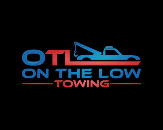
This custom logo design incorporates less playful elements and focuses on professional, classic features. With the use of lines and a bold, serif font, the logo incorporates the colors the client requested and includes both the shortened company name, the full company name, and a tow truck image.

What causes this logo design to stand out is the absence of a tow truck. Instead of using a tow truck to capture the company’s purpose, the creative used tire chains, and the font. The bold, graffiti-like font, and color choices, are what the client requested, and the logo can be applied to any medium, on a variety of color backgrounds.

Unlike other creatives, this creative opted to use a color that wasn’t initially included in the brief. By using different shades of orange, the client was able to see how the logo would pop with other dominant colors. This creative incorporated all the key features of the brand and created a logo that caught the client’s attention.

While at first glance this logo design looks like a classic design, this creative crafted a custom logo design that is much more complex. The creative provided the design with three different background colors, which were all colors that the client suggested. The company name is incorporated into the tow truck design and the use of the truck helps to give customers a great first impression of what the company does.
The Winning Design

The client received a total of 141 entries and after reviewing each entry, OTL ultimately rewarded this design as the winning design and awarded the creative $360.00.
What made this design stand out was the thoughtful use of colors and the graffiti-inspired font choice that the client liked. Instead of over-complicating the logo with too many features, the designer decided to focus on three colors that complemented each other.
This final design is incredibly versatile and is now the face of OTL.
- Rosie
- October 3, 2022

