


Hatchwise is an amazing smorgasbord of global talent, all of whom strive to deliver amazing results for our clients. So, we always get a tingle of goosebumps when a new design contest starts! It’s a lot of fun to see the incredibly creative entries roll in.
Let’s take a look at a recent contest for an upscale picnic catering and event planning company. This is a very niche industry and it needed a fantastic logo to get customers’ mouths watering. Our designers were eager to whip up a delicious logo! Read on to see the entries we thought were most enticing … and which one took the cake.
What Was Requested
Boujee Picnic LLC wanted a logo for their company, which curates luxury picnics for date nights, celebrations, etc. They requested that the design ” incorporate the traditional picnic basket but make it “Boujee”!” (In case you’re not hip on the lingo, “boujee” is short for bourgeois, meaning one with refined tastes. So, the logo needed to be elegant and classy but still express the rustic charm of a picnic.
A Few Mouthwatering Entries
This cute logo design features a whimsically fancy font for the brand name, which is centered within a traditional picnic basket illustration. We love that the final “e” weaves seamlessly into the basket shape. Rather than drawing the full wicker pattern, the designer subtly suggests the texture. These symbols counterbalance the sweeping typeface on the diagonal. On the other, a tidy yet fun typeface shows the remainder of the business name. Overall, we appreciate the clean details and dynamic, flirty aesthetic.
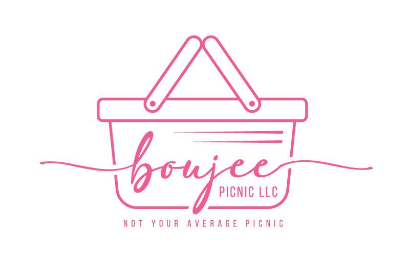
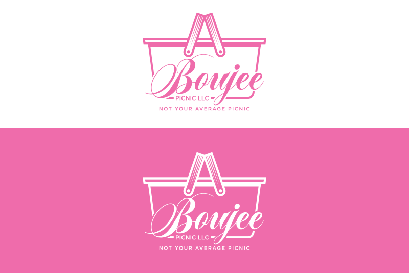
We love the minimalist approach to this logo. The vivacious pink hue makes it eye-catching, and we love how the “B” doubles as one end of the basket. The typeface is a fancy yet legible cursive. The designer wisely balances this font with a simple, friendly sans-serif for the rest of the brand name, as well as the tagline. We also appreciate that the basket’s lid is slightly open, giving the design a dynamic shape without being cluttered.

It can be difficult to incorporate multiple text and illustrative elements into a cohesive logo design, but this designer has mastered it. The two colors complement each other well. We love the pink basket hanging off the final “e.” The illustration itself is vibrant and detailed, but not too overwhelming.
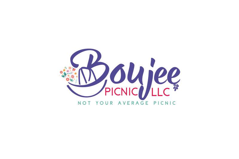
The overall typography is visually pleasing. The main brand name appears in a sophisticated cursive typeface that’s well balanced by the thin serif. Finally, the tagline tucks neatly into the overall design, unified by the dramatic leg of the “j.”
Here’s another design in which the letters flow into the picnic basket illustration. This perfectly illustrates that this picnic is fancy and luxurious! We appreciate the minimalist “mod” style of the images. The swirl adds a bit of flirtiness for this brand that specializes in date nights.
Logo Design Entry #2743554 by dibbofficial
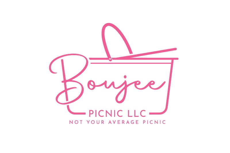
This simple yet elegant logo design features a lovely script typeface centered within a minimalist picnic-basket shape. We love that the “B” and the “e” flow beyond the main illustration. Two parallel lines suggest a forward-thinking approach to catering while perfectly balancing the dramatic “B.”
The client requested feminine colors, so most designers unsurprisingly chose pink. We appreciate that this design uses a range of colors without being overwhelming. The main brand name appears in a sophisticated indigo hue, balanced by wine-red and soothing turquoise. The overall palette evokes the pleasure of dining outdoors amidst nature. We also like that the body of the “B” forms a picnic basket.
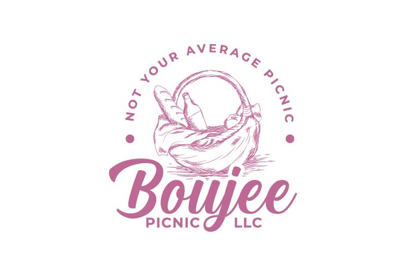
Picnics are typically handmade, and this logo design honors that tradition while looking “boujee.” We appreciate the beautiful line drawing of a picnic basket filled with goodies. A bold script typeface balances the fine lines of the illustration. The remaining text is an eye-pleasing sans-serif. The tagline forms a clean semicircle around the basket, creating a unified appearance.

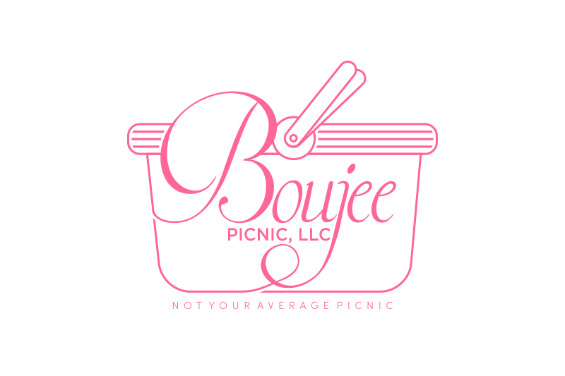
This sophisticated design depicts a more abstract picnic basket, partly formed by a decorative flourish that intersects with the “B.” We love the angled view of the handles that creates a heart-like shape! The brand name appears in an elegant serif typeface, slightly curved across the main horizontal. These features make the logo dynamic but not too wild and crazy. After all, Boujee Picnic LLC specializes in luxury.

Here’s another twist on the typeface-turned-basket approach to this logo. We love how the brand name forms the bottom of the basket. The “B” and “e” flow upward into a cornucopia of goodies. It’s a luscious-looking design that balances detailed illustration with a fun-yet-elegant typeface.
Logo Design Entry #2743663 by ENVIRON
This logo design renders the word “Boujee” in a stunning script typeface, framed by a traditional picnic basket illustration. Typographic flourishes draw attention to the remainder of the name that’s tucked neatly into the basket’s bottom. We appreciate that the main illustration features more detail at the top to counterbalance the typographic work.
And the Winner Is…

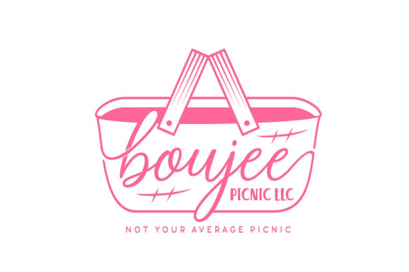
After reviewing 123 entries from 52 designers, Boujee Picnic LLC selected this logo design, which won a $150 prize.
This cute logo design makes great use of diagonals, from the angled brand name to the raised lid. This gives the logo a dynamic, elevated feel that evokes both luxury and adventure. We love the adorable napkin draped over the edge, as well as the flirty typeface flowing into the basket shape. It encompasses everything the client wanted to express: indulgence, comfort, class, and fun!