News and inspiration for entrepreneurs and creatives, plus updates on new developments at Hatchwise.
Home / Blog Posts / Featured Design Contest: Baby Luna Luna – YouTube Logo
Hatchwise is #1 in Creative Custom Logo Design and Eyecatching Marketing Material Design.

Featured Design Contest: Baby Luna Luna – YouTube Logo
Today’s featured contest is for Hatchwise client dawnvv. They wanted a logo for their YouTube channel, where they post videos related to all things baby. Their target audience is women between the ages of 25 and 45.
They were very specific about what they were looking for in a design, so they got many different concepts with a similar look, but each with its own special twist. This is a great example of a contest that a client can create for as little as $50.
The client offered a prize of $50 and received a total of 69 entries.
What the Client Asked For
In the design brief, our client requested a navy blue background with “BabyLunaLuna” written in gold. They also asked for a crescent or full moon to be included in the design. Even with these fairly specific parameters, they still received a variety of different concepts to choose from.
The final logo will be used on their website, business cards, and merchandise.

#10
This first design is a creative one. It has a lot of components but still has a very simple appearance, with only blue and gold being the color scheme just like the client asked for.
The designer has also included a baby sitting on a crescent moon and touching a star. The baby appears to have found a shooting star which wraps itself around the moon.

#9
This next design fits very well with the client’s requests. The designer has decided to add a face to the moon which is something that we don’t see in any other designs. The face looks calm, which gives the whole image a peaceful look.

#8
This one has a little bit of a different look than the ones we’ve seen so far. The image shows the same design but in two different color schemes, so that we can see the logo in more than one way. The design on top has blue, gold and white colors, with flowy lettering. It is all outlined with a circle and stars as well as the crescent moon that keeps popping up in these designs. The concept on the bottom is the same as the first but with a gold, black and white color scheme. There is also a smiley face on the right side of the letters, which makes the design look cheerful and fun.

#7
Here is another silhouette, but this time the baby image exists within the negative space of the color scheme. The child appears to reach for the stars, with crescent moons and clouds adding to the whimsical feel of the whole image. There is a sense of quiet wonder in this design.

#6
This design has a lot going on so let’s get into it. The background is a dark blue color that fades into the white circle in the middle as clouds and stars. There is a baby sleeping peacefully in the circle, right above the gold font. Not only is this design a good one, but it also evokes a sense of calm and relaxation.

#5
This is the only submission by the designers that contained a mother and child. The image of the mother seems to rise up out of the letters of the word ‘baby’,and the moon surrounds everyone with its light. There is a sense of movement in this picture, both in the people and in the motion of the flowing script. Altogether a lovely design concept.

#4
This concept is quite possibly the exact opposite of the one featured above, and yet it would work equally well for what the client needs. The font is blocky rather than flowy, and the icon is centered symmetrically above the text, which makes it ideal for merchandise labels or stickers. The images are drawn with well-defined, heavy lines, but the image itself is soft and peaceful.

#3
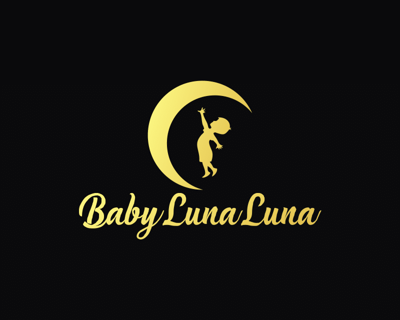
This design is a bit different from the others; the image shows a child stretching up to reach for the moon.The color scheme of this design is bold. The black background contrasting with the yellow image and lettering makes the image appear to be glowing.

#2
A slice of a realistically pockmarked moon sets this design apart from the rest. Even so, all the elements are contained within a circle, even if we can’t see the boundary of it. Is a baby cradled inside the moon? That seems to be what the designer is implying.
And the winner is…..

#1
The winning design was submitted by Hatchwise creative Deki, who collected the $50 prize. The design features a simple black and silver color scheme with a subtle gradient. A stylized image of a child sleeps peacefully inside the cradling shelter of a silver crescent moon. A single star shines down from above.
This design contest is another fantastic example of how even a small budget can get some really great design choices. If you’re curious to see the whole contest with all 69 entries, visit it here.
- Katie
- September 19, 2022

