


At Hatchwise we love our jobs and we especially love the part where we get to see so many talented individuals submitting entries to contests. We love seeing the entries for all the contests that are run at Hatchwise but logo contests in particular always catch our gaze and intrigue us. Not only do we love getting the opportunity to see all the entries submitted and the result but we especially love when we’re able to share these entries with you. If you love getting to see a high-quality logo design as much as we do then you’re in the right place because we’ve chosen a few of our favorites to share with you. Keep on reading to learn about the contest, the client, the entries submitted, and the winning entry!
What Was Requested
When first starting the contest the client initiated the process by filling out a contest brief where they clearly stated what they were looking for and gave some information about their company. This helps our Hatchwise creatives to be able to gain the knowledge that they need to create concepts by knowing what the client is looking for and what their brand personality is. For this contest, the client said, “Coppola Wellness is an educational and coaching platform to help individuals prevent chronic illness.”
The Entries Submitted

This first entry shows the company name in green and blue with a design above the letter ‘C’. The design above is shown in the same green and blue as the letters on a crisp white background. The design keeps it simple while also having meaning and using unique color choices.

This second design opts to go in a different direction with the color choices that they use by choosing purple and grey for the design. This design shows the company name in grey and purple underneath a flower design. Half of the company name and the flower are both in purple while the second part of the name is in grey with the entire design on a clean white background.
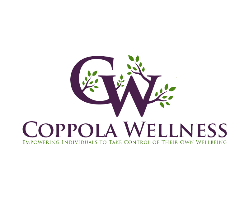
This next design opts to use dark purple and light green on a white background for the design, with the purple color choice standing out in comparison to the other color choices. This design has a few more features, making the company name in large letters and bold font with the company slogan below it. Above that is the name initials and we see tree leaves coming out of the letters, adding a unique and individual look to the design.

The next design shows two different options, one with a white background and one with a purple background. The logo itself shows a circle design with a ‘W’ inside and below it we see the company name with the slogan in smaller letters below it. The font is clear and direct, drawing attention to both the name and making sure that the design stands out as symbolic.

This last entry has more details than the previous ones but still keeps the same concept idea as the other entries. It shows the company name in purple and green with a design above using the initials in the same colors. The design is shown on a white background, creating a clean and minimalistic design that shows what the company does while also being unique.
The Result

After looking through all the entries submitted to the contest and deciding what would work for their business, the client settled on a winning entry to use as their new logo. The winning entry is shown above and features a simplistic and clean design.
The logo shows the company name below a design that features a circle with the name initials inside. The colors used are purple and a natural green on a white background. The concept is clean and classy while expressing what the company does.