


Recently there was a logo contest run for a client and it caught our attention almost immediately. We were fascinated with all the entries that were submitted by our talented Hatchwise creatives and wanted to share them with our readers. We can’t resist sharing excellent contests when we see them and this contest had a variety of unique and individually artistic designs that stood out to us. We went through and selected our favorite entries from the contest as well as some information on what the client was looking for and the result that they received.
What Was Requested
To start the process for the contest the client filled out a contest brief describing their company and what they were looking for. When describing what they were looking for the client said the following, “We bought an 11 acre farm with an old dairy barn we are restoring to keep horses in. We will have cows and homestead the land. The perimeter of the property is done in rock walls and we live in cross street .” Hatchwise creatives took a look at the contest brief to see what the client was looking for before they got to work on the concepts to submit to the contest.
The Entries Submitted

This first logo entry has the classic colors of red and green for the logo on a white background. There’s a setting at the top of the design and we see the company name shown in big letters in the middle of the design. The letters are shown in red and green and there’s a black border that encases the entire design.

The second design is similar to the first, showing a farm setting with a black and white border. The farm name is shown in big black letters on a white background with the setting above it. The setting shows a barn with green grass in front, stones on either side, and a blue sky with a few scattered trees. The design appears cozy and welcoming, holding value to the company and what it stands for.

This creative goes in a different direction with the color choice, opting to go with a couple of different shades of green on a white background. The creative decided to use both light and dark green with the company name being the main part of the design and a circle above it. Inside the circle, we see fields, mountains, a barn, and a cow while the company name is in a clean and thin font that stands out.

The next concept uses both green and dark grey with a clean white background. The company name is shown in the center of the design here and uses two different colors for the concept. The design uses a circle by showing a plant circling above the top part of the design where we see a barn, a road, and mountains. Fields are shown at the bottom of the design in dark grey, standing out and bringing a unique look to the concept.
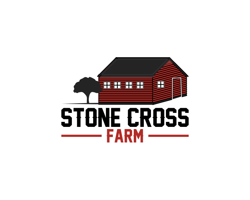
The last entry here uses a dark red and black for the entry and the concept is shown on a white background. This design stands out for the darker colors used and the impression that it makes at a simple glance. The concept includes a tree, putting equal emphasis on both the design and the company name shown in a fun font below it. By using only a few colors and keeping the design to a minimum the logo easily gets the intention across without confusing viewers.
The Result

The client proceeded to look through all the entries that our Hatchwise creatives submitted and rated them before they chose the winning entry.
The winning entry is shown above and features a circle with a farm setting inside. We see a red barn with a neon green door and to the right and left we see grey stones. Across the circle, there’s a ribbon with the company name inside with the letters in the same red and neon green for the ribbon.
The logo is clean and simple while also conveying what the logo is for and using a variety of features and colors.
Check out other Farm Design contests:
The Farm…And Beyond – A small farm (3 acres) with chickens, alpaca, lemon trees, and grown fruit, veggies, herbs, etc. Potentially going to set up a shop (online and for markets) to sell things such as jams, marmalade, pickles, pottery, and basket weaving.
Moonlight Farms – The company is a farmhouse wedding venue & campus (animals, barns). They offer twilight and moonlight weddings. The feel of the company is very natural, outdoorsy, and farmlike.
Nutrient Dense Farm – An aspiring Biodynamic farm grown from the heart of universal love.
Root Cause Farm – A small urban organic farm selling fruits and vegetables to the neighborhood near the farm. The farm aims to make healthy, affordable food available to the local community, ultimately improving the health of local residents and building a community around the farm.
Stevens Family Farm – A small market gardening farm serving a local community.