


As we were looking through the site recently we came across an intriguing contest that caught our eye and we knew right away that it would receive some pretty creative entries. The client was looking for a new logo and Hatchwise creatives were happy to deliver spectacular results as they came out with new concepts. We were surprised at the amazing concepts that the contest received and instantly knew that we wanted to share our favorites. For this blog post, we’ve gone through and collected our top entries submitted to the contest to share with our readers.
In this blog post, we’ll go over what the client requested for this contest, the entries that were submitted, and lastly, we’ll also look at the result that was chosen as the winning design.
What Was Requested
To start, Hatchwise creatives read over the contest brief that the client filled out to get an idea of what the client was looking for. The client described their business as “An exclusive, physician-only coaching program designed to help empower physicians who struggle with their weight, stress and binge eating, and feeling overwhelmed.”
When asked what they were looking for the client said they “Would like versions of the logo with and without the slogan (Lose Weight & Love Your Life); would like the logo to feel feminine, empowering, and positive.”
The creatives reviewed the contest brief before they got to work on their design concepts to submit to the contest.
Entries Submitted

This first entry uses three different colors to show the company and embrace the concept. Here we see a cool blue and red on a white background used to express the company. We see the company name below a circle where two hands are shown with a heart above them, incorporating a heart and conveying what the company does.
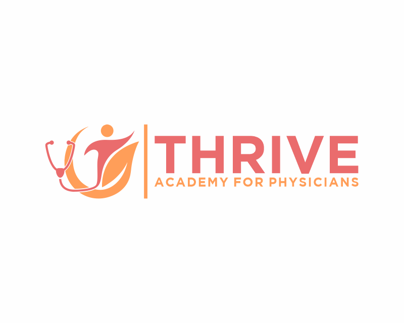
For this second concept submitted by Hatchwise creatives, we see more focus on the name and less focus on the design. We see a small design to the left of the company name that shows a stethoscope and connects it with a figure of a person. The whole design is shown in red and orange on a white background. This concept does an excellent job of displaying what the company does while also giving attention to the company name.

In the next concept, we see a unique change in the font; this time the creative opts to use an elegant cursive font for the first letter of the company name. A stethoscope is tied into the name by coming off the end of the ‘T’. At the end of the name, we see a figure in blue while the remaining letters are shown in the classic red and blue colors of the company. At the bottom of the design in smaller letters, the company slogan is included in cursive.

In this concept, the creative provides the client with two different options for the same design. Both options make the company name the star of the logo in bold letters and to the left of the name is a stethoscope with leaves tied in to show health and wellness for the company. On the top design, the slogan is included in the name while below it there is shown a cleaner option without the slogan included. Both examples are shown on a crisp white background and the colors include blue and red.

This last option shows the first letter of the company name in cursive and emphasizes it. We see the first letter shown in big letters and a unique font and beside it, there’s a stethoscope shown in blue. The rest of the company name is shown in blue the same as the stethoscope on a white background. The design is simple and clean while embracing a minimalistic look and effectively displaying what the company does.
The Result
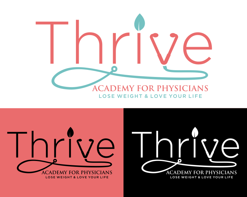
After the client looked at all the entries submitted and rated them they finally settled on a winning entry to use as their new logo for their company. The winning entry is shown above and was submitted by Hatchwise creative, Marsell.
The creative showed the client three different color options for the concept, including a white background, red background, and black background. We’re always thrilled when clients receive results that they love and use!