News and inspiration for entrepreneurs and creatives, plus updates on new developments at Hatchwise.
Home / Blog Posts / Featured Design Contest: Brew Tour – Biker Patch Design
Hatchwise is #1 in Creative Custom Logo Design and Eyecatching Marketing Material Design.

Featured Design Contest: Brew Tour – Biker Patch Design
This graphic design contest caught our attention when we were browsing the website and we thought that our readers might find it as fascinating as we do. This contest received a vast number of entries, all unique and stylish. If you’re curious about what these entries were and what the winning entry was, check out the blog post below where we share all the details. We take a look at what the client requested in the creative brief when they filled it out as well as a few of our favorite entries from creatives and of course, the winning entry submitted. Getting to see the contests run and especially the design that the client received at the end is always the highlight of our day!
What Was Requested
The client started their process by filling out a contest brief where they described what they were looking for and a little bit about their company. They gave the creatives an idea of what concept they were looking for with the contest and also gave them some information about the event. The creatives reviewed the brief to understand the contest and what the client was requesting for their event.
In the brief the client said the design should have the following, “looking for a patch/ like on a bikers jacket/ that will be used on T-shirts/ marketing/ etc; I have a basic design that we want you to capture the vision ; enhance, and run with the creative’.” They also provided some information on the target audience and the event that the contest was for.
The Entries Submitted

This first entry shows a detailed dark grey symbol on a white background. The letters for the event are at the bottom of a circle, in which there’s a scene shown. Inside the circle, there are cars, a motorcycle, and a concert set. Inside the outer rim of the circle are stars and there’s a small design on the very outer edge of it.

This creative opted to use a few different colors in their design, the main colors being the following; red, white, blue, and gold. The design is festive and artistic and the colors make it pop. The design concept clearly shows what the event is about while also having unique details that stand out.

This third entry uses a red design on a white background, opting to use only two colors for the design. This entry shows a circle with red in the outer ring and the center circle are two beers with ‘22’ inside them. The words ‘22 No More Brew Tour’ in the middle circle and stars in the outer circle.

The creative opted to show their entry in two different versions, one in black and white and the other in red, white, and blue. The design shows a circle with wings coming off either side. The wings are blue while the center circle is red and the outer is blue. Inside the circle are two glasses of beer, stars, and the words “Brew Tour”. This gives the client two different design colors and shows them both on a white background.

This design concept shows a blue and red design on a white background. The font used for the wording is unique and adds an interesting touch to the design. The circle has a design around it and in the center, there’s a setting with cars, a motorcycle, and a concert scene. The design is shown on a white background and the unique font plays a part in creating a design with personality.

This entry takes on a different appearance than the previous one, using a badge for the base of the design. The badge is red with an outer gold line and an even further blue line. At the bottom, the design says ‘Brew Tour’ and there are two glasses of beer in the middle of the badge. The design is unique and the multiple colors tie together to create an appealing and creative concept.

Then we see another entry that includes three colors on a white background. The design includes blue, black, and red. The design shows two glasses of beer inside a circle with wings coming off the sides of the circle. The letters are above and below the symbol in red and there’s a large star in the center of the circle.

Here we see a fun entry that opts to include bright colors on a white background. This embraces the purpose of the design, showing two blue and white mugs in the center of two red wings. There’s a badge in the center of the design with motorcycle handles coming out. The next is in red and white, standing out in contrast to the white and blue used in other aspects of the design. The design comes together nicely and uses a brighter red than the previous designs.

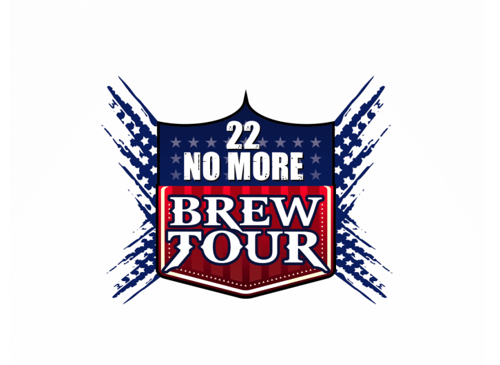
This creative opted to take their entry in a different direction, incorporating red, white, and blue into their design. The design is on a white background and we see stars coming out of the edge. In the center is a design with a red and blue badge on it, stars, and white letters. The design is unique and has personality, creating a complete and bright design.

This entry uses the classic colors of red, white, and blue. It shows a circle with two beers in the center and the letters inside of the first circle. The design shows critical elements of the event and ties in all areas to create a beautiful and simplistic design. The white letters stand out against the blue and red colors used in the design and there’s a blue outline on the very edge of the design. This design is shown on a white background.
The Result

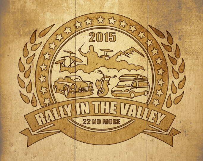
After reviewing all the entries submitted to the contest, the client chose the design above as the winning entry. This entry is unique and is shown in a light brown. The design is creative and does an excellent job of telling what the event is about. The design almost appears vintage and has a unique touch to it that stands out. We love when a client received the perfect result for their business and this one was submitted by Hatchwise creative nusantara!
- Mosi A.
- February 5, 2022

