News and inspiration for entrepreneurs and creatives, plus updates on new developments at Hatchwise.
Home / Blog Posts / Featured Design Contest: Launch Lobster – Start-Up Logo
Hatchwise is #1 in Creative Custom Logo Design and Eyecatching Marketing Material Design.

Featured Design Contest: Launch Lobster – Start-Up Logo
We see a variety of contests run every week on our site and we can’t resist taking a look at all the amazing entries that are being submitted. Every once in a while we’ll go through and check out what was requested for the contest, what entries our creatives submitted to the contest, and lastly, the result for the contest. Not only do the contests range in what’s requested and the businesses that use our services, but the entries in the contests are always unique and exciting to see. When we were taking a look through contests, this logo design contest caught our attention.
We took one glance at the entries and instantly knew that we had to share with our readers! Let’s take a dive into what was requested and the entries that were submitted to the contest!
What Was Requested
The client started the process by filling out a contest brief describing what they were looking for and giving some information on their business. They said they were looking for a logo to set their brand and that it should be fun and creative. To tie in the name, they wanted a lobster included in the logo. They wanted the color red to be included in the logo, as well as colors pulled from their website design. They wanted the logo to inspire entrepreneurs to launch their businesses with them. Hatchwise creatives made sure to look over the request and thoroughly review the brief before they started creating their entries!
The Entries Submitted

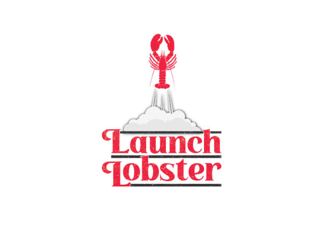
This first entry shows a lobster being launched towards the sky. We see the color red being used for both the lobster that’s shooting up towards the sky and the letters used for the company name. The letters are sparkling slightly and the puff of smoke above it is in white. The logo is simple while also adding to the company name.

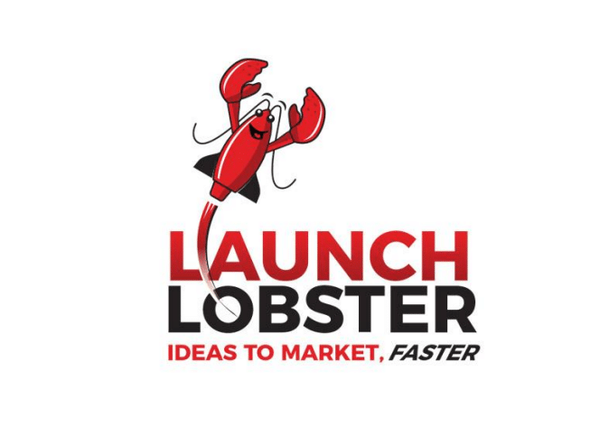
This entry shows a cartoon lobster smiling as it shoots above the company name. The words are red and black, the same as the lobster. The lobster has personality and is smiling. This concept includes a lobster while playing on the company name while still keeping the logo looking professional.

This logo entry pays more attention to the name than it does the lobster, making the company name the center of the logo. We see bold letters, the top word in red and the bottom in black. The company’s slogan is below it, also in red and black letters. The logo also includes a cartoon lobster shooting upwards to the left of the words. The entire logo is encased in a thin black rectangle.

The main colors used for this logo entry are white and red. The company name is shown in red to the left of the symbol. The symbol shows a spaceship going around the world and a second circle around that one. The logo is all red except for the background which is white.

This logo entry is different from the others listed, opting to focus mainly on the wordmark for the logo. The top of the name is in bold black letters while the bottom part is in thin red letters. The letters are bold and put emphasis on the company name. To the left, we see a cartoon lobster image. This image shows a spaceship with a lobster incorporated into it shooting towards the sky. The logo is unique and simplistic while still incorporating a detailed symbol.

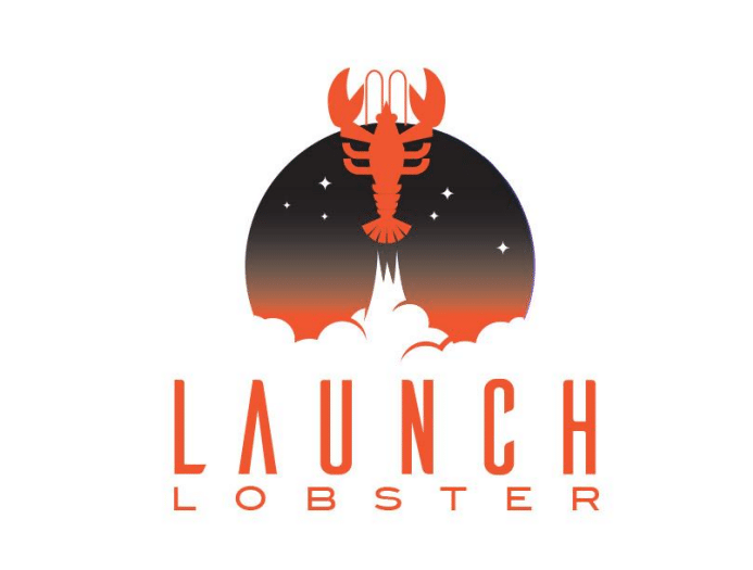
This entry uses black, red, and white for the logo concept. This concept is interesting, showing a lobster in the center seemingly in space, with stars around it. The lobster is the center of the design and is encased in a circle. A larger circle is around the entire design and on the inside is the company name and slogan. The lobster is red and stands out against the black background. While the company name is in bold black letters, the slogan is in smaller letters below it.

This logo entry is simple and unique. It shows the company name to the right of a spaceship lobster. While the spaceship is in red, the company name towards the right is in black letters. The company’s slogan is shown below the image in smaller black letters. The colors for this entry are simple and make an impact when you first see it.

This logo entry takes a different approach to the contest and opts to use a different shade of red. The two colors used in this logo are bright red and bold black. The logo is minimalistic, merely using a symbol and a wordmark. The symbol is simply a lobster claw, with half in red and the other half in black. Below the symbol is the wordmark in big letters with the first word in red and the second in black.

This logo entry shows a cartoon lobster in red shooting above the company name. The name is in black and the same red as the lobster. The company slogan is shown below in grey and the red stands out. This plays on the company name and includes a touch of color that makes the image pop. This entry is fun and creative while keeping the idea simplistic and able to be used in a variety of circumstances.

This entry embraces the company name, showing a lobster shooting off towards space with a wordmark below it. The wordmark is in red and the first letter is larger than the second. Above it, along with the lobster, we see smoke and a star setting. This logo entry is more detailed than the others shown and shows a setting above the company name. The logo is detailed and elegant.
The Result

After reviewing the entries submitted to the contest and rating them, the client finally choose their winning entry that they would use as their new logo.
The winning entry is shown above and was submitted by Hatchwise creative Jart. The entry features a cartoon lobster shooting above the company name. Below the name that’s shown in red and black is the company’s slogan in red. Congratulations to the winner and we’re thrilled that the client found a result they love!
- Mosi A.
- January 11, 2022

