


If there’s one thing that it’s critical your logo does not have, it’s a very close association with another very popular and well-known logo. After all, isn’t the whole point of your logo that it’s specific to your brand and stands out from others? Well, YouTube Studio doesn’t seem to think so. In fact, there are a lot of big brands that seem to forget that they don’t want their logo to be matching with another logo to the point where some people think that they may be seeing double.

(Image source: YouTube)
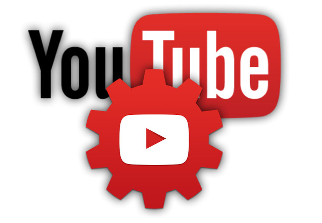
YouTube has subtly launched a new app icon that will be the new logo for YouTube Studio. The old logo, a gear design that showed a play button in the middle, has been replaced with a hexagon in red with the same familiar play button in the middle. Users were quick to notice that the change had the new logo looking very similar, almost too similar to the YouTube Music logo. In fact, they look identical.
As happens with every unsuccessful logo launch (and yes, most times successful ones as well), users have quickly taken to Twitter to show their feelings on the logo. People are sorry to see the original gears logo leave, saying that it had more of a studio concept to it, and are quick to criticize the new logo. As if the anger over the gears logo leaving wasn’t enough, there’s the drama of the logo matching the YouTube Music app icon that users are tweeting about.
Remember last year when Google decided to update their workspace logos to be confusingly similar to one another? It seems that YouTube, which is also owned by Google, is quickly following in suite of Google and users are noticing. YouTube’s suite of apps, although similar, have all been different enough that users can still tell them apart and have their own visual identity. This logo is just a little too similar to the YouTube Music logo then we’d like to see.
Users are mostly confused why the update was made to the logo since it doesn’t seem to improve the logo or benefit the company. The logo isn’t much more modern looking and it certainly doesn’t convey more of a studio look than the original logo. It’s confusing who’s calling the shots because so far the new logo hasn’t done anything besides receive hate from those that use the platform.
Although IOS users know what we’re talking about, Android users may be a tad bit confused. Android users are still seeing the original gears logo, while only IOS users are getting to see the updated hexagon logo. The logos appear very similar, with the YouTube Studio app icon being nearly identical except for it being a hexagon instead of a circle. Both have the same red and the same familiar white play button in the middle.
After being so distinct with their suite of YouTube app icons, YouTube Kids and YouTube TV both have substantially different app icons, it’s unusual for them to branch out into such a similarity between their logos. We’re already seeing jokes on Twitter about YouTube getting a touch of Google Workspace syndrome after what they did last year with their workspace suites.
All we’re saying is if you’re thinking about designing your own app icon, make sure that people don’t think they’re seeing double when they view it. And secondly, when you see the new YouTube Studio icon app, we promise you’re not going crazy, the logo is confusing everyone.