


Every once in a while we like to share contests with you that have fascinating results and creative entries. Here’s another amazing logo contest that was run for Whiskey Consortium. This contest received over eighty unique entries from our creatives and chose their final winner at the end. To learn more about this contest read below!
About The Company
Whiskey Consortium is a group of seven or eight professionals that are in the whiskey business. In the contest brief, they said they included the following details about their company: “A few craft mixologists or bartenders, few whiskey salesmen, and a few marketing and advertising managers that specialize in marketing/advertising.”
What Was Requested
They requested a new logo for their company and filled out the contest brief letting creatives know what they wanted. They wanted the logo to be centered around whiskey and wanted the logo to convey what they did to customers. They gave descriptions of what they wanted and the creatives got started on their entries!
Entries Given
There were over eighty amazing and unique entries submitted for this contest by our talented creatives! Below we’ve gathered our favorite designs from this contest, all three unique and stylish.
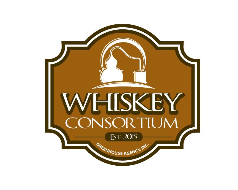
This entry uses three colors; brown, white and black to create a visually appealing design. The entry has an old, authentic look about it and gives an interesting perspective to what the client requested in their brief. The design clearly shows what they do and gives the logo character.
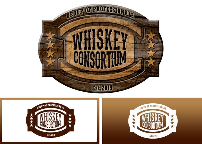
This entry stands out from the others submitted for its interesting style. The logo features the company name and a few basic colors. The logo shows a wooden background with the logo itself in front of it. This logo entry is unique for its style and characteristics.

This logo entry stands out for its blue color in use and the different colors used. The logo appears to have a blue sky with white clouds behind the upper part of the logo. The logo still has an old and authentic feel to it, while also bringing in a refreshing touch of color. This logo is one of the few entries that used any other colors in its design.
The Final Result

After reviewing all the entries submitted and rating them, the client chose a final design entry. The winning entry was submitted by Hatchwise creative Quimcey, and is pictured above. This entry included elements that the client asked for and put a unique spin on the design!