


It’s no secret that food logos can be a tricky thing since not only do they have to be professional, but it also has to draw customers in and encourage them to try the restaurant’s food. At Hatchwise, we pride ourselves on having creatives that understand the importance of a good food logo and who can create captivating logos that will do the job.
This particular logo contest saw a range of participation from creatives and logo entries that were unique and specific to the brand. We’re always thrilled to see contests where clients get creative and interesting entries to choose from and this was one of those contests.
About The Company
Fork In The Road is a new cafe and catering company that’s located in an office building in Delaware. The cafe serves homemade lunches to people in the office building, local buildings surrounding the area, and the public. The company has a sister company, ‘I Don’t Give A Fork’, that helps them with fulfilling catering orders and providing food.
What Was Requested
The client requested a new logo for their company and filled out what they would like included in it. They said that the logo should have a cohesive look that could combine both Fork In The Road and Give A Fork. The cafe basically serves all the homemade comfort food necessities, listing in their brief that they serve, ‘homemade hot and cold sandwiches, salads, burgers, and meals such as pulled pork, potatoes, veggies, etc.’
The client listed that they wanted the following included: ‘The Fork in the Road Cafe logo should be the same colors as the other logo (black, navy and orange) and include a road of some sort, a fork and if a food truck could be driving down the road or incorporated somehow that would be great but not necessary. When asked what they didn’t want to be included, the client said, ‘No comic sans or any bubbly, child-like font.’
The Entries Submitted
After submitting the contest brief, Hatchwise creatives reviewed the brief and got to work on their entries. Taking into account everything that the client requested, our creatives got busy with their designs to submit. Although all entries submitted were creative and unique, below are the three of the top entries submitted by creatives.

This creative entry stood out from the others listed for its use of colors and the difference from the other entries. Unlike the other entries that opted to use roads included in their entries for a play on the company name, this creative chose to go with a fork and the company name. The entry only uses three colors; white, purple, and orange. This is a vibrant and creative entry.
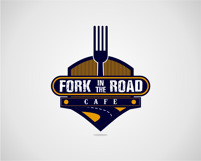
This entry has a vintage look, displaying a fork above the company name and a road. The design instantly gives you the feeling of home and contentment when you see it. The colors used are dark blue and orange with the letters in white. The vintage, granite-look has a feeling of home and almost instantly makes you thinking of a home-cooked meal.

This entry took a far turn from what other creatives chose to submit, although using similar colors, they decided to go in a different direction with the font and style of design. We can see a fork that’s dug down into a road and the company name in a circle around it. The entry has character and uses a few different colors to add depth to the design.
The Final Result

After reviewing the entries submitted and rating them, the client finally chose a winning entry for their company. The entry seen above was submitted by Hatchwise creative, Quimcey. This contest saw over 50 entries from 32 talented creatives and the client paid a total of $150 for the winning design.