


Apart from the memorable characters and eye-popping artwork of our favorite video games, we also remember iconic video game logos. Chances are their bright fonts and graphics immediately captured our imaginations well before the title screen had loaded for the first time. But what are the best gaming logos of all time? Let’s look at 10 of them, in no particular order of course.
It’s hard to comprehend how this game was released so long ago (1997), yet remains so relevant. The sprawling action-adventure genre defining series from Rockstar Games introduced us to Vice City, San Andreas and of course Liberty City. But as memorable as each edition of the games are, one constant has been this logo version which started with 2001’s Grand Theft Auto III. Iconic in its simplicity, the GTA logo retains its retro street cred. Inspired from 70’s B-grade movies and grindhouse cinema, gamers often think that it reminds them of winding streets that seemingly dead end on command, just like the game.
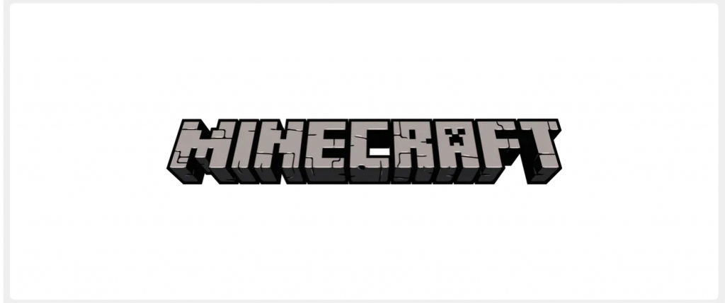
Sandbox styled Minecraft was for many of us our first foray into gaming. Undeniably educational, Minecraft is one of the greatest selling games of all time. By seemingly going against the grain with blocky retro-styled 3D-generated graphics, many would argue that its success is quite ironic. Retaining its iconic 3D blocky style, the logo of course is also reminiscent of the game environment itself. Since users create their world of Minecraft according to their journeys within the game, the logo is deliberately blank in terms of color, because it is up to the gamer themselves to design their world.
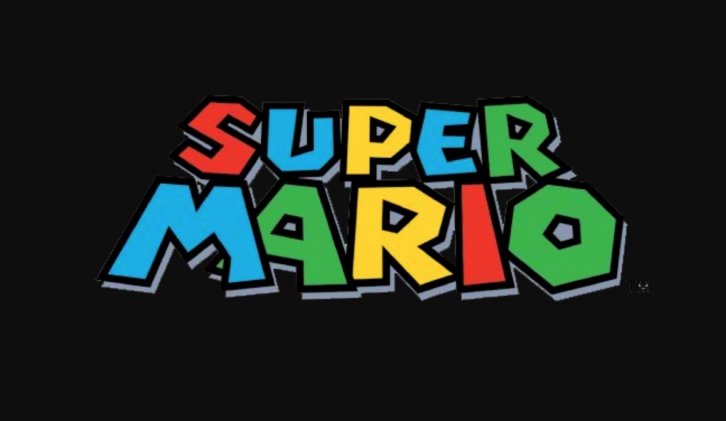
For people only remotely familiar with video gaming, even they will know the name Super Mario. Shigeru Miyamoto, Takashi Tezuka, and Nintendo’s quirky masterpiece spans generations of gamers and spawned countless spinoffs. The video game logo has evolved several times, but this version is probably its most recognized form. The chunky, colorful lettering attracts young gamers and matches well with the environments and characters in each edition.
When it comes to MMORPGs (massive multiplayer online role-playing games) World of Warcraft is the most memorable of the genre. Released in 2004, WoW let gamers immerse themselves in a medieval Arthurian-styled fantasy world complete with dragons, guilds, dwarves, and elves. Chances are you either spent some time in the world of the game or at least saw the South Park episode. The logo is self-explanatory, yet retains elements of old-world regality. Gilded and golden with a globe and map to boot, you don’t need a literature degree to understand the references here.
Arguably the most famous fighting game ever made, and definitely the most controversial, Mortal Kombat has endured countless remakes and inspired a whole universe of side stories and fanfiction. Since the beginning though, the fiery dragon logo has been attached to the franchise. Taking obvious inspiration from Hong Kong cinema, Chinese folklore and traditional Asian tattoo art, Mortal Kombat (always with a K) is recognized all over the globe.
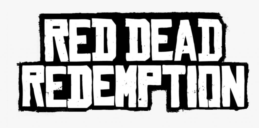
Years ago, who would have thought that one of the most popular games of all-time would be set in the American Old West? Rockstar did it again with their Red Dead Redemption games by basically taking the Grand Theft Auto formula and shoving it into a more historic (and historically accurate) setting. The games take glaringly obvious inspiration from Spaghetti Western films and Wild West folklore, as does its logo. Also, fans of Rockstar games will see the connection between the logos of GTA and RDR instantly.
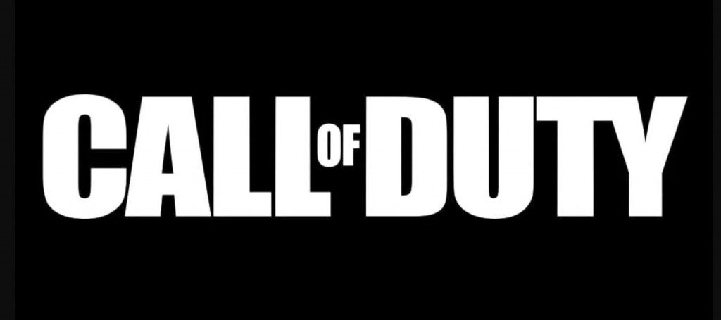
The Call of Duty franchise continues to be extremely popular despite gameplay complaints in recent editions. Fans of the first-person shooter series love the frantic action, team play and supposedly authentic military experience. The logo itself is bold and aggressive and seems to almost shout at you like a commanding officer. Styled like many logos and graphics connected to the military, it is true to form and tone. The name itself is a very recognized military rallying cry.
The early 80’s was dominated by the little yellow man, and later his wife. Kids (and adults) packed arcades to see how long they could go eating yellow pellets and evading ghosts in mazes while searching for fruits with superpowers. But the game was amazing because of its kitschy simplicity, and this started with the game’s logo. Despite variations, the one constant is the bright yellow coloring and the ‘C’ being shaped like the man himself.
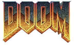
Playing this game would at times inspire feelings of doom, as players would navigate a first person shooter post-apocalyptic hellscape. The moons of Mars and Hell itself are filled with demons in need of slaughtering. The logo is iconic because it looks like Hell is literally rising up. But instead of meeting earth, Hell is encroaching on a mechanic or digitized world, representing much of the landscape and technology in the game. There’s also a maze like quality to it, again taking inspiration from the maps of the game.
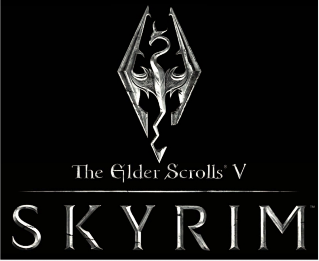
Specifically this version of the franchise, The Elder Scrolls V, it’s hard to look past the eye-catching quality of the Skyrim franchise. The hugely consuming open-world game has familiar fantasy plot lines but is stunning in its visuals. The logo conjures images of magical swords, with blades made of heavy, shiny steel that would slay dragons. The dragon logo itself is in the shape of a blade.