


The world of books is a fascinating and intriguing one, with stories from our childhood to adult books that fill up library books, all books are capable of taking us on an adventure. Book publisher logos are equally as fascinating as the books that they’re printed on. With book publisher logos you never know what to expect – logos range from penguins to candlesticks, with some colored and some not.
We’ve collected a gallery of book publisher logos for both your enjoyment and library of knowledge. There’s a wide range of book publisher’s genres here; some may be familiar and others might be your first time seeing them, but there’s a variety here that will intrigue all.
Without further ado, here are the six most famous book publishers and their logos!
Penguin Press

Image sourced here.
Few don’t recognize the classic Penguin Press logo. The famous penguin on the orange background is one that is widely known and has set a standard for many newer book publisher logos. What many don’t know is that the logo dates back to 1935, changing overtime to get the logo that we’re most familiar with today.
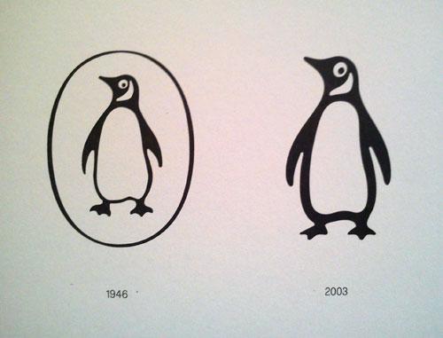
Image sourced here.
This logo was designed in 2003. The story behind the current logo is that typographer Jan Tschichold‘s 1946 modification was fine-tuned in 2003 by Angus Hyland and is now used as the company logo. This logo is fun yet classy and stylish, a symbol that goes well with the book publisher company.

Image sourced here.
HarperCollins

Image sourced here.
HarperCollins, the world’s leading book publishing company has a unique, modern, and classy logo to represent them. The story behind the logo is a fascinating one, combining two famous logos to create a unique new one. In 1989, the consolidation of Harper & Row and Collins Publishers resulted in the companies two logos being combined.

Image sourced here.
The logo shows the elements of the two logos being combined to create one. It shows the Harper Torch element and the Collins Fountain element. Above you can see how the two are combined to make the logo that we now see today. Their logo recognizes the union between the two and combines them to create a stunning book publishing logo.
Random House
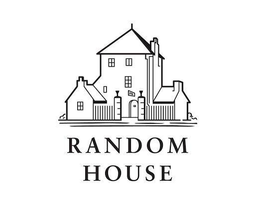
Image sourced here.
Founded in 1927, Random House is one of the oldest and most well-known book publishing companies. It dates back to 1925 when two New Yorkers in their mid-twenties, Bennett Cerf and Donald Klopfer, acquired The Modern Library. They took on the name ‘Random House’ two years later and decided to try out publishing a few books on the site. Now they have a library of knowledge-filled books for the public, with a stylish and classic logo that represents them well.
Seal Press

Image sourced here.
Founded in 1976, Seal Press publishes books that challenge readers and encourages them to see the world in a new light. Although starting with a different look, the most recent book publisher logo features a cleaner style of logo. A book publishing company that has a fascinating story behind it and a classy logo to represent it, this logo is one of the best out there.
Open Book Publishers

Image sourced here.
Founded in 2008, Open Book Publishers is a book Publishers company that’s based in the United Kingdom and a non-profit enterprise. The logo is simplistic, featuring an open book next to the name in a few different shades of blue.
Thames & Hudson

Image sourced here.
Thames & Hudson is a book publishing company that publishes illustrated books that focus on publishing books on design, art, and architecture. The logo is simple, stylish, and has a classy style. It features two dolphins with the name next to them, creating a stylish logo for the book publisher’s company.